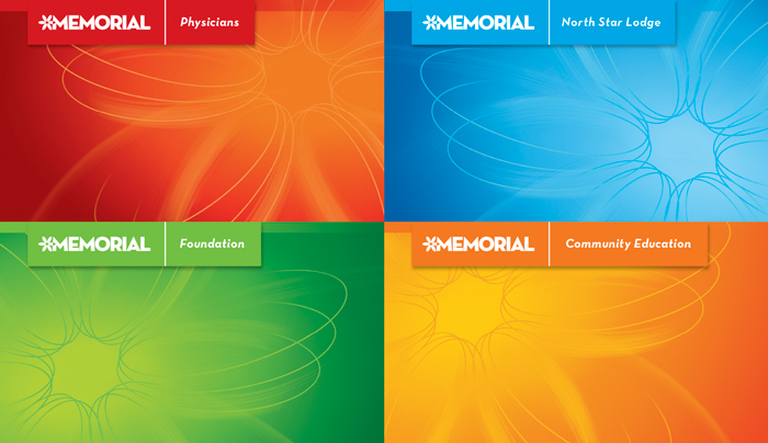
Yakima Valley Memorial Hospital Association is a private, not-for-profit organization providing services from emergency care to neurosurgery to oncology. Since its founding in 1950, it’s become the area’s largest healthcare provider. It had also become an unwieldy collection of parent, affiliate, education, and philanthropic brands that, at first glance, appeared entirely unrelated.
In partnership with Spokane’s Desautel Hege Communications, helveticka set out to, in the words of Memorial president and CEO Rick Linneweh, “unify, simplify, and clarify the Memorial brand…[to] further strengthen Memorial’s position” within the community.
Beginning with a brand promise that identifies Memorial’s role — both now and well into the future — helveticka established a set of visual identity and graphic standards to help the organization create a cohesive and recognizable image wherever the Memorial brand is encountered.
Red is used to denote the two parent brands (Yakima Valley Memorial Hospital and Memorial Physicians), blue to identify all affiliate brands, and orange to indicate messaging related to community education across all brands, while green is set aside for materials connected with Memorial’s charitable foundation. A secondary color palette was established as well, along with approved fonts, usage guidelines, and a host of sample applications: print ads, stationery, PowerPoint templates, and more.
The entire process took nearly a year, and followed closely on the heels of previous work for Memorial by helveticka and Desautel Hege.