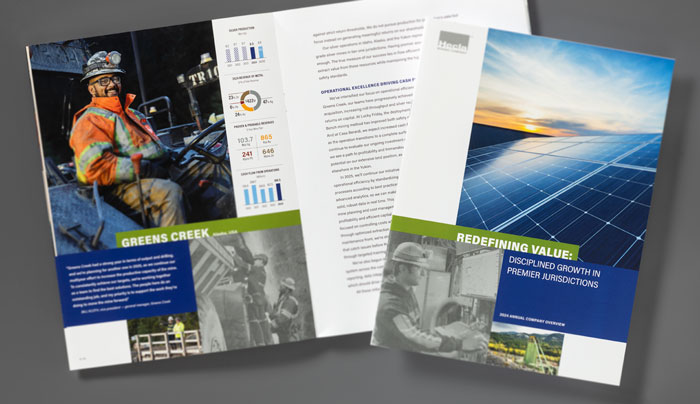
Redefining Value: Disciplined Growth in Premier Jurisdictions was Hecla Mining Company’s first annual report under CEO Rob Krcmarov, and the title reflects Hecla’s shift in focus from production volumes to a more holistic view of sustainable, profitable growth. View the report.
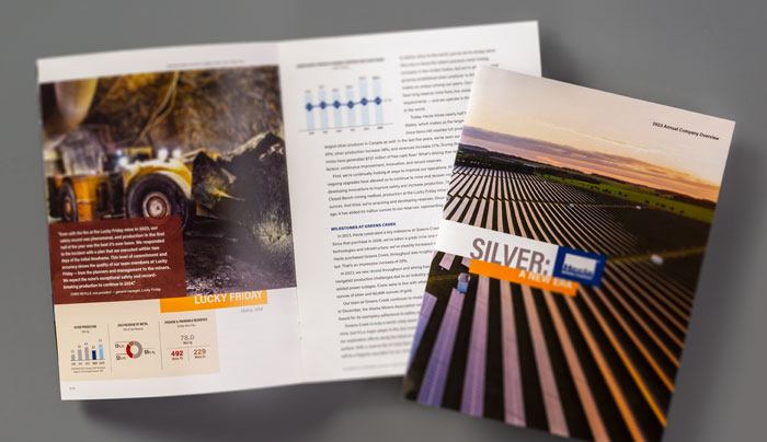
Hecla’s 2023 annual report, Silver: A New Era, examines the market fundamentals of silver, which are stronger than ever, thanks to rising industrial demand driven by the global momentum for a green economy. View the report.
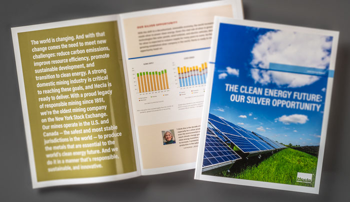
The Clean Energy Future: Our Silver Opportunity, the theme of Hecla’s 2022 annual report, highlights an unprecedented opportunity for the 133-year-old company – growing demand driven by clean energy technologies. View the report.
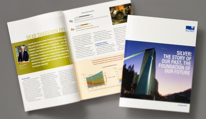
Silver: The Story of Our Past, the Foundation of Our Future was the theme of Hecla’s 2021 annual report – an acknowledgment of the company’s roots in Idaho’s storied Silver Valley while pointing to an increasing need for the minerals it produces as the world shifts to a greener economy. View the report.
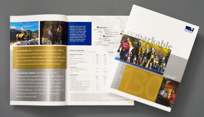
Hecla’s 2020 annual report celebrated a remarkable performance – not only the safest in the company’s 130-year history, but also its highest gross revenues – in the face of a relentless global pandemic. View the report.
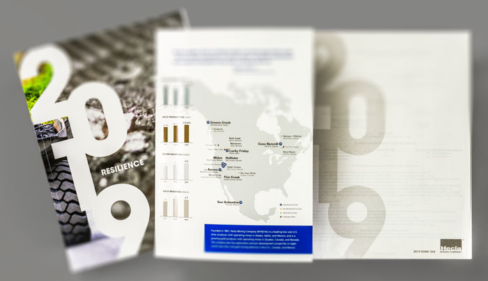
Hecla’s 2019 annual report, themed Resilience, is helveticka’s 32nd consecutive AR for the mining company – a relationship that dates back to 1988. View the report.
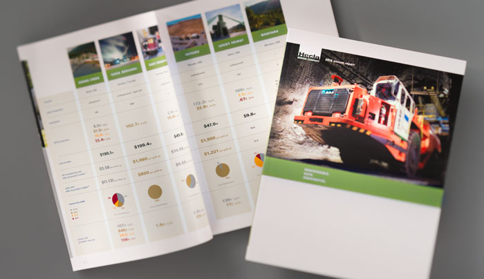
Responsible. Safe. Innovative., the company’s 2018 report, expresses Hecla’s transparent and open approach to mining; to “the safety of our people, to the protection of the environment, to continuous improvement through technological innovation.” View the report.
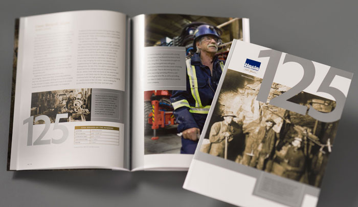
Hecla’s 2015 annual report celebrated 125 years in business for the Coeur d’Alene-based silver and gold producer. View the report.
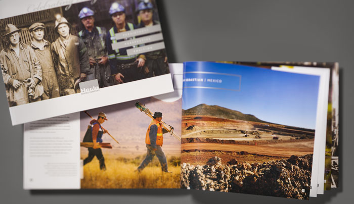
Persistence, Perspective, Position, a 40-page book commemorating Hecla’s 125th year in business, features archival imagery and a historical timeline. View the book.
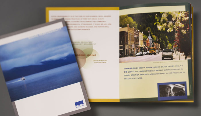
Hecla’s Social Responsibility Report is a 12-page publication promoting the North Idaho mining company’s core business principles: safety, environmental stewardship, and economic development. View the book.
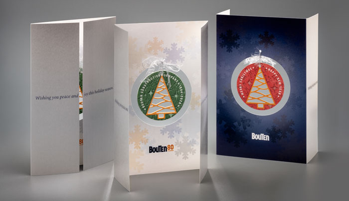
This holiday card, designed for Bouten Construction, was digitally printed on 110-lb Neenah Classic Crest Classic Avalanche White paper. The ornament attached inside the card was letterpress die-cut and printed on 220-lb Crane’s Lettra Pearl White paper.
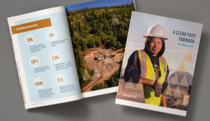
2021 marked the ninth consecutive annual report collaboration between helveticka and NOVAGOLD. A Clear Path Forward included a special feature: John Hathaway, one of the precious metals company’s longtime shareholders, discussing the gold market trajectory, jurisdictional safety, and cryptocurrencies with Dr. Thomas S. Kaplan, chairman of the board of directors at NOVAGOLD. View the report.
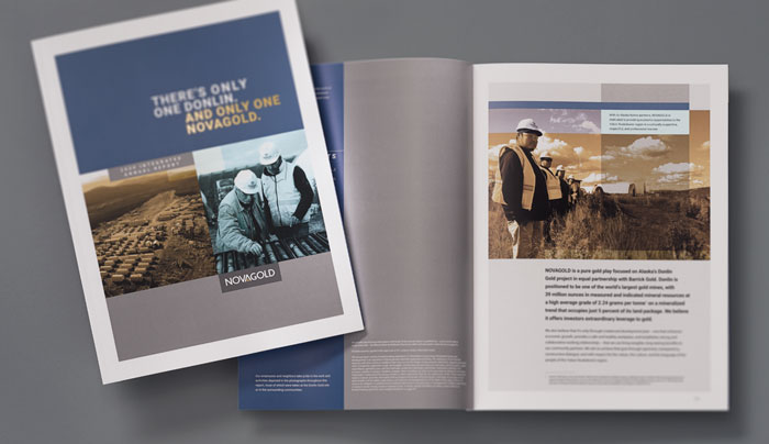
For NOVAGOLD’s 2020 annual report, helveticka combined the Vancouver, BC-based company’s 2020 financial and sustainability summaries into a single, 52-page integrated report. View the report.
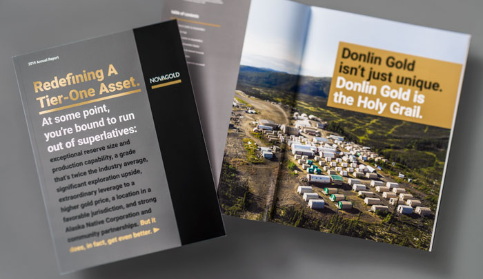
Opening with a big, bold statement on the cover, NOVAGOLD bet on the power of storytelling with its 2019 annual report, including a section devoted to the people of the Yukon-Kuskokwim region of southwestern Alaska, where the company has a 50-percent interest in one of the world’s top-tier gold assets. View the report.
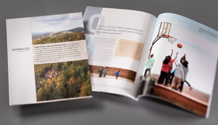
In 2012, NOVAGOLD “laid out a clear roadmap for investors.” Six years later, the precious metals company delivered in every conceivable way. Its 2018 annual report outlines the promises made and kept – not only to investors, but also to Native and community partners. View the report.
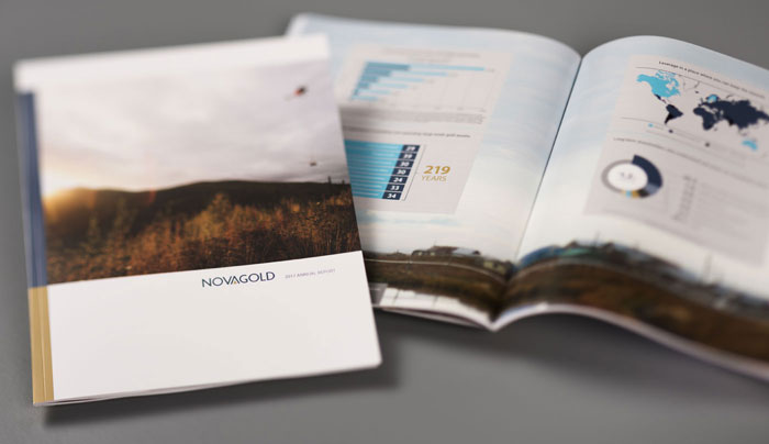
NOVAGOLD’s 2017 annual report, themed Implementing Our Value-Enhancing Strategy, highlights the company’s methodical approach to advancing Donlin Gold and Galore Creek, its two 50 percent-owned assets, up the value chain – and the milestones it’s met along the way. View the report.
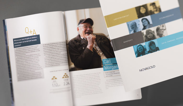
In a sense, the theme of NOVAGOLD’s 2016 annual report – Empowerment. Stewardship. Respect. – can be seen as a distillation of the precious metals company’s ethos: building collaborative, mutually beneficial relationships. View the report.
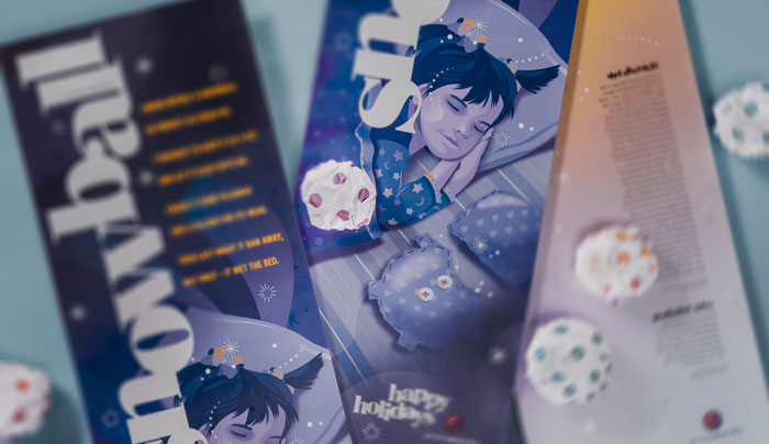
The Spokane printing company’s 2019 holiday card was a 12.5"w x 39.5"h poster, printed two-sided as a single pass using metallic inks. Inspired by Shel Silverstein’s “Snowball” from his poetry collection Falling Up, the poster was accompanied by a bag of “Pressworks Brand No-Mess Office Snowballs.”
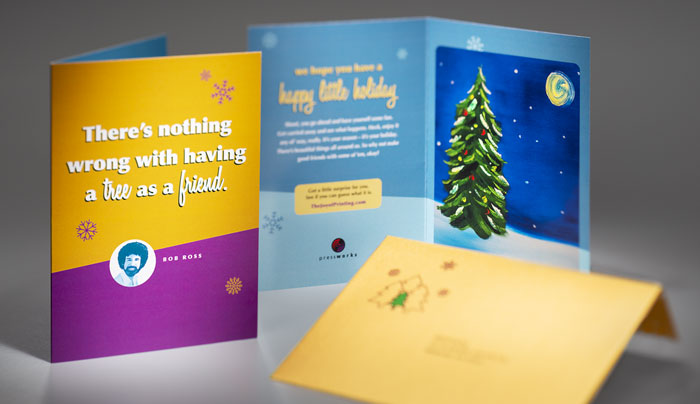
2018’s card was even more of a radical departure from convention than usual: a Bob Ross-inspired video, the painting from which served as the card cover.
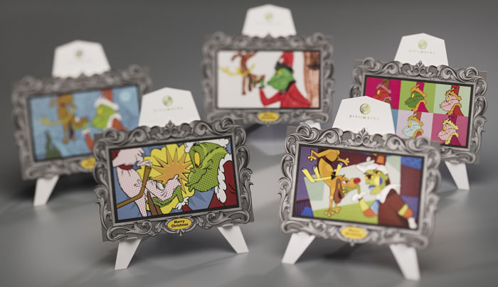
An homage to Dr. Seuss, the 2017 card offered five interpretations of a still from the 1966 animated television special How the Grinch Stole Christmas!, with Van Gogh, Lichtenstein, Picasso, Warhol, and a Pressworks employee’s 9-year-old daughter featured.
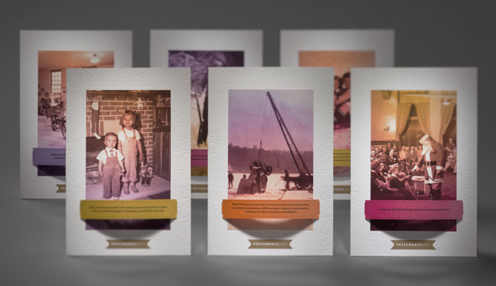
The 2016 card enabled recipients to customize one of six vintage photographs with a series of captions (or they could create their own). It came with a built-in easel that not only allowed for displaying on flat surfaces, but also provided storage for the excess captions.
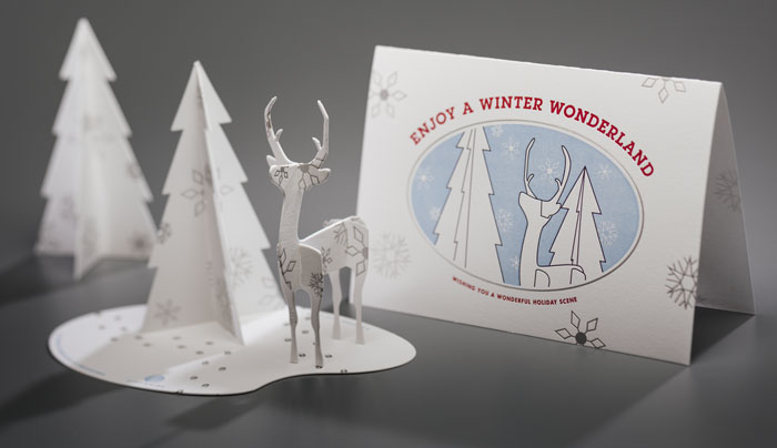
For 2015, helveticka designed an assemble-yourself winter wonderland scene, letterpress-printed on cover weight stock. Both the scene and the accompanying card were die-cut and silver-foiled; the card was also embossed.
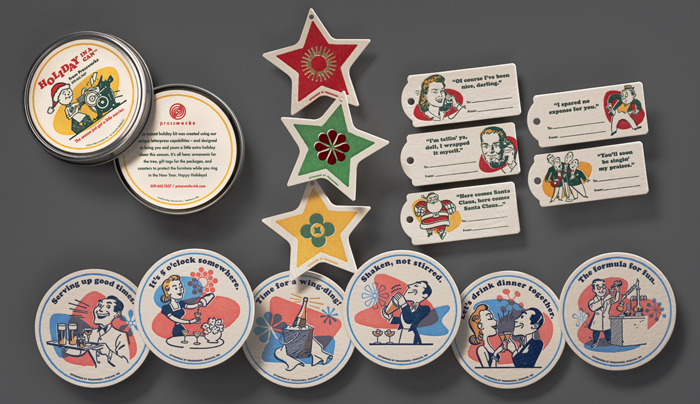
Helveticka’s unique take on Pressworks’ 2014 holiday card took advantage of the client’s vintage 1940s-era Heidelberg Windmill printing press, and included ornaments, gift tags, and coasters.
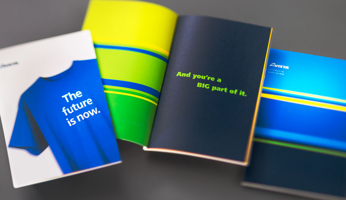
helveticka created – and Avista provided each of its employees with – a 6.5" x 9.5", 40-page book designed to share the company’s vision, mission, and values.
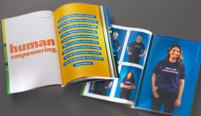
The book featured 46 employees representing various company departments and office locations.
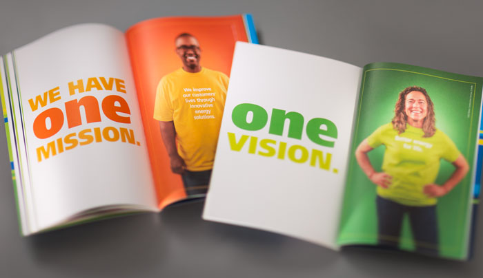
Through typography custom-printed on T-shirts, Avista employees became the storytelling messengers.
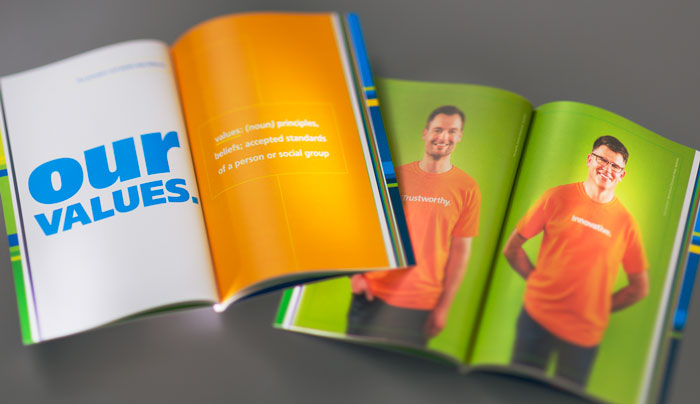
The colors used throughout the piece – including those on the T-shirts – were inspired by Avista’s corporate brand palette.
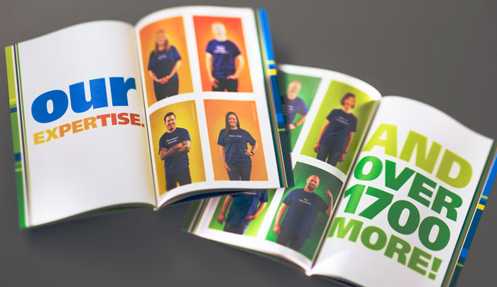
In the “Our Expertise” section, 24 employees represent just a few of the dozens of departments required to operate a utility across four states.
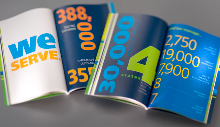
“We Serve” reminds employees of the magnitude and reach of their company.
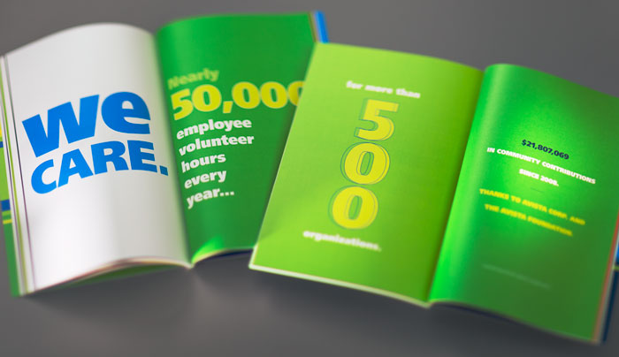
The “We Care” section demonstrates the philanthropic impact that both employees and the company have on the communities where Avista operates.
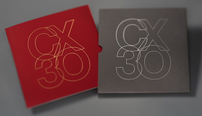
In conjunction with CX30: Creative Experiences, Thirty Collaborators – an exhibit curated, designed, written, and installed by helveticka to celebrate its 30th anniversary – the firm produced a commemorative book. View the book.
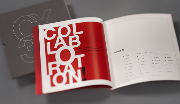
The 68-page limited-edition book, entitled CX30, commits to print all 30 of the exhibit’s featured stories.
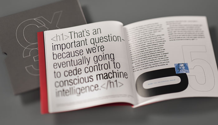
Those stories include personal insights, anecdotes, and reflections from select collaborators who played a role in helveticka’s success over the last three decades.
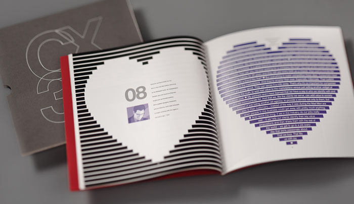
Each story is expressed through typography treatments that attempt to capture not only the essence of that story, but also the collaborator’s personality.
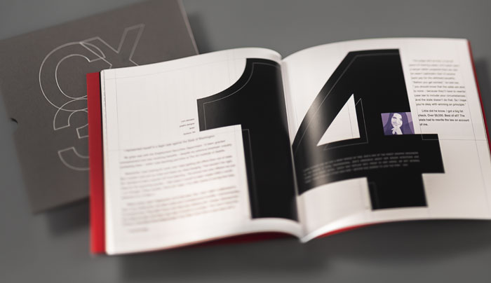
That approach makes each page spread unique – just like the individuals themselves.
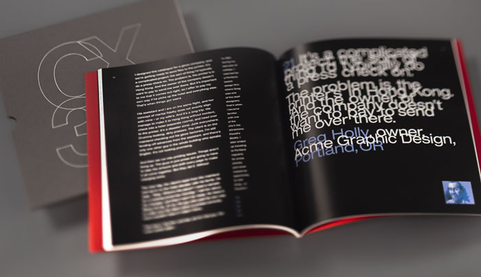
More than 50 different Helvetica fonts were used throughout the 11" x 11" book.
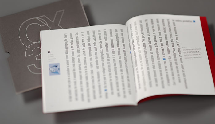
The book was presented to each collaborator at a ceremony opening the exhibit.
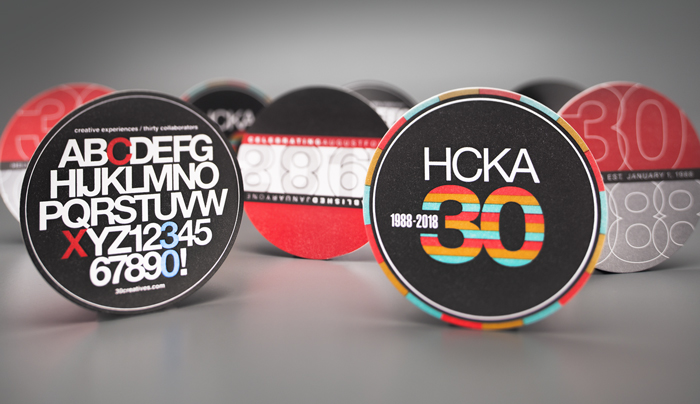
A set of four coasters, letterpress-printed on 200-lb. 100 percent cotton paper, created to commemorate helveticka’s 30th anniversary in 2018.
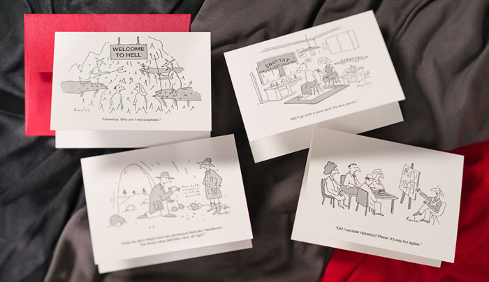
Spokane cartoonist Dave Rowles created four custom Helvetica-inspired cartoons for a set of unique letterpress-printed note cards.
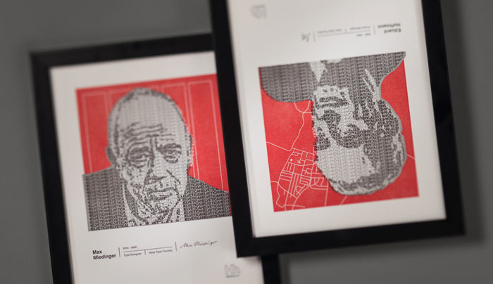
A pair of mini-posters, adapted from a design by SFCC student Corri Woods, pay homage to Eduard Hoffmann and Max Miedinger – the creators of Helvetica.
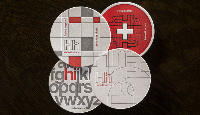
These coasters, designed for online retailer Helveticahaus, were letterpress printed on 220-lb. Crane’s Lettra Fluorescent White, a 100% pure cotton paper.
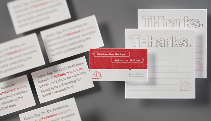
Printed on 220-lb. cotton paper, Helveticahaus’ business cards feature an imagined conversation between the creators of the namesake typeface; thank-you notes playfully employ the company’s logo.
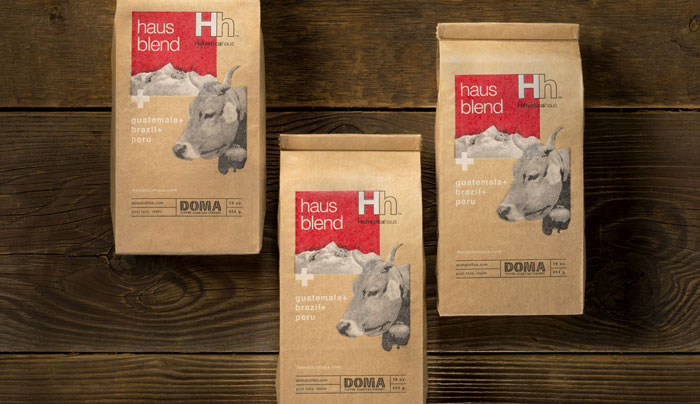
Helveticahaus partnered with local coffee roaster DOMA for Haus Blend, part of a product line devoted to Hh’s namesake sans serif font.
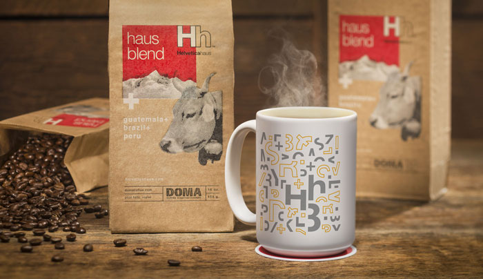
The coffee is available for purchase by the pound or through a monthly subscription service. Proceeds fund scholarships for area design students.
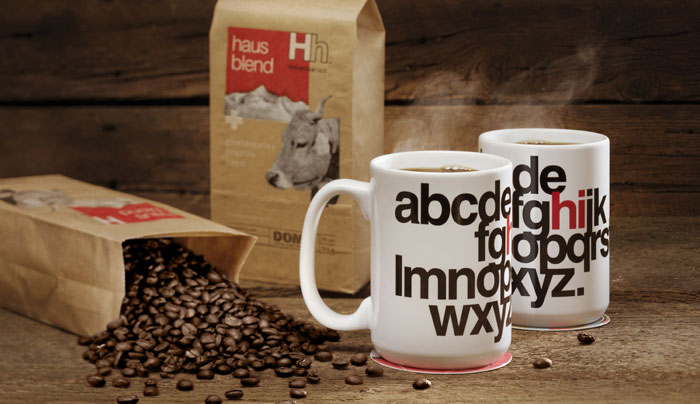
Seven distinctive Hh designs were adapted to fit on 14-ounce ceramic coffee mugs, which are printed to order locally.
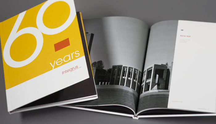
Integrus celebrated its 60th anniversary in business with a 76-page hardbound book chronicling the firm’s achievements – including a sample portfolio – since 1953. View the book.
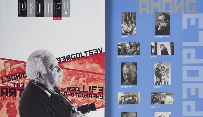
The inaugural issue of PROOF!, a biannual arts publication designed, researched, and written by helveticka, featured the work of Russian photographer Leonid Bergoltsev, whose career spanned decades of Cold War history. View v1.
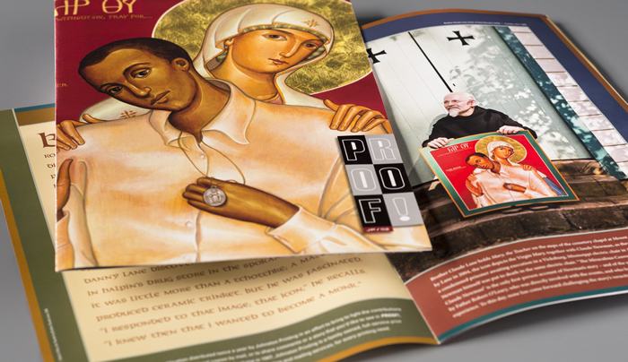
The work of Benedictine monk and iconographer Brother Claude Lane, OSB was the subject of issue number 2 of PROOF!. View v2.
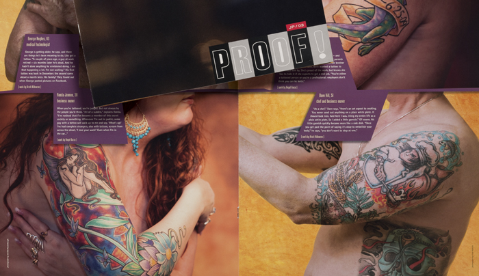
The clothes came off in issue number 3 as the living art of tattooing – and the culture that surrounds it – was examined. View v3.
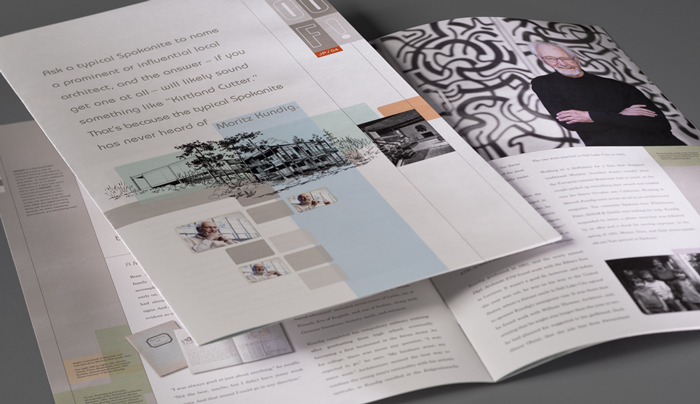
The Modern architecture of Swiss immigrant Moritz Kundig, FAIA, was featured in PROOF! number 4. View v4.
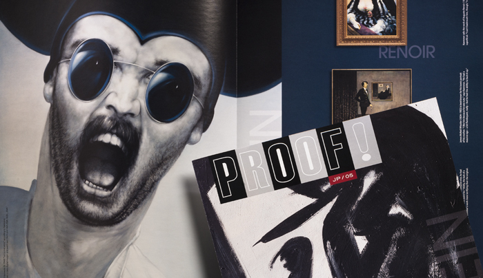
An exploration of commercial art was the impetus behind the fifth issue, which took a look at the work of Gary Kaemmer. View v5.
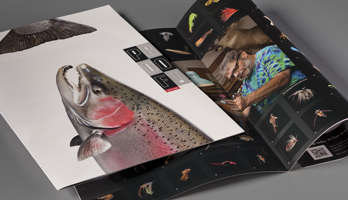
The sixth and final issue of PROOF! took a surprising turn, showcasing the work of world-renowned fly tier John Newbury. View v6.
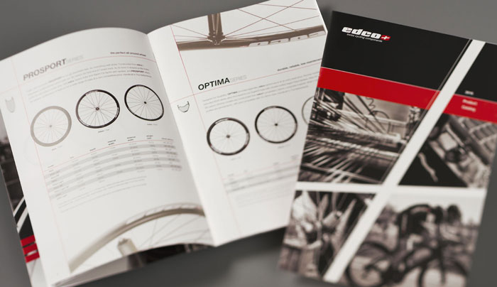
edco’s entry into the North American market coincided with the release of its product catalog. The Dutch company specializes in hand-built carbon bicycle wheels, primarily for racing. View the brochure.
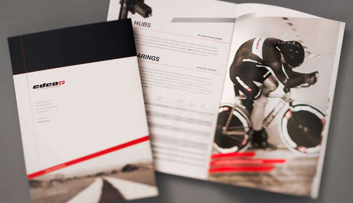
The back cover and a typical spread from the brochure exhibit one of the design elements used throughout – red stripes inspired by edco’s logo.