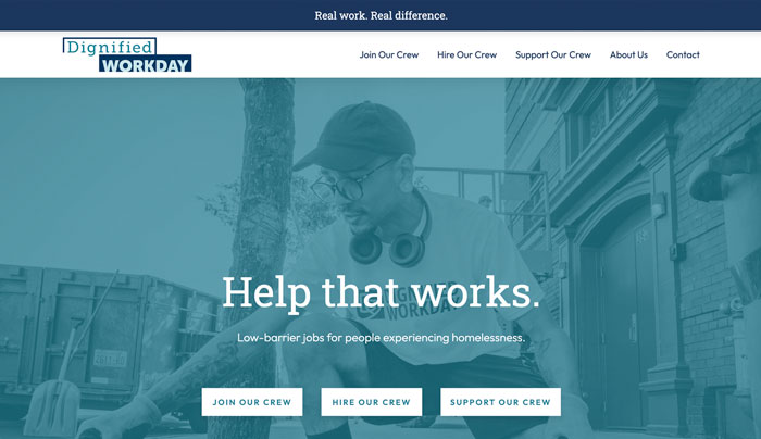
Through compelling photography and storytelling, Dignified Workday's website engages the nonprofit's diverse audience of program participants, worksite partners, and donors and volunteers – and inspires them to take action.
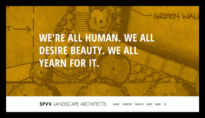
SPVV’s website looks a lot less like a typical service company’s site – and a lot more like the landscape architecture firm itself: bold, dynamic, creative, friendly, and engaging.
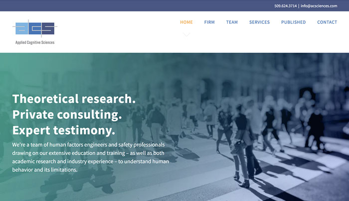
ACS’s website employs custom illustrations and graphics, a straightforward, conversational tone, and an intuitive user experience to help explain what the company does – and why it matters.
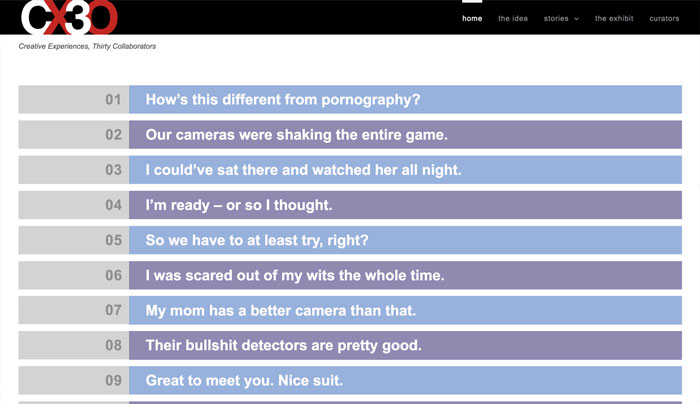
CX30: Creative Experiences, Thirty Collaborators puts participants’ stories front and center, ensuring they live far beyond the temporal constraints of the site’s namesake exhibit.
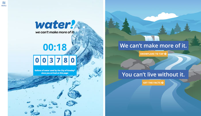
GreeleyH2O.com was part of a multi-year, three-phase public relations campaign designed to help the city promote the expansion of Milton Seaman Reservoir.
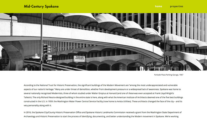
As part of a state-funded survey of Spokane’s mid-century architecture, midcenturyspokane.org featured a new project for each week of the year.
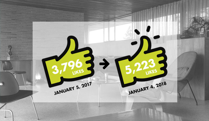
Projects were highlighted on the Spokane Historic Landmarks Facebook page, which saw a 37 percent increase in page likes over the year.
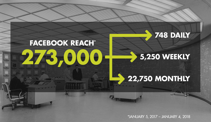
Those posts reached nearly 750 different people a day throughout the year, easily meeting one of the client’s key objectives: education.
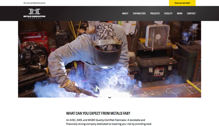
Metals Fabrication’s feature-rich and responsive website includes video, photography, custom illustrations, and a massive searchable project database.
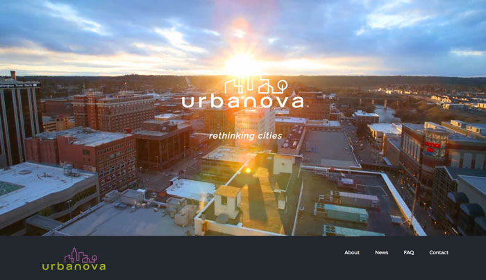
helveticka worked alongside stakeholders from all six of Urbanova’s founding partners to develop a website that helps express who they are and what they do.
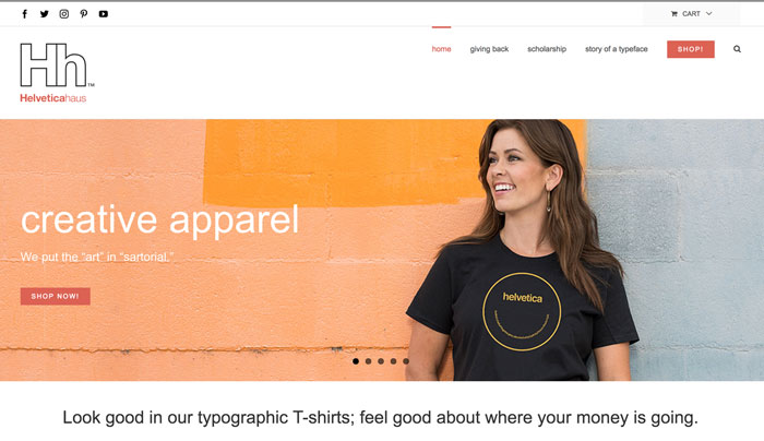
The website created for online retailer Helveticahaus honors the company’s namesake typeface with clean, intuitive, and responsive design.