blog
tyblography

categories

architecture (28)
on location (21)
random thoughts (1,257)
staff (25)
the design life (285)
the writing life (412)
blog archive


Local Boy Makes Good

I somehow missed the news that Gary Dahl, inventor of the Pet Rock, died a couple of days ago. The Spokesman-Review’s Doug Clark is on the case—because it turns out that Dahl was a Rogers High School graduate. Who knew?

In 1975, at the height of the craze, my best friend owned a Pet Rock. My feelings about it at the time can best be described as ambivalent: even as an eight-year-old, I understood how unbelievably dumb it was, yet I couldn’t deny that I really, really wanted one. Probably my first lesson in marketing.

Dahl, a “down-at-the-heels advertising copywriter” when he came up with the Pet Rock idea, was no one-trick pony. He published Advertising for Dummies in 2001. And a year earlier he was the grand prize winner in the 18th annual Bulwer-Lytton Fiction Contest, a competition that “challenges entrants to compose the opening sentence to the worst of all possible novels.” Here’s his winning entry:

“The heather-encrusted Headlands, veiled in fog as thick as smoke in a crowded pub, hunched precariously over the moors, their rocky elbows slipping off land’s end, their bulbous, craggy noses thrust into the thick foam of the North Sea like bearded old men falling asleep in their pints.”

RIP, Mr. Dahl. You done your hometown proud.

Quote of the Day

A lot’s been going on lately. Politically, I mean. Stuff we don’t want to discuss here. Stuff that turns Facebook and Twitter into fetid fever swamps of amateur punditry and carefully cultivated outrage.

Time, in other words, to remember our Kierkegaard: “Talk takes the name of enthusiasm in vain by proclaiming loudly from the housetop what it should work out in silence.”

The Best of Show

No matter how small or large your ego is, it’s always nice to see your work recognized by your peers. And while I’ve become a bit numb to the annual ADDY Awards event (you might too if you attended 34 out of the last 35 year’s worth of shows), the evening still provides a showcase for the many talented folks working in our local community.

ADDYs2015
Left to right: Morgan Lynch, Courtney Sowards, CK Anderson, Linda Anderson. Photo by Chad Ramsey.

Not all eligible firms participate, but the entries remain a reflection of the enormous body of creative work produced here in Spokane and the collaborative energy behind it. So…here’s to the writers, designers, creative directors, account managers, photographers, filmmakers, sound designers, editors, animators, printers, interns, and programmers (to name just a few). And—most of all—to our clients. Cheers!

Question, Answered.

Why is it important to have a mobile friendly website, you ask? According to Nielsen, “Nearly half of smartphone owners (46%) and tablet owners (43%) said they use their devices as second screens while watching TV every day.” That means that while your audience is watching the latest Modern Family episode, they are also surfing the web. And according to a Forbes article, “9 out of 10 mobile searches lead to action. More than half lead to sales.”

To help sway you toward insuring a pleasant mobile experience for your audience, check out the other 49 mobile marketing facts here.


Your Daily Dose of Awesome

ab_blog_img

Last week, ArchDaily shared some behind-the-scenes photos taken in the Blade Runner model shop. (For you nerds out there, the entire 142-image Imgur album is here.) While I yield to no one in my love for the 1982 film, I’ll be honest: this post is really just an excuse to share one of my favorite Clive James poems.

DECKARD WAS A REPLICANT

The forms of nature cuff-linked through your life
Bring a sense of what Americans call closure.
The full-blown iris swims in English air
Like the wreckage of an airbag jellyfish
Rinsed by a wave’s thin edge at Tamarama:
The same frail blue, the same exhausted sprawl,
The same splendour. Nothing but the poison
Is taken out. In the gallery, that girl
Has the beauty that once gave itself to you
To be turned into marriage, children, houses.
She will give these things to someone else this time.

If this time seems the same time, it’s because
It is. The reason she is not for you
Is she already was. Try to remember
What power they have, knowing what sex is for:
Replacing us. The Gainsborough chatelaine
She studies wears a shawl dipped in the hint
Of jacaranda blossoms, yet it might
Remind her of sucked sweets, or the pale veins
Of her own breasts. Setting the Thames on fire,
The tall white-painted training ship from Denmark
Flaunts the brass fittings of the little ferry
That took you as a child to Kirribilli
On its way to Wandsworth, then the Acheron
And Hades. Those gulls that graze the mud
Took sixty years to get here from Bundeena.

At an average speed of forty yards an hour
They hardly moved. It seems you didn’t either.
You stood still with your head wrapped in the armour
Of perception’s hard-wired interlocking habits.
Ned Kelly was the ghost of Hamlet’s father.
Dazzled by lipstick pulped from waratahs,
The smoker coughs, having been born again.

(2003)

Miscellany

When female restaurant servers draw a smiley face on bills, their tips increase by about 20 percent.

The surprising origins of…well, a word we prefer not to repeat in a family blog.

Speaking of words, the consequences of “a totalistic universe in which all questions are answered,” it seems, is the rise of “thought-terminating clichés.”

Is humankind becoming more selfless and beneficent? Steven Pinker’s The Better Angels of Our Nature (2011) argues as much. But John Gray isn’t buying it.

Blasphemy!

“However trivial the product may be, you are actively furthering your life while earning a living.” More from the Bard of Madison Avenue.

And finally, did a “hunting, riding, fighting and sexually uninhibited tribe of wild women”—you know, Amazons—actually exist? Perhaps.

Internet Time Machine

If you’re up for a deep-drive today, Wayback Machine has you afternoon planned out for you. As an internet archive, the website backlogs previous designs of almost any website you can think of, effectively giving you an evolutionary timeline of the internet.  It’s flooring to see how far we have come. At the risk of dating myself, my first favorite website that I can recall was Yahooligans.com – a search engine for kids that was packed full of fun games and bright colors. It looks just as I remember it did in 1999. As I stare at the page, watching the text dance with pixelation and squinting to read the icons, it’s easy for me to see how we have refined web design and created such a lovingly user-centric craft.

Between the Digital and the Physical

“Like a lot of people, I split my time now between the digital world and the physical one. My head’s filled with all this amazing stuff I see online and yet I also need the messiness of the clay and materiality of it to feed me on some fundamental level.”

For the first time, my love for ceramics has been put into words and done so with such elegance that I have have chills. Ayumi Horie is a studio potter based in Portland, Maine and uses her pottery to encourage connections between people with subtle detail and organic, tactile designs. Watch her intoxicating explanation of her love for clay and have a better Thursday because of it!


Flower Striptease

It’s mid-March and already the spring-time lovelies are peeking their heads out of the ground to brighten up the Pacific Northwest. To say I am excited is a gross understatement. Being from Alaska, sunshine works wonders on me and those added splashes of natural color basically makes me skip to work. If you are lacking in either of these categories, here is my treat to you: 10,000 flower images stitched together by French director Thomas Blanchard. You’re welcome.

The Glorious 70s

1970s

I know I’m supposed to be outraged (or something), but all this photo collection elicits from me is fond recollections of my childhood. Nostalgia’s funny that way. Speaking of which, remember when record companies did this? Good times.

Type Matters

helvetica

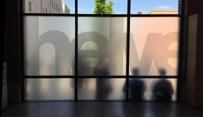
Helvetica has always had a sense of purpose. While it’s one of several great fonts at every designer’s disposal, it is—by far—the most famous. And it didn’t achieve this status simply by lookin’ good (although the documentary certainly didn’t hurt). Helvetica is educated. Hardworking. Likable. And for nearly 60 years now, its success has depended on keeping an open mind and never being afraid to appear on anything, anywhere, at any time. In short, it’s never met a design it couldn’t help. In this regard, Helvetica is a very charitable font.

That’s why we formed Helveticahaus—to showcase a typeface that’s willing to give itself over to a higher calling. And with your support, this haus will give aspiring designers an opportunity to continue to use Helvetica in new and exciting ways.

Yay! Writerly Stuff!

Today I bring you not one, not two, but three articles with at least a tenuous connection to the writing life: Barton Swaim reviews a book on metaphors, Tom McCarthy proposes that “if there is an individual alive in 2015 with the genius and vision of James Joyce, they’re probably working for Google,” and Julia Holmes exposes the sordid underbelly of copy-editing.

What? Tired of blog posts about grammar and writing and other stuff nobody cares about? Tell Courtney to write something designy.

Everything’s a Problem

If you’re one of those who wonders why so many people these days are concerned, hurt, offended, or “made uncomfortable,” by something as innocuous as a word, a photograph, or a tasteless joke, this is the site for you.

On the “problematic nature of the snow shoveling gender gap,” for example, we learn that “the patriarchy hurts men just as much as women: forcing yourself into rigid gender roles keeps you outside on a cold, snowy day, gents. Wouldn’t you rather be inside while your partner shoulders some of the burden?”

It’s brilliant stuff.

Songs from the Wood

The irreproachable Morgan Lynch, soon-to-be runner-up in the office chess championship, alerted me to Bartholomäus Traubeck’s modified record player that “plays” slices of wood:

It’s a brilliant idea, really (inspired by a Jethro Tull album), and the resulting sounds are surprisingly musical.

Brooks in Boise

modernmasters

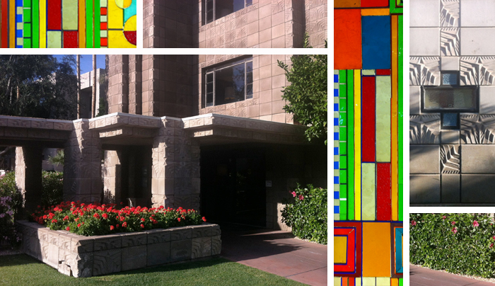
Last Saturday I had the pleasure of presenting a lecture at Boise’s fourth annual Modern Masters series, sponsored by Preservation Idaho and Idaho Modern. The subject? The late Spokane architect Kenneth W. Brooks, part of our region’s stellar mid-century modern architecture movement that spanned two decades beginning in the early 1950s.

Brooks received three national awards from the American Institute of Architects in three different decades: Washington Water Power Central Service Facility (Spokane, 1959—the first national AIA award in the state of Washington), Intermountain Gas Company Headquarters (Boise, 1966—where Saturday’s event was held), and Columbia Basin College’s Art-Drama-Music Complex (Pasco, 1978).

Though I never had the privilege of meeting Mr. Brooks, his determination and love of his craft were unparalleled.

back to top    |     1 70 71 72 73 74 131     |    archive >