2014 is winding down. Which means, of course, that it’s time for a review of the year’s best music. We’re going to do something a little different this time around, though. Rather than simply listing the top 10 albums—half of which would likely fall within the pop or rock genre (it was a good year for both)—I assigned a single winner to each of 10 different categories. Starting today, we’ll share a couple of winners each week. Then, the big reveal: artist of the year. Stay tuned.
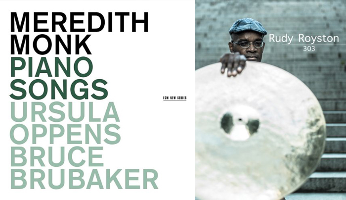
Best avant-garde album of 2014: Meredith Monk, Piano Songs “Monk’s most notable mediation,” writes Matthew Guerreri, “is between the poles of minimalist repetition and modernist continuous variation.” Drawn from works composed between 1971 and 2006, Piano Songs revels in the music’s purity, asymmetry, and transparency. (Honorable mention: Vijay Iyer, Mutations.)
Best debut album of 2014: Rudy Royston, 303 It’s not like Rudy Royston’s unheard of. It’s just that it took him a while to release his first album as a leader. So how good is 303? Let’s just say that it’s pretty much all I listened to during the entire month of February—both for Royston’s inventive compositions and for his septet’s amazing musicianship.