blog
tyblography

categories

architecture (28)
on location (21)
random thoughts (1,257)
staff (25)
the design life (285)
the writing life (412)
blog archive


Kickstarting a Classic

nycmtastyleguide

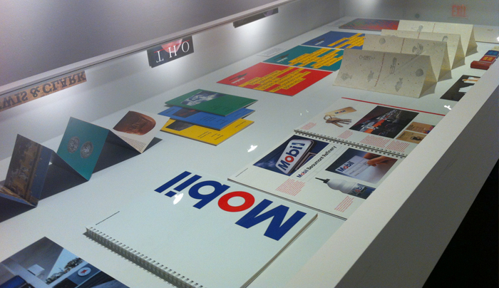
It may be the most famous graphics standards manual ever created (if not one of the largest): Unimark International’s 364-page manual for The New York City Transit Authority’s signage and wayfinding system. It was put together by Unimark’s Bob Noorda and Massimo Vignelli in 1970.

So…how famous? A couple of years ago, an original copy was discovered in the basement of the New York office of Pentagram. Last week, a Kickstarter campaign was launched to raise $108,000 to faithfully reproduce the manual. By 10am PST, over $65,000 had been pledged. By noon, that figure was up to $126,000. And by 2:30pm, it had topped $160,000. As of this morning, total funds pledged had surpassed $600,000. You get the idea.

Side note: It’s widely known that Helvetica is the font currently used throughout the NYC subway system. But in 1970, Noorda and Vignelli spec’d Standard Medium. Helvetica didn’t become the official font until 1989.

Winter Is Coming

On September 16, 1805—209 years ago today—the Lewis and Clark expedition was crossing the Bitterroot Range of the Rocky Mountains, somewhere between present-day Missoula and Weippe, Idaho, on their way toward the Pacific. Clark wrote in his journal that evening:

“A thickly timbered country of eight different kinds of pine, which are so covered with snow, that in passing through them we are continually covered with snow. I have been wet and as cold in every part as I ever was in my life. indeed I was at one time fearful my feet would freeze in the thin moccasins which I wore. After a short delay in the middle of the day, I took one man and proceeded on as fast as I could about six miles to a small branch passing on to the right, halted and built fires for the party against their arrival which was at dusk, very cold and much fatigued. We encamped at this branch in a thickly timbered bottom which was scarcely large enough for us to lie level, men all wet, cold and hungry. Killed a second colt which we all supped heartily on and thought it fine meet.”

Happy Birthday, Bouten

bouten70

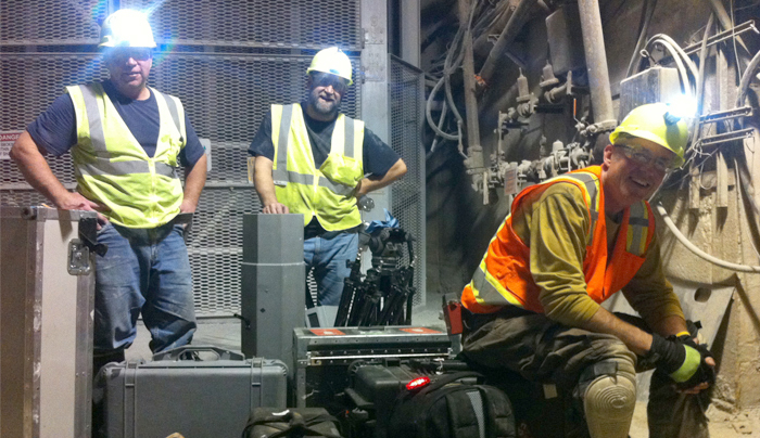
Bouten Construction Company turns 70 this year, and last week they invited a couple hundred of their closest friends to the Spokane Convention Center’s Roof Deck Patio to help them celebrate the occasion. Naturally, we were there—eating, drinking, and taking unauthorized photographs. Congratulations to everyone at Bouten for reaching this historic milestone. And thanks for including bacon-wrapped scallops on the menu.

On Teaching

Though I’ve more than once used this space to extol the virtues of Stephen King’s On Writing (here and here), I thought I’d draw your attention to an interview he gave to The Atlantic‘s Jessica Lahey.

“I asked King,” writes Lahey in her introduction, “to expound on the parts of On Writing I love most: the nuts and bolts of teaching, the geekiest details of grammar, and his ideas about how to encourage a love of language in all of our students.”

His responses are—as you’d expect—illuminating.

The Week that Was: September 5 Edition

The headline says it all: “Underwear-stealing ghosts made my life hell.” The best line of the story, though? “I thought I was going crazy.”

Though the possibility of a paper clip making software that turns Americans into even more paper clips is “not technologically possible in the next 20 years” (estimates range from 20 years to, well…never), “the potential negative consequences are too severe not to study the possibility.” Welcome to the Centre for the Study of Existential Risk.

Apparently, it needed to be said: “applying electrodes to the brain…could have some unintended results.”

Hogzilla!

Finally, if your child “screams at night, cries, is always feverish, suddenly deteriorates in health, puts up an attitude of fear, and may not feed very well,” it may very well be possessed by vampire witchcraft spirits

(yawn)

I guess football season is starting? Like…tonight? And the Seahawks are somehow involved?

I’ll admit it: I just don’t find it all that interesting. So great is the ennui, in fact, that I can’t even be bothered to explain the reasons behind my apathy.

I can, however, write a haiku:

blue and green ospreys
something about a twelfth man
I don’t understand

I didn’t say it was a good haiku.

helveticka endorses…

“All work and no play,” wrote Jack Torrance (over and over and over again), “makes Jack a dull boy.” So do the fine folks at helveticka have any recommendations for spending your leisure time? Glad you asked.

CK just read The Boys in the Boat, and thinks you should, too.

If it’s cocktails you’re after, Linda suggests a Copper Camel for the ladies—or straight-up absinthe if you’re a dude.

Tony heartily endorses Guardians of the Galaxy regardless of your gender.

Shirlee says there’s a pretty tasty Hawaiian pie with prosciutto and jalapeños over at South Perry Pizza, though it’s mysteriously missing from the online menu.

As for me, I humbly submit that seasons 1 and 2 of the FX drama “The Americans” might be some of the best television ever.

Proofreaders of the World Untie!

I’ve long held that proofreading your own work is a fool’s errand. And no, it’s not because I particularly suck at it, but rather because every writer I’ve ever worked with has cautioned against the practice.

It’s hard to explain to non-writers how difficult it is to catch your own errors; often, in fact, our protestations come across as nothing more than a desire to escape accountability.

It appears, however, that there’s evidence to support our reluctance.

Labor Day Weekend Miscellany

“I’ll bet there are lots of people who would try—and enjoy—squirrel brains if they thought nobody would find out.” I’ll take that bet.

Philip Larkin on form and the poet.

Ever wonder why “Arkansas” isn’t pronounced like “Kansas”? You’re welcome.

Professor Larry Cebula and his students at EWU continue to do interesting and important public history work in the Spokane area. Like this, for instance.

Caught in the act: Death Valley’s mysterious moving rocks.

It’s a helluva line: “Fate has ordained that the men who went to the moon to explore in peace will stay on the moon to rest in peace.” Good thing Nixon never had to utter it.

Well done, Toronto.

From Metal to Digital

newhaasgrotesk

Some of you may know that the font Helvetica was originally called Neue Haas Grotesk. In the mid-1950s, designer Max Miedinger was commissioned by Eduard Hoffman of the Haas Type Foundry in Switzerland to develop a new, modern, sans-serif (a.k.a. grotesk) typeface. It launched in 1957. The rest, of course, is history. In 2006, type designer Christian Schwartz was commissioned to digitize Miedinger’s original forms. Four years later, Schwartz finished his work.

In a Night Forest

Nils Petter Molvær has been one of my favorite musicians for a while now, and Lucid Dream—a “one-of-a-kind new audiovisual installation” in the forest of Schloss Benrath—shows why. Check it out.

The Language Police Strike Again

So the other day the New York Times—you know, America’s “newspaper of record”—relied on anecdotes and hearsay to gravely inform its readers that the word “burly” is “racially charged.” Mark Liberman actually looked for evidence to support the Times‘ claim, and (surprise!) found none.

Quote of the Day

“Since music is a language with some meaning, at least for the immense majority of mankind, although only a tiny minority of people are capable of formulating a meaning in it, and since it is the only language with the contradictory attributes of being at once intelligible and untranslatable, the musical creator is a being comparable to the gods, and music itself the supreme mystery of the science of man, a mystery that all the various disciplines come up against and which holds the key to their progress.”

Claude Lévi-Strauss, The Raw and the Cooked (1969 translation by John and Doreen Weightman)

Spec These Spectacles

helvetica-frames

As a dude who wears glasses I would totally rock these Helvetica frames.

Brought to you by Type, a line of Japanese glasses, you can now wear your favorite font right on your face (no pun intended). You are limited to either Helvetica or Garamond however. Man, if only they had Comic Sans, or Wingdings.

Although, good luck trying to order them. The shop page is all in Japanese…

Stop! Grammar Time!

oxfordcomma

I think this image is a much better way to describe the importance of commas. (artist unknown.)

(from OxfordDictionaries.com)

What is the ‘Oxford comma’?

The ‘Oxford comma’ is an optional comma before the word ‘and’ at the end of a list:

We sell books, videos, and magazines.

It’s known as the Oxford comma because it was traditionally used by printers, readers, and editors at Oxford University Press. Not all writers and publishers use it, but it can clarify the meaning of a sentence when the items in a list are not single words:

These items are available in black and white, red and yellow, and blue and green.

The Oxford comma is also known as the ‘serial comma’.

Aaron will never go on vacation again.

back to top    |     1 76 77 78 79 80 131     |    archive >