In one conversation, Caya Berndt defended geese, contextualized monster romance novels, and considered flat minimalism’s takeover of visual culture. This is what happens when two intellectual doodlers meet for coffee.
Caya had won the 2025 Helveticahaus scholarship, and we were talking about their approach to design. And everything else.
Our exchange was so rich that I had to share some excerpts, coinciding with Caya being announced as the 20th recipient of the Hh scholarship. Since 2016, the fund has supported students in the Spokane Falls Community College (SFCC) graphic design program. Congratulations again to Caya, whose perspective was a joy to absorb.
This interview has been edited for length and clarity.

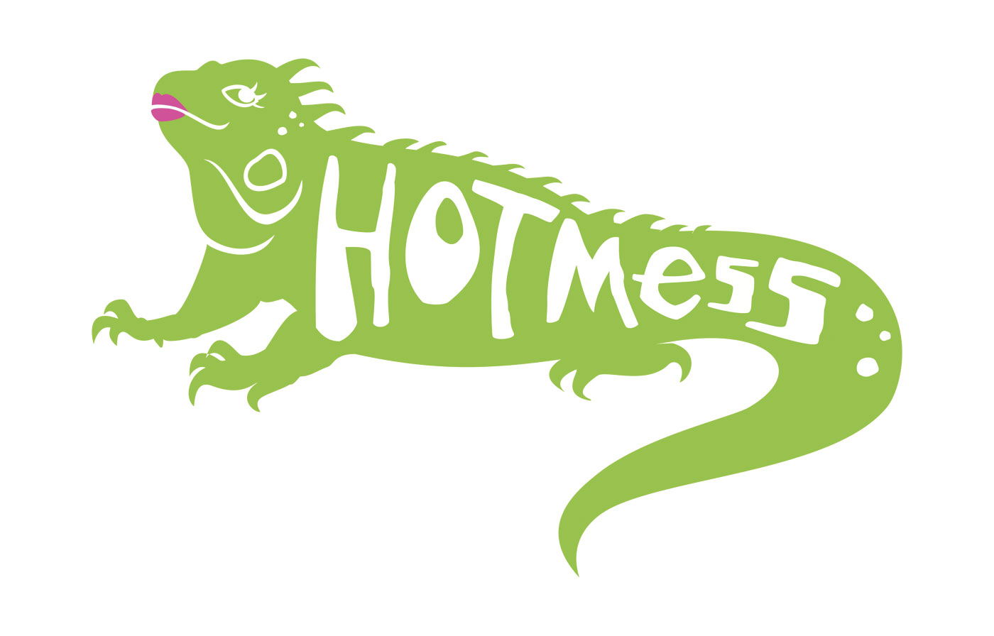
Erin Ryan: Your iguana logo delighted our panel. CK said, “This is pretty much perfect.” Why did it work for your restaurant branding challenge?
Caya Berndt: Wow, thank you. I made a vegan breakfast place, because I have a hard time finding good breakfast places with more nonmeat options. And iguanas eat insects, but for the most part they can be herbivorous – a fitting mascot.
ER: There’s so much in design that the average person isn’t going to pick up on, glancing at a logo or a graphic treatment. Why is it worth putting all that time and thought and effort into adding significance? As an artist, I know the answer – it just is. But what’s your take on that?
CB: One of my favorite parts of the idea development process is coming up with things and realizing there are unintended meanings or connections. Something that we talk about in class is that younger designers will throw things in because it looks cool. And I think you can do things because they’re cool. Like, wizards are cool (references Thomas Hammer’s wizard-bedecked Hammer Van). I get it; you want to evoke energy and magic. But there needs to be a purpose. I really do try to have an intention behind everything that I put out, because I think that if something is well-designed, you don’t need to add stuff to make it look cool. It already is.
ER: The way I see it, things have a specific identity, a feel, a soul. And design has to bring that out. Not just show you nice lines and colors, but show you that thing, in a way where every mark on the page or menu or wall is necessary. And you feel that when you look at it. It’s the same with a really good line of writing that nails the essence of something.
CB: I wouldn’t call myself a writer, but I read a lot and I listen to a lot of music, and I’m a very lyrics-forward person. I have my own running list of perfect songs.
ER: It’s amazing where I find those songs. Whenever I’m in line at the grocery store, I ask the clerks what they’re listening to, and so often they have incredible taste. Every kind of music you can imagine.
CB: I’ve seen these videos on TikTok – and the ethics of gonzo, on-the-street, asking people questions in their face; the ethics of that are an ongoing thing – but they’ll stop people and be like, “Hey, what are you listening to right now?” Then they’ll play that song while the person is walking away. It’s fascinating, just seeing what people are into. I’ll think, that could’ve been me! I hope if I get stopped by one of these guys, I’m listening to something good. (laughs)
ER: For some reason, I have worked my entire career with hardcore music nerds – people who knew so much more about the entire universe of music that I always felt embarrassed to admit liking certain stuff. Thankfully, most of them were like, this is not a cool contest. It’s not about your bona fides. If you enjoy something, that’s great. For example, I love just very basic pop music.
CB: Because it’s good.
ER: I like a little bit of everything. Almost everything. The only place where I get lost is really experimental noise-rock where it’s just so dissonant. And I appreciate that as a form of art, but I cannot connect to it.
CB: It’s a mood. I admire people for whom that’s their ambient. We need people like that in the world—everyone’s brains are wired differently.

ER: Let’s talk about designer brain. Milton Glaser is one of the greats, and you mentioned the documentary about him, To Inform and Delight, in your scholarship application. He felt such a pull between being an artist and creating design for everyday life, and I loved how you articulated the value and beauty of that everyday design side.
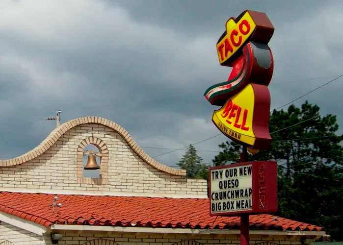
Not to mention your appreciation for the original Taco Bell sign. Do you know who designed it?
CB: I have a lot of inner conflict about my relationship with design that has been designed for profit. Most of the things around us are. It’s branding, it’s advertising, and I have conflicting feelings about that in regard to my personal politics. But at the same time, you know, if you’re going to brand and advertise and create these things, you gotta at least make them look good. Make them interesting.
I should know who designed that Taco Bell sign. I do not. But I have always had strong opinions about what I consider to be the erosion of individual character in branding. I’ve noticed this trend. I saw a side-by-side comparison online, all these famous brands you’d recognize in their original iterations and then after rebrands. In the 2000s and 2010s, a lot of brands started switching over to something sleek, more minimalist, what I would call flat design.
ER: I recognize that term from your application, too, where you got into what it means to take away so much of the vocabulary of design for this idea of understated cool. Whereas you’re a huge fan of Aries Moross, whose design is awesomely maximalist.
CB: I saw their work and immediately was like, this is it. This is my style, the type of energy that I want to bring to the world. Also, I think a lot of design and creative arts in general have been overrepresented by straight white men, and it was really nice seeing another queer person in a position like that. It was like, there’s a place for me!

But going back to the Taco Bell sign, just because I want to close that thread, I have a real soft spot for landmarks – old road signs, decaying motel signs, these remnants of Americana. And to my knowledge there’s only that one remaining original Taco Bell sign in Savannah, Georgia. The new Taco Bell logo is good, but this one is so full of motion. Look at that thing (shows a photo of the sign on their phone).
ER: Wowsa. It’s a beauty.
CB: And it’s totally different energy.
ER: You need to do a pilgrimage, I think.
CB: I lived there for a year and a half and didn’t realize I was living with a monument.
ER: (laughs) Let’s talk about flat minimalism, the aesthetic du jour.
CB: My thoughts on this are connected to something that I see in design in general, and that includes environmental design. I listened to a podcast about a book where the author went in search of “the last coffeeshop.” Because he noticed that wherever he traveled, he happened to find a coffeeshop and they all had a similar aesthetic. He was like, what’s going on here? Why do I always find this same style? The hanging plants, the geometric lights – you know the place I’m talking about; you see it everywhere. What he observed was that one coffeeshop like this would advertise online, and then other coffeeshops would mimic it. Next thing you know, you have all these different coffeeshops trying to be like each other, and that creates this same aesthetic because they’re all trying to appeal to the broadest audience, which means fewer elements they see as offensive or evocative. Those tastes are then curated by social media. It becomes this recursive effect, and the result of that is a complete lack of character.
And I just think that’s really sad, because I don’t like the idea that people aren’t taking risks because they’re afraid of financial loss or feel like they have to design to maximize profit. Sacrificing creativity for the sake of profit.
So, I think there is a little bit of frustration in me, where I’m like, try something different. Just get weird! Get silly with it. Try something new. That could be riskier. You do see brands willing to try something different and break outside the box, and you see a lot of success there, because I think people like seeing things that are different. They like seeing new things that expose them to new ideas and aesthetics. It shakes the mind out of its routine.
ER: That makes me think of a panel I went to the other day, featuring four women in different areas of creativity. Marit Fischer, head of advertising and media relations for the Northwest Museum of Arts and Culture, was talking about her early experience at this backcountry magazine. Her boss always said, “The risky way is the safe way.” I think it’s true. Like you say, I think humans actually do want to be rattled. They want to be stopped. You’re just coasting, and then something gets your attention.
That’s definitely the case with the Aries Moross-designed illustration you referenced in your application. The one you said reads like a poem and looks like one. Scrolling Aries’ portfolio, the range is amazing, yet there’s this core brilliant signature in the hand-drawn lettering.
CB: I did it for my Hot Mess logo and did the entire alphabet for the menu typeface.
ER: What would you call your typeface?
CB: Scrabble Rabble? I don’t know.
ER: I love this (points to a menu detail that reads “The eggs are not what they seem”).
CB: We were almost to the end of the project and somebody finally asked, “What does that even mean?” I’m like, “It’s a Twin Peaks reference.” Kids! (laughs)
ER: Apparently you’re old enough to like Dungeons & Dragons, too.
CB: It’s like having an awesome TV show, only it’s your friends doing improv.
ER: What’s your character’s name?
CB: Asphodel. My character’s a warlock, but his patron is my partner’s old character. This is like friend D&D lore, but rest assured it’s very spicy as a concept. (laughs)
ER: Do you still doodle? You must.
CB: Not as much anymore. During the school year, classwork takes up all my time. But when I was a kid, I was always drawing in the margins. I was always drawing on the back of my assignments. I would get in trouble all the time. And I’ve since learned that I really do need something to occupy my hands just because of the way my brain works.
ER: On that panel of creative women I mentioned, there was an illustrator named Madison Merica who talked about being that same kind of kid and constantly getting in trouble for drawing. She ended up in graphic design. I think because of the place she was working, but also because of the work, her creative spirit died. And she found that she couldn’t just draw anymore. Ideas weren’t coming to her. Whatever she had was broken, and she wasn’t sure if she could ever get it back. So she quit and healed herself, and now she has a successful career as an independent artist.
I thought that was so sad and probably very common, that you could have creativity that’s just bursting from you while everybody is telling you to keep it in.
CB: I can relate really hard, because that happened to me. So it’s been really, really enriching to be in this [SFCC] program and have an outlet again. And I’m very fortunate to be learning from Katrina Brisbin. She incorporates a lot of physical practice into her curriculum. When we learned about Art Nouveau, she wanted us to create an Art Nouveau book cover. It’s challenging! I actually didn’t finish the assignment because I was getting really, really detailed with it. Those types of challenges give me an outlet for the non-design artwork stuff.
ER: Speaking of non-design, I love that you volunteer for animals at a rescue.
CB: I think you can learn a lot about a culture by how it treats its animals. I would love to work on creative campaigns for an organization like that.
ER: Do you have any concrete notions of what that might look like?
CB: I think I’m still too early in my education to know what the shape of that would be. And I’m trying to be realistic about my career.
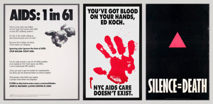
I’m also still learning about how design can make an impact. And again, I’m really grateful for Katrina’s mentorship, because that’s a lot of what she focuses on – design for social impact. For a recent history assignment, she wanted us to look at an event and see how design was critical in shaping it. One of the options was Pride and LBGTQ rights in the ’90s. There was a group called ACT UP and Gran Fury. ACT UP was formed to raise awareness around AIDS, because the epidemic was horrible and absolutely the result of political neglect due to homophobia. The community had to step up and keep each other safe.

Gran Fury was the art and design arm of ACT UP. They created a lot of these awareness campaigns, usually distributed through flyers – things that were really easy to spread around. Some of them were overt, like a bloody handprint suggesting blood on the hands of those in power. There was one that, after the fact, they didn’t consider to be their best work, but it was really simple black-and-white with a baby doll in the corner and the stat “1 in 61.” It called attention to the fact that a lot of babies were being born with HIV, because the stigma around it was that it was something only gay men got. Or reclaiming the pink triangle (a Nazi symbol marking gay men) and pairing it with “SILENCE = DEATH.”
These are examples of how knowledge can be spread in an impactful way that moves people and gets them thinking and starting to unlearn preconceptions and prejudices. I think contributing to information campaigns that are able to shake those things loose for people would be really meaningful.
What that would look like, I don’t know yet. I’m still learning and figuring that out. I’m hoping that I’ll get adopted by an agency that will teach me how. (laughs)
ER: I believe that when you have something driving you and you want to share it, you’ll find your place. You’ve said you’re not as young as some of your classmates. You’re not in your 20s chain-smoking and drawing with ash on the street anymore. You have the perspective and the awareness of what will suck your soul, and you’re not just going to take something that will crush who you are.
We really appreciate your work, and that of the other students who submitted. It was so much fun to look at every application. Personally, I was moved by your words. You are a writer, just so you know.
CB: Thanks!

ER: Last question: How did you decide on an animal for your own personal logo?
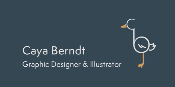
CB: It’s called a ligature, putting first and last initials together in a single mark. I always thought if I were to brand myself, I’d probably want to do something where I’m a goose. I love geese.
ER: I’ve never met anyone who loved geese. They’re so angry.
CB: I think y’all are acting really weird about an animal that’s just asserting its boundaries in a way that you don’t understand.
ER: I was once driven into a car by a goose. My grandmother and my sister and me. We all had to run for our lives and jump into the car. The goose was not having us.
CB: If you thought that your family was threatened, would you not do the same? (laughs)
ER: I totally would! This goose was not playing.
CB: They’re warriors. I love them. So I was just doodling stuff, and I was like – wait a minute! I’m still so proud of this.
ER: The little feet at the end. Such a sweet little touch. I look at something like this, and not having that design experience, I’m wondering how you choose how the tail looks in terms of bringing balance to the overall image, and where the wing is placed in relation to the tail, and all of those dimensional aspects.
CB: I think this is where my illustration experience comes into play, because animals are one of my favorite things to draw. I wish I could say I put some lines here to make sure that these were perfectly proportional, but I just eyeballed what looked balanced. When you have the little tail going up, that’s a very friendly shape. The one thing I will say is that I made sure the leg was aligned with the curve of the body, made sure the beak was aligned and then rounded these edges. The little things.
ER: The risky way is the safe way, and the little things are the big things.

