blog
tyblography

categories

architecture (27)
on location (21)
random thoughts (1,253)
staff (25)
the design life (282)
the writing life (410)
blog archive


Cue the Goats

There’s a lot of drama in my neighborhood.

Animal drama, that is.

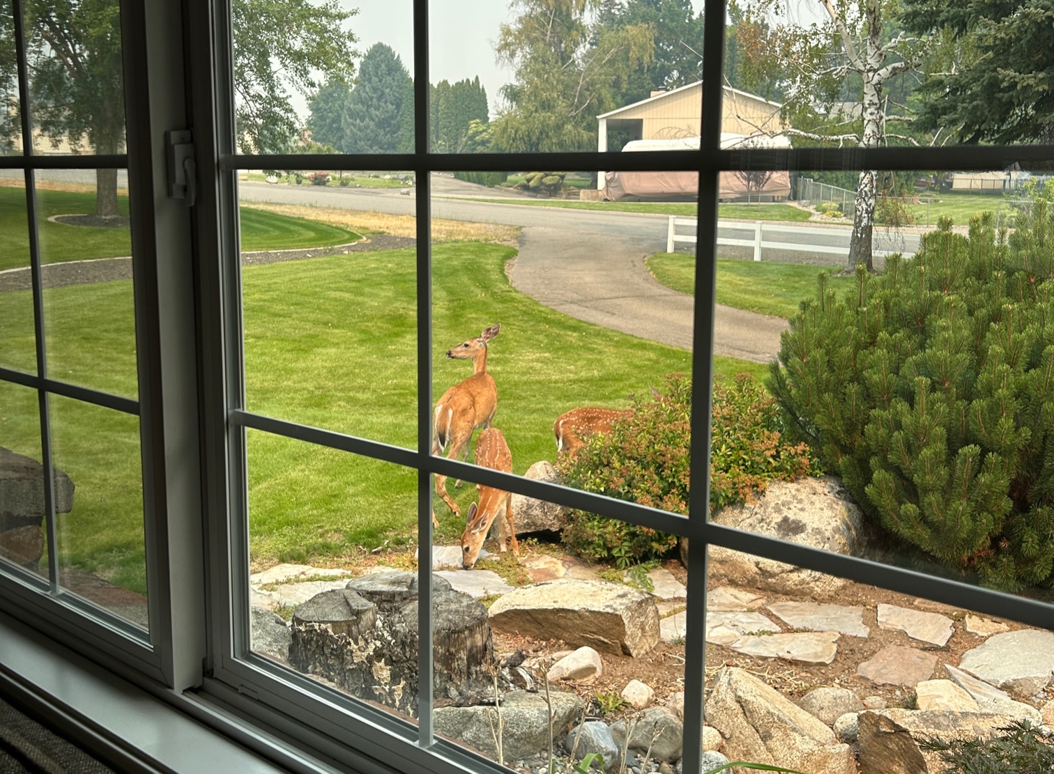
It beats any reality show on TV. In my yard alone, we’ve seen wild turkeys wander down the driveway, bucks spar by the trampoline, quail nest in the shrubs, and hawks nab rabbits right off the lawn. And who could forget the tubby raccoon that tried to use the cat door to get into our garage?

Not me. I discovered him.

It’s reached the point where our neighbors have even started naming the cast members. My personal favorites are Bruiser, the biggest, baddest buck in the hood, and Skippy, a gimpy doe who still manages to run off any animal that gets near her twin fawns.

deer in the front yard

Our neighbors gather in their front yards to dish about the animals – just like a bunch of Bachelor fans gossiping about who started the drama and what’s going to happen next:

“Did you see how Bruiser totally gaslighted Skippy?”
“OMG, yes! And I’m not even surprised. He’s such a thug.”

My husband and I hear about all the animal drama, whether we want to or not. Which is why we were so surprised, when we took a walk a few nights ago, to witness the most shocking episode yet.

A herd of goats was devouring the neighborhood.

Whoa. I did not see that plot twist coming. Frankly, I don’t think anyone did.

At this point, I should probably clarify that the goats weren’t eating our whole neighborhood. They were munching their way through a large, wooded hillside just east of all the houses. And they’d been brought into the neighborhood on purpose.

It turns out that goats are unlikely firefighters. In a matter of days, a few dozen can clear out acres of underbrush that might otherwise fuel wildfires.

Given recent tragedies in our region and throughout the world due to wildfires, I’m thankful for this latest turn in the neighborhood drama.

So, go ahead. Cue the goats.

I’ll keep watching the show.

That’s Punny: Why Dad Jokes are Serious Fun

Love ‘em or loathe ‘em, dad jokes serve a higher porpoise. Er, purpose.

If you find that hard to believe – and you probably do, unless you’re a dad – then trust me, I get it. My husband deals dad jokes regularly and without apology. Here’s one he shared recently:

Q: How do strawberries party?
A: They pump up the jam.

Sadly, our kids missed this one. But I guarantee that if they’d been around, the joke would’ve evolved into a full-blown performance of the famous Technotronic song, with dance moves.

Which would’ve elicited a look of disdain from our 17-year-old daughter and a comment about being “so cringy” from our 12-year-old son. (This comes from a kid who wears orange Crocs with knee-high socks and shorts every day.)

Their responses only encourage my husband. In his eyes, any reaction is a win – from a giggle to an eye roll to a full-on groan. He gets plenty of each at our house. Just don’t ask him to dish out dad jokes on demand. Apparently, they are as spontaneous as their source is mysterious:

“I don’t bring the puns, Denise. The puns come to me.”

Here’s the thing. Contrary to what most kids (and many adults) believe, dad jokes aren’t necessarily lame and uncool. Puns especially can be quite smart and witty.

“They can be a demonstration of wit, of cleverness,” says Peter McGraw, director of the Humor Research Lab at the University of Colorado, Boulder. “You’re relying on a person’s ability to parse language, to understand the nuances and complexities of words.”

And, more importantly, the lowly dad joke plays a surprisingly positive role in parenting. According to humor researcher Mark Hye-Knudsen, dad jokes teach kids to be more resilient.

“It is worth considering dad jokes as a pedagogical tool that may serve a beneficial function for the very children who roll their eyes at them. By continually telling their children jokes that are so bad that they’re embarrassing, fathers may push their children’s limits for how much embarrassment they can handle. They show their children that embarrassment isn’t fatal.”

So, we should probably give dads a break. After all, they’re sharing their best material.

For the kids’ sake, of course.

pun

Talk About Giving a Dog a Bad Name

Here’s proof that designer dog names have gotten completely out of control.

At a stoplight this morning, I pulled up behind a car that had a bumper sticker in the shape of a dog bone with these words inside:

I love my whoodle.

Call me ignorant, but I don’t know what a whoodle is. I’ve got to assume, based on the shape of the bumper sticker, that it’s a type of mixed breed dog. But which one? These days, there seem to be endless varieties of bougie designer dogs with absurd names.

During the rest of my drive to work, I mulled over the meaning of “whoodle.”

The “oodle,” of course, was obvious. It’s a poodle. But what about the “who”? I couldn’t think of a single dog breed that starts with the letters w-h-o. The closest would be a whippet. But, as I discovered later, after a quick online search, a whippet and poodle mix is called a whipoodle.

For real? Is a kid making up these names?

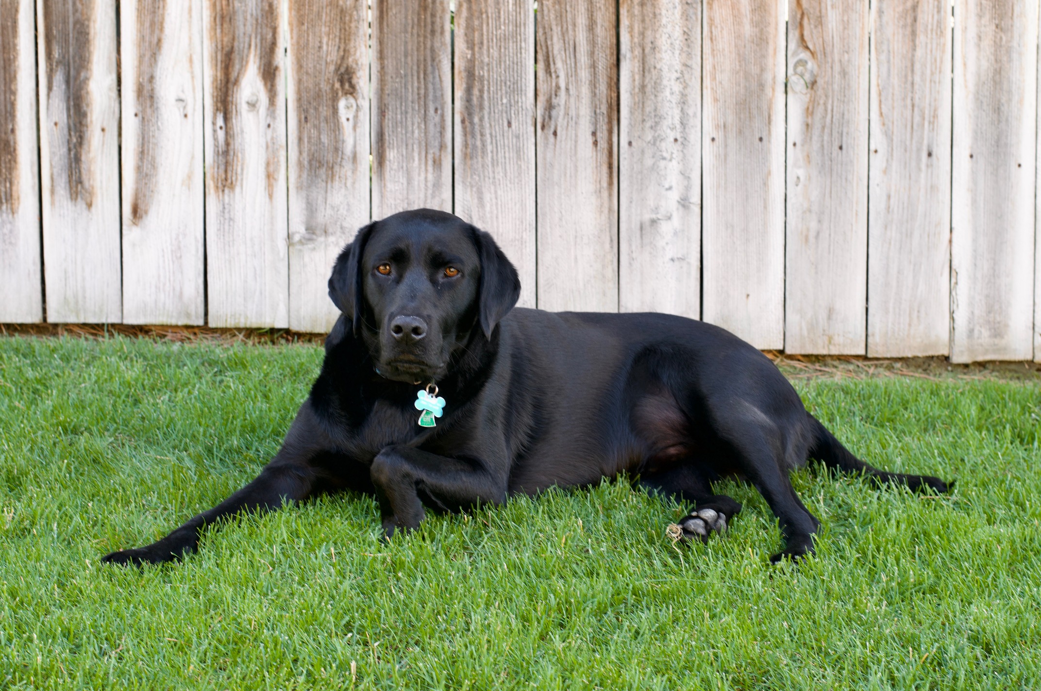
Don’t get me wrong. I like dogs, and I have one myself. Timber may be a plain old Labrador retriever, the standard vanilla of dog breeds, but he’s still a good boy who lives for food, naps, and belly rubs. I mean, just look at him. Who couldn’t love that face?

black Labrador retriever

People, on the other hand, are the ones coming up with these silly, over-the-top names for dogs. What’s the deal with all the whos, poos, and oodles? Why not just call the dog a poodle mix? Do we really need to invent a frankenword to describe man’s best friend?

With this naming logic, my childhood pup – a dachshund, schnauzer, and terrier mix – would have been a designer dog with an outlandish name. Like a weinerschnitzel.

Go figure. As a kid, I’d just assumed that Gus was an ordinary Heinz 57 dog.

As for the meaning of “whoodle,” I’d like to think that the “who” actually stands for, “Who got the poodle pregnant?” And the breed is essentially half poodle and half sneaky neighbor dog.

Now that’s a meaning I like.

And frankly, it makes a lot more sense than the real one.

Sweet Memes are Made of These

We’ve all seen them.

Design mistakes so embarrassing that they make us laugh.

They’re everywhere – from the logo that resembles a body part to the typeface that makes it look like the local bakery sells “farts” instead of “tarts.”

Then, there’s the copy that’s oddly uncomfortable. Like the old Yellow Pages tagline to “let your fingers do the walking.” Oof. This one practically begs an awkward innuendo.

It’s the stuff memes are made of.

Let’s face it. When it comes to design, pitfalls abound. Especially if you don’t know what you’re doing.

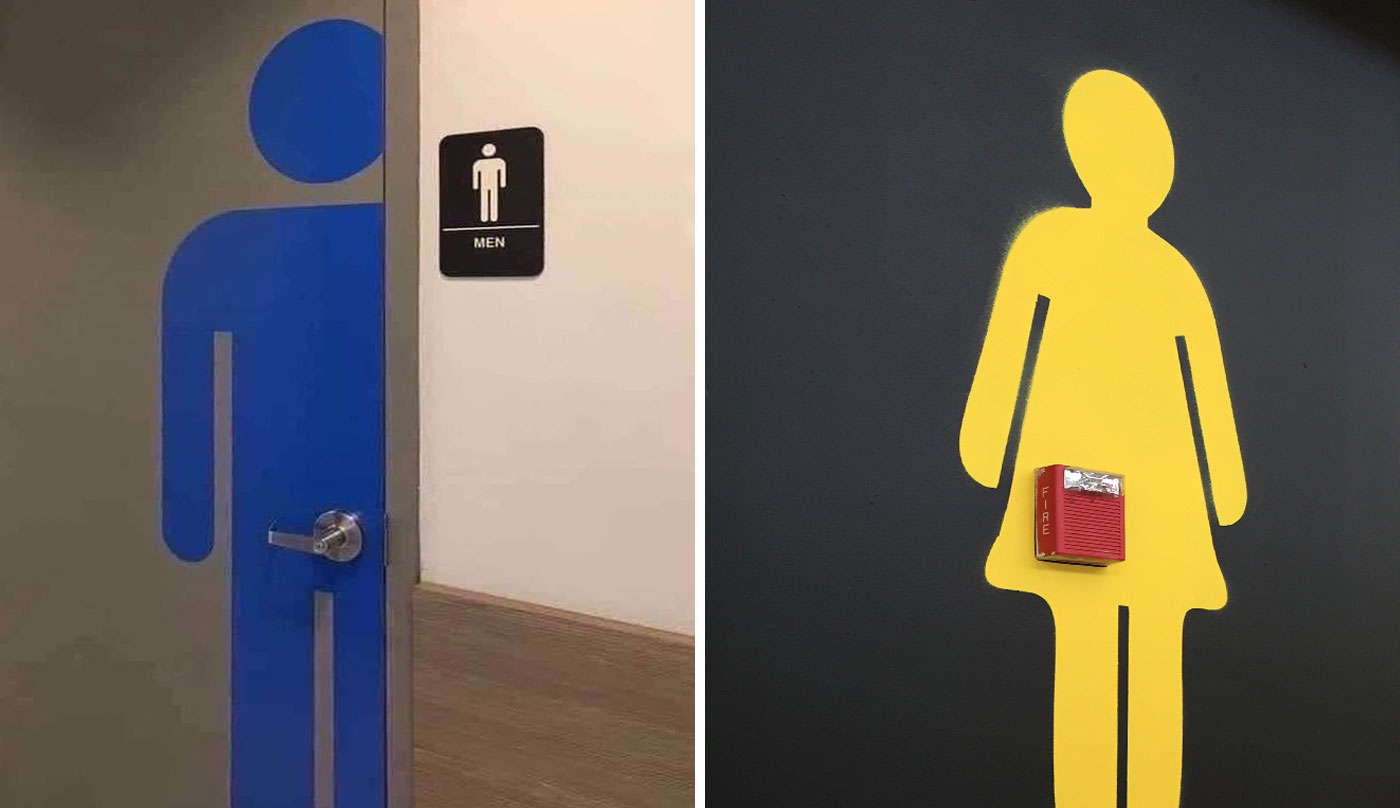
Take the basic restroom sign, for example. Of any design project, this one seems the most straightforward. Heck, we’ve already got universal symbols for restrooms. So, all you need to do is stick them on a door, right?

Au contraire.

bathroom sign design fails

Even the humble restroom sign requires a surprising amount of thinking, planning, and intention – not to mention a keen eye for visual details.

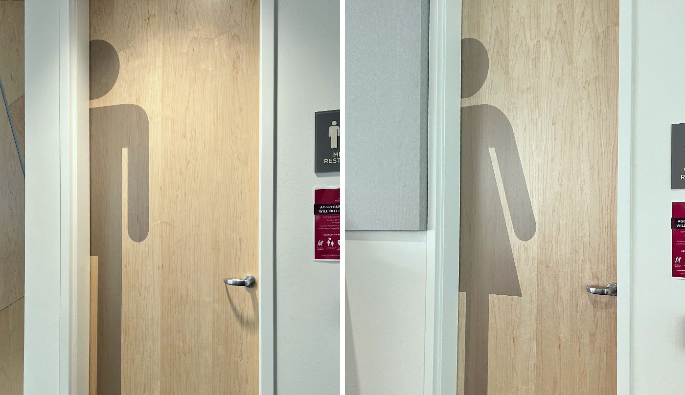
Now, take our design solution for the restrooms at the downtown Spokane Public Library, shown below. These vinyl graphics are clean, modern, and simple. They even allow the natural beauty of the wood to show through.

bathroom sign designs

And, best of all, their placement won’t make you feel like a middle schooler whose voice just cracked in front of the entire class.

Hey, I’ve said it before, and I’ll say it again:

Some things are just better left to the professionals.

Some Unforgettable Sh%t

I’m about to share two pieces of information. But, by tomorrow, you’ll only remember one of them.

And I can accurately predict which one it will be.

Here goes…

1. According to the National Highway Traffic Safety Administration, rear-end collisions make up 23% of all traffic accidents. Which is why I don’t tailgate.

2. Yesterday, I was driving to work on the freeway, and a station wagon rear-ended a truckload of porta potties. Let me tell you, sh%t got real on I-90. Which is why I don’t tailgate.

Alright, it’s obvious which piece of information is more memorable. Intuitively, we know that stories – especially the unusual ones – are, well, sticky. Stories tend to stick with us far longer than facts or statistics, even when they’re about the same subject.

Now, thanks to research from the Harvard Business School, we know why: it’s based on the way our memory works. I won’t go into the details here, but I definitely recommend reading the full study if you have the time. It’s fascinating stuff.

I also recommend driving at a safe following distance, especially when you’re staring at the backside of a dozen portable toilets.

And I’m sure you won’t forget that advice.

It’s All Geek to Me

My husband is fluent in geek.

He’s a software engineer, so he obviously learned it on the job – along with Python, C++, and Java. Heck, even the names of those programming languages are geek speak.

To most people, a python is just a snake, C++ is a grade barely below a B- -, and java is a cuppa joe. But to programmers, ordinary words take on new meaning.

As a word nerd myself – which, to be fair, is related to a geek – I’m amused and sometimes irritated by the words my husband uses at work. Today, I’m going to share some of my favorite geek words, and by the end of this post, you’ll be able to speak geek too.

Let’s start with my husband’s job title: he’s a backend software engineer. Which basically means he works on the part of the software system that users don’t see.

I’ll be honest. My immature side finds the term backend a bit funny, and I’m happy to say I’m not the only one. Recently, my husband mentioned his job title to a gastroenterology nurse, who replied without skipping a beat:

“A backend engineer? That’s what I am too.”

Touché.

When it comes to speaking geek, portmanteaus – aka frankenwords – are common. That’s when you blend two words to make a new one, like spork (spoon + fork). Here are a couple that programmers like to use:

DevOps, or development operations. This makes me think of the word cyclops. But I’m pretty sure everyone who works in DevOps has two eyes. Or most of them do, anyway.

Mutex, or mutually exclusive. Um, no. This is destined to be the name of a nasal spray.

In geek, it’s also perfectly acceptable to make up new words altogether. Usually, this means adding prefixes and/or suffixes to otherwise respectable words. I’ll admit, this bugs me quite a bit. Here are a few examples I’ve heard from programmers:

intentful
redocumentation
evolvability
robusticize

So far, the folks at Merriam-Webster haven’t officially recognized these words. But it’s probably only a matter of time until they do.

Geek also uses tons of acronyms and initialisms. In the programming world, these can get excessive. Here are a few you should know:

PO, or product owner. Ordinarily, this just means that someone’s peeved, as in, “Programmers hate it when their PO gets poed.”

MVP, or minimum viable product. Usually, an MVP is a rockstar. But in this case, it’s pretty much the opposite.

WYSIWYG, or what you see is what you get. Seriously. Could this acronym get any longer? Thankfully, it’s pronounced whiz-ee-wig, and that’s plain fun to say.

BOTW, or Legend of Zelda: Breath of the Wild. I guarantee this one’s been showing up in the Slack chat for weeks now, since BOTW 2 was just released. (Or would it be TOTK?)

MTFBWY, or may the force be with you. You can’t even make this stuff up. Hey, I call it geek speak for a reason.

And finally, there’s this one – which may or may not apply to this blog post:

TLDR, or too long; didn’t read.

How NOT to Name Your Business

The ol’ blog has been a tad lackluster lately (read: nonexistent). What can I say? We’ve been busy, and client projects take precedence over my ramblings. Not surprisingly.

So, until there’s time to return to deeper musings, I’ll leave you with this gem and a bit of advice about naming a business.

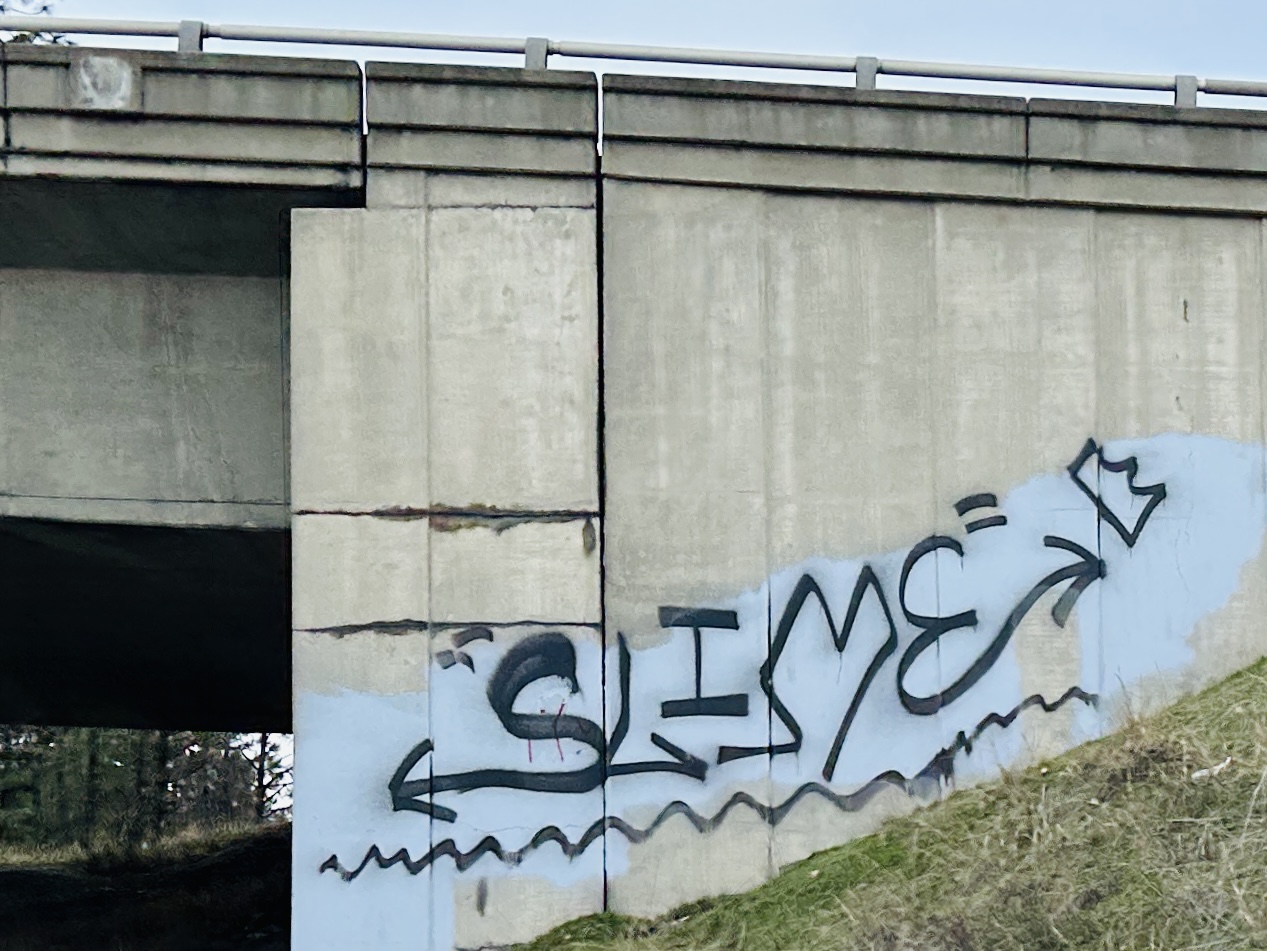
Interesting Business Name

When my husband was traveling a few weeks ago, he snapped this photo of an actual business. For obvious reasons, I’m withholding its city, state, and exact location to protect the innocent.

Hey, there are times to consult a middle school boy for advice. (Minecraft tips, anyone?) But naming your business ain’t one of them.

That should be left to the professionals. Like the – ahem – talented team that developed this name and brand identity.

How to Make an Editor Swear

Typically, I don’t use salty language. So, if you hear an expletive while I’m editing, I guarantee it’s because of one thing.

Abstraction.

It’s the bane of my copywriting existence and the number one enemy of clarity. What do I mean by abstraction? It’s what happens when someone takes a simple, straightforward message like this:

Jack and Jill went up the hill to fetch a pail of water.
Jack fell down and broke his crown, and Jill came tumbling after.

And writes it in an impersonal, indirect way, like this:

The intention behind the scaling of the incline was the retrieval of a water vessel.
An unexpected descent resulted in the breaking of a crown, with an occurrence of tumbling thereafter.

Sure, it sounds ridiculous in a child’s nursery rhyme. Yet this style is commonplace in corporate, academic, and legal writing. What audience has the mental energy to wade through all that abstraction to get to the real meaning?

This is where I come in, with my brutal red pen and my cussing ways. As I edit, I constantly ask myself:

Who are the main characters? And what are they doing?

I’ll be honest. It’s surprisingly hard to answer these questions when I’m dealing with abstract writing. Still, I figure it’s better for me to find the answers than to force the poor readers to do it. The best would be to write clearly from the start.

So, for the public good and my sanity – and to save my coworkers’ tender ears – I’m going to share two ways to avoid abstract writing. (I learned them from this book. My own copy is dog-eared from use.)

1.  Express the main characters as subjects.
2.  Express their actions as verbs.

It’s as simple as that. Instead of saying, “A solution to the problem was achieved,” you would say, “We solved the problem.” In the second version, the characters and their action are 100% clear. There are, of course, many other tips for writing clearly, and you can read some of them here.

Nonetheless, I believe that these two are the best way to fight our common writing enemy.

And send that $*&@ing abstraction to &*%$!

Visiting One of Spokane’s Oldest Neighborhoods

Been to Hillyard lately? If you haven’t, you’re missing out.

Not that I’m judging. Until last year, I didn’t even know that Hillyard existed. Apparently, I’m still a Spokane newbie. When I heard about a live jazz show at a place called The Bad Seed in Hillyard, I asked my husband, “Where’s that?”

(East of downtown and north of the river – in case you didn’t already know.)

I’ve since learned that Hillyard has a reputation as one of the city’s toughest neighborhoods. But it also has a fascinating history and some darn cool architecture too.

The Bad Seed itself is a great example.

The Bad Seed

This Tex-Mex restaurant and bar lives in the former Hillyard Public Library, a space that served the community for over 50 years. The Bad Seed balances a hip, eclectic atmosphere with the historical integrity of the 1929 brick building.

In a lighthearted nod to the building’s “storied” past, there are vintage books on the built-in shelf over the entry and – I believe – a set of encyclopedias below the beer taps. Although, based on the paintings in the bar area, the space isn’t quite as family friendly as it was in its former life.

With its tasty street tacos and solid room acoustics, The Bad Seed is the perfect spot to enjoy live music. There’s jazz on the second and fourth Monday of every month, starting at 7 p.m.*

I’ve been there. And trust me, you won’t want to miss that either.

——————–

*To find out who’s playing, visit Imagine Jazz Spokane.

Seeing the World a Little Differently

My son has a love-hate relationship with puzzles. He loves figuring out how the pieces interlock to create a bigger picture, but he hates that he can only tell those pieces apart by their shapes – not their colors.

That’s because he’s colorblind.

It’s a common condition. According to the National Eye Institute, some form of color blindness affects 1 in 12 males and 1 in 200 females.

Yet, contrary to what my son’s classmates believe, most people who are colorblind do see color. They just perceive color balance differently – sometimes much differently. My son, for example, has red-green color blindness, the most common form. He confuses purple with blue, brown with green, and pink with gray. For him, it’s almost as if the color red doesn’t exist.

He simply sees the world a little differently.

A few weeks ago, I started looking for puzzles made specifically for people with color blindness. I was surprised and delighted to find several options by a graphic designer on Zazzle. Here’s the one I ordered:

colorblind puzzle

You may notice that the designer used several techniques to make the illustration more accessible to people who are colorblind: high contrast, a limited color palette, and a variety of patterns and textures.

The result? It was my son’s first love-love experience with a puzzle. And now that I know what to look for, it won’t be his last.

I’ll admit that, while I’m familiar with accessible design, I didn’t really get its impact until I saw my son’s excitement over a simple puzzle. Sure, there are far weightier examples of accessible design. Still, this one made a difference in the life of an 11-year-old kid.

It wasn’t even the puzzle itself that made him the happiest. It was the fact that someone had purposely made a product for people like him.

And all it took was a designer who was willing to see the world a little differently too.

—————

This animation video by Yoav Brill offers an artist’s perspective on the experience of color blindness.

A Mascot You’ll Never Forget

What’s the most unusual sports mascot you’ve ever seen? For me, it’s hands down the pierogi.

Oh? You’re not familiar with this mighty mascot? Allow me to introduce you.

A pierogi is a tasty Polish dumpling with a sweet or savory filling. A pierogi mascot is a poor soul in a stifling plush costume who works summer days at PNC Park in Pittsburgh. During every home game, the Pirates Pierogis – and yes, there are several – take the field at the bottom of the fifth inning.

Around the same time many kids start losing interest in the game.

Jalapeno Hannah, Oliver Onion, and the rest of the gang race around the bases in comical fashion, while fans cheer for their favorite filling. (Mine is Sauerkraut Saul – in case you’re wondering.) Throughout the race, the crowd stays surprisingly engaged and invested in the outcome.

Here’s what’s so great about the pierogis. Not only do they provide lighthearted entertainment during America’s favorite pastime, but they’re distinctly Pittsburgh. Historically, the city’s steel industry attracted large numbers of Polish immigrants, and their culture and descendants have shaped the region for generations. To this day, Polish Hill in Pittsburgh remains a well-established neighborhood.

Sure, the pierogi has become a bit of a caricature, but it’s still the most well-known and beloved dish in Western Pennsylvania. That makes it an ideal symbol for Pirates’ baseball. After all, the purpose of a mascot is to express the identity and spirit of a school, team, or organization through a living character – one that’s unique and memorable.

The pierogi easily qualifies as both.

In the spirit of full disclosure, I must admit that the pierogis are unofficial mascots. Technically, they’re known as “in-game entertainment.” The official mascot of the Pirates is a parrot. Aye, matey, ‘tis logical. But also, predictably boring. Because, while a parrot may be cute, it’s rarely memorable.

Giant slaphappy dumplings that race around a baseball diamond, tripping all over each other, on the other hand, are impossible to forget.

The Power of One

Have you ever tried a dish that tasted nothing like its main ingredient?

It happened to me once at an expensive restaurant on the Seattle waterfront. I ordered halibut, my favorite seafood, and the pan-seared fillet came heavily topped with a spicy fruit salsa. Rather than enhance the delicate flavor of the fish, the bold spices and tangy sweetness overwhelmed it. I got a mouthful of heat and fruit, but I could hardly taste halibut at all.

It was a meal that disappointed my taste buds and my wallet, so I never returned to that restaurant.

Marketing communication often suffers the same fate. We try to season our messaging with so many clever and complex flavors that we obscure the main point. The result is communication that’s confusing, distracting, or even overwhelming – and that can cause an audience to tune out.

Recently, I saw an interview with Francis Ford Coppola, the renowned filmmaker. In it, he shared how each of his films is intentionally driven by a single theme or idea:

“I always try to have a word that is the core of what the movie is really about, in one word. For Godfather, the key word is succession. That’s what the movie is about. Apocalypse Now, morality. The Conversation, privacy.”

Coppola’s films are built around singular themes, yet the plots are still complex and engaging, and the characters are multi-dimensional. So, while simplicity may seem basic or even unsophisticated, it’s at the heart of great storytelling – and great communication.

A clear message starts and ends with a single, driving idea.

A couple summers ago, I ordered my favorite seafood yet again, this time at an unassuming restaurant along the wharf of Juneau, Alaska. The pan-seared halibut was cleanly flavored with an herb rub, one that enhanced the mild taste and freshness of the fish. It was the simplest halibut dish I’ve ever tasted.

And, frankly, it was the best one too.

Does Print Still Matter in the Digital Age?

print in the digital age

Would you expect someone from the most technologically immersed generation in history to pay any attention to print? No, me neither. And here’s why.

My youngest kid is Gen Alpha – the generation born between 2010 and 2024 – and not only is he tech savvy, but he’s also adept at integrating digital experiences into his real life.

For example, last year he discovered claw machines – those deceptively simple arcade games that are darn near impossible to win. He learned about the game, not from seeing a one in real life, but from watching a gamer play it on YouTube Kids.

Now, my son uses claw machine apps, like Clawee and Arcademy. If you aren’t familiar with these apps, they connect players via tablet or smartphone to real claw machines in a remote location. Any prizes that players win are shipped directly to them. Each attempt is videoed for instant replay, so players can share videos with family and friends.

I may or may not be subjected to said videos on a weekly basis.

So, given my son’s penchant for digital experiences, imagine my surprise when I found him on the living room couch last month, engrossed in a toy catalog that came in the mail. There he sat, for over half an hour, pointing out gift ideas and circling items he’s saving money to buy.

Isn’t it curious that the same kid who scrolls past digital ads without pausing will spend half an hour flipping through a glossy, old-school catalog? And then keep it in his room for weeks afterward? I understand the appeal of a toy catalog. After all, I grew up in the Sears catalog generation. But the allure of print advertising with a kid today seems surprising.

It says something about the enduring value of tactile experiences in an increasingly virtual age.

And it reveals that perhaps – just perhaps – in our oversaturated digital world, the old-fashioned print piece has now become a novel way to grab an audience.

Wayfinding: A Graphic Design Superpower

I’m convinced that there are two kinds of people in this world: those who are navigationally gifted, and those who aren’t. Alas, I land squarely in the latter group. Which means that I’m just lucky to find my way out of a parking lot.

Fortunately for me and others like me, graphic designers possess a superpower that can save people from getting lost in a confusing world. Their power lies not just in the ability to make a space easier to navigate, but to make it more engaging as well.

It’s a superpower called wayfinding, and you can see it at work here:

At the newly renovated Shadle Park Library, wayfinding shows up in everything from the outdoor signs and vinyl studio letters to the checkout kiosks and bookshelf labels. Each design solution helps library visitors seamlessly navigate the space and find exactly what they’re looking for.

But wayfinding offers more than just utility. It delivers impact too. Did you notice the graphic pattern in the privacy vinyl on the library’s glass walls? This one-of-a-kind pattern was inspired by a street map of the post-war Shadle Park neighborhood. It subtly adds interest and promotes a sense of space that’s unique to this Spokane community.

Wayfinding may not seem obvious at first, but once you start looking for it, you’ll discover it in the spaces you navigate every day.

And – whether you’re navigationally challenged or not – you’ll have a graphic designer to thank for that help.

Warning: Don’t Try This at Home

Some things are better left to the professionals.

Like choosing the right font for, well, just about anything. Except maybe a kid’s birthday party invite. And probably not even then. After all, what 10-year-old deserves to be stigmatized for the rest of fifth grade because Mom thought Curlz was cute?

(Pro Tip: Always be suspicious of a name that replaces the plural “s” with “z.” And if, God forbid, that name has a number in place of a word, run as if your reputation depends on it. Because it does.)

So, who are the professionals when it comes to type? Graphic designers. Because they know what the font they’re doing. These people think – and talk – about typefaces all day long. Trust me, I know. I work with them, which means that I’m forever hearing about font studies and kerning and leading and…the list goes on.

Earlier this week, I asked the helveticka designers what makes a bad font choice. Let me tell you, I was not prepared for just how serious they are about bad fonts. Don’t believe me? This SNL skit from a few years ago is a little closer to reality than satire. It’s worth watching, even if you’ve already seen it.

Aaron Robertson even admitted to me that he’s written a children’s book based on his hatred of Comic Sans. He swears that the language is G-rated, but as it is (yet) unpublished, I can’t guarantee that the book is safe for young readers. I can, however, share the ten fonts that Aaron and the rest of our team find most offensive.

Worst Fonts

While a couple of these should probably be retired for good, most could work under the right circumstances. But it takes a highly trained and experienced designer to recognize such circumstances. Non-experts, like me and maybe you, are wise to avoid them altogether. And stick to using the world’s best font.

Helvetica. Of course.

back to top    |     1 2 3 130     |    archive >