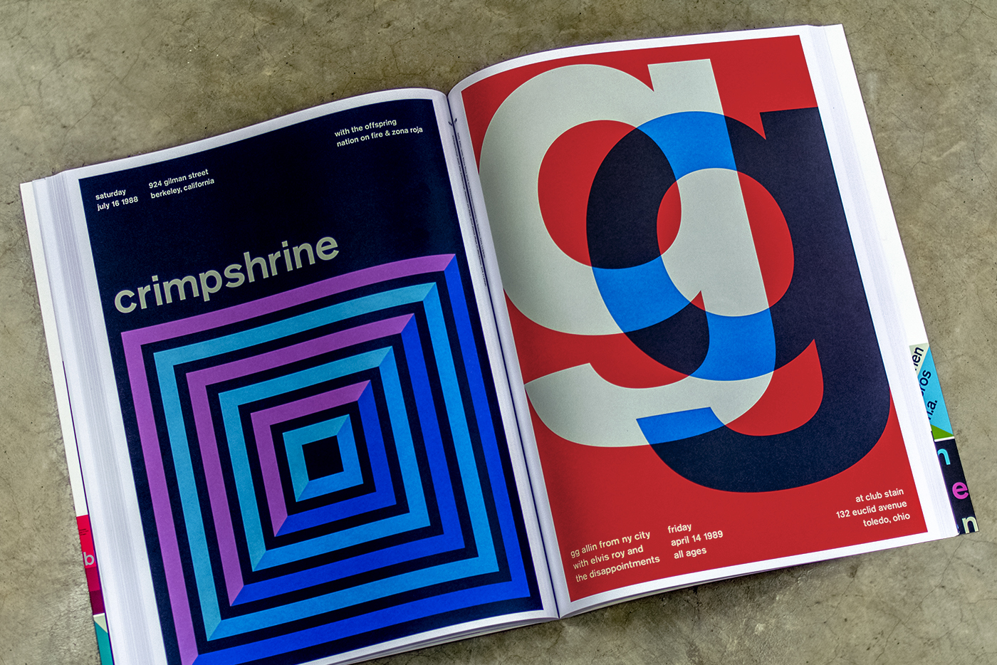
One of my favorite gifts from this past Christmas was Swissted: Vintage Rock Posters Remixed and Reimagined. The creation of New York graphic designer Mike Joyce, this compendium contains 200 ready-to-frame posters. Joyce masterfully blends vintage rock, punk, and alternative show flyers from the 1970s, 80s, and 90s with the visual sensibilities of the International Typographic Style pioneered in the 50s and 60s by such Swiss design luminaries as Armin Hofmann and Josef Müller-Brockman. “To see these posters all together,” writes Steven Heller in the foreword, “en masse in this book, in one pleasing eyeful, is to be totally fooled.”
It’s interesting to see posters for punk bands like Black Flag and the Dead Kennedys – and more, many of which I’d never heard of – typeset in lowercase Akzidenz-Grotesk medium. (Helvetica was developed in the late 50s to compete with Akzidenz-Grotesk, which was released in 1898.) “[I]t’s also interesting,” writes Joyce, “to consider the common threads between the two art forms. The Swiss modernists purged on extraneous decoration to create crystal-clear communications, while punk rock took on bloated self-indulgent rock and roll and stripped it to its core. Both created something new, powerful, timeless.”
Visit Mike Joyce’s website to see how he incorporates his minimalist style into all of his work.

