You know you work for a design firm when Instagram starts serving you typeface ads.
I liked Flapjack immediately. To me, it felt current and fun, easygoing but distinct. The letterforms were clever, with a hint of a wave like batter carefully poured into a shape. What would CK, a person who knows way too much about typefaces, think? Would he confirm my good taste, or politely tell me he’s not into Nickelback.
Without context, I flipped the printed ad over on his desk.
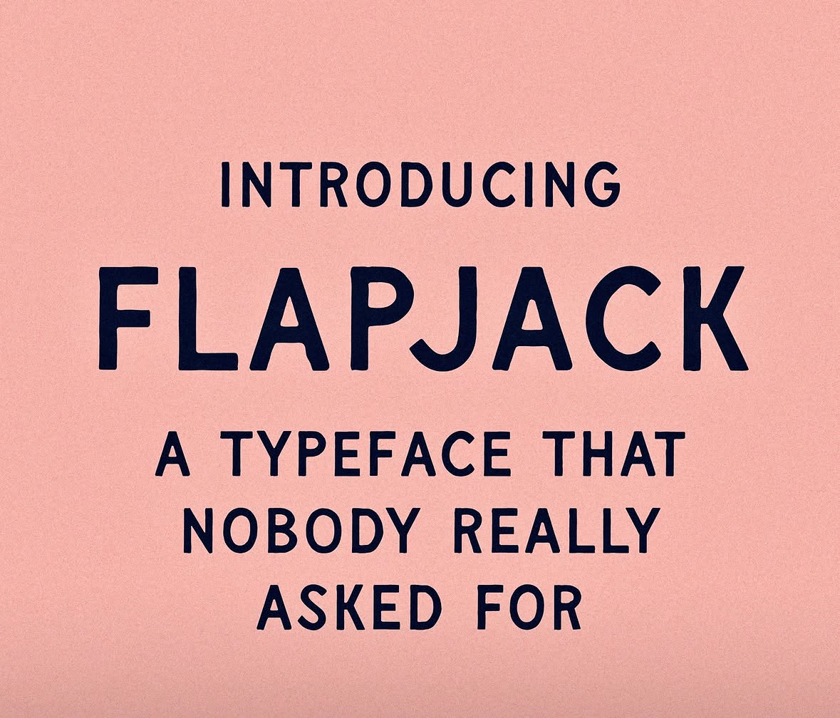
“It’s fine.” Not Nickelback, but not great.
“It has personality and character. The K is unusual, and that’s fun.” Getting warmer…
“It has a retro quality, like it’s been reproduced a bunch of times – dated in a good way. The two As are different. That’s a cool feature giving it a hand-drawn, organic look.” Hooray, my taste doesn’t suck!
“In the right context, it’d be great.” Taylor Penton’s taste doesn’t suck either!
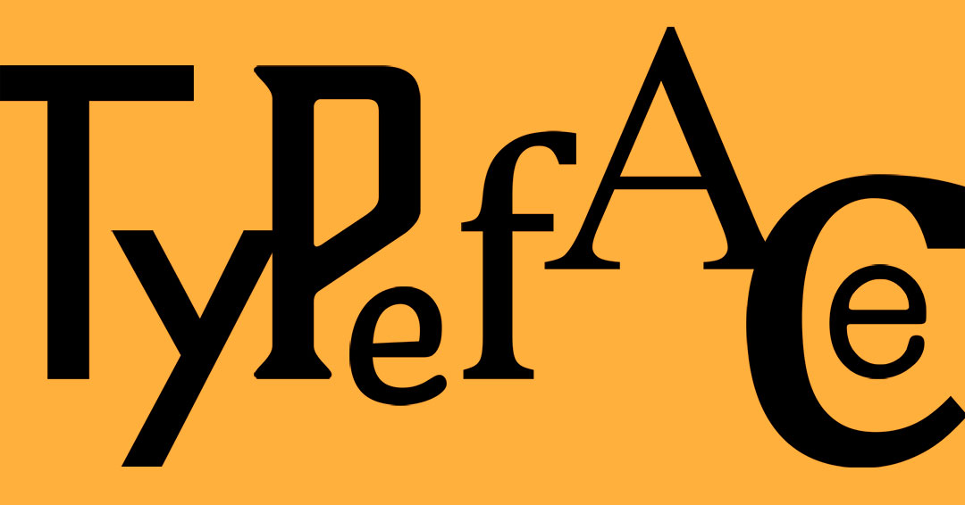
Penton, a Maui-based designer, specializes in hand-drawn type. From these examples, you can see he has a knack for names that personify the energy.

Things read so differently, depending on font. And designers have hundreds of thousands of options, with new ones constantly coming into being. There are many subreddits full of professional designers debating bests and worsts, though even civilians know the universal pariahs:

In discussing Flapjack, and the idea that every typeface has a purpose in the right application, CK added that these two are the exceptions. “There is no purpose for them.”
He compared typeface vibes to that of colors or clothing. They have foundational qualities that transform in different venues and in different ensembles on different subjects. The challenge for graphic designers is to pinpoint which vessel most reflects the message.
To keep my influence out of it, I asked AI to give me a sentence to test typefaces against. Apparently, it knows me too well.
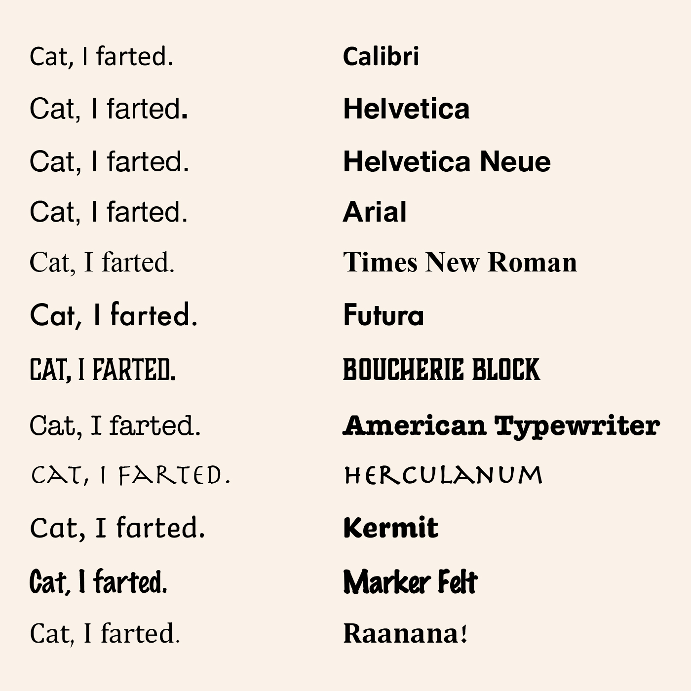
Here you have a mix of stalwarts and gimmicks (and whatever Raanana! is). Many of them work for me, but my pick is American Typewriter. Because it’s the funniest – imagining myself typing this to a cat and silently slipping the missive under its paws.
When typed writing was confined to typewriters, there weren’t half a million options for giving the text personality. There were essentially two, Pica and Elite, respectively spaced at 10 and 12 characters per inch. Elite was preferred for personal correspondence because it felt cozier.
I think about this stuff when I write letters. Sometimes in my unpredictable handwriting. Sometimes typed in Calibri, a small and spare typeface that was served to me by Microsoft and stuck. Mostly I type, because I like to edit myself; because it hurts my hand to scratch out more than a page or two; and because it gives readers more room to interpret. To that end, one writer friend shares poetry exclusively typed in lowercase with no punctuation. The clean Apple packaging of forms inviting all users to find their own rhythm and meaning.
But neutrality is an illusion. The absence of character is character too. Our brains are never not dancing with aesthetic choices, and their associations shape how we receive the messenger as much as the message.
The cat will judge me no matter how I present my confession. So, in this case, I’m pleasing myself.
