Handwriting is endangered. It’s thumbwriting now. Even if you use index fingers like me and the elderly, I’d bet most of your writings wear a digital mask devoid of individual personality.
As a species, we’re not sure how we feel about this, per take after take after take on what the unfolding loss means for human expression.
helveticka being a crafter of human expression, we care. And I care, as a writer who loves the intimacy of handwriting and the fun of decoding it. That’s called graphology, which looks for personal traits in the physical characteristics of script – size, slant, spacing, pressure, flourish. Is it confident and open? Tight and furtive? Sloppy and warm?
Graphologists or otherwise, people infer things from your scribble, both consciously and unconsciously. So, in observance of National Handwriting Day, the helveticka team engaged in a blind analysis/contest. We’d all handwrite the same line; I’d feed scans to an AI; and everyone would try to match the person to the graphological readout without seeing the samples.
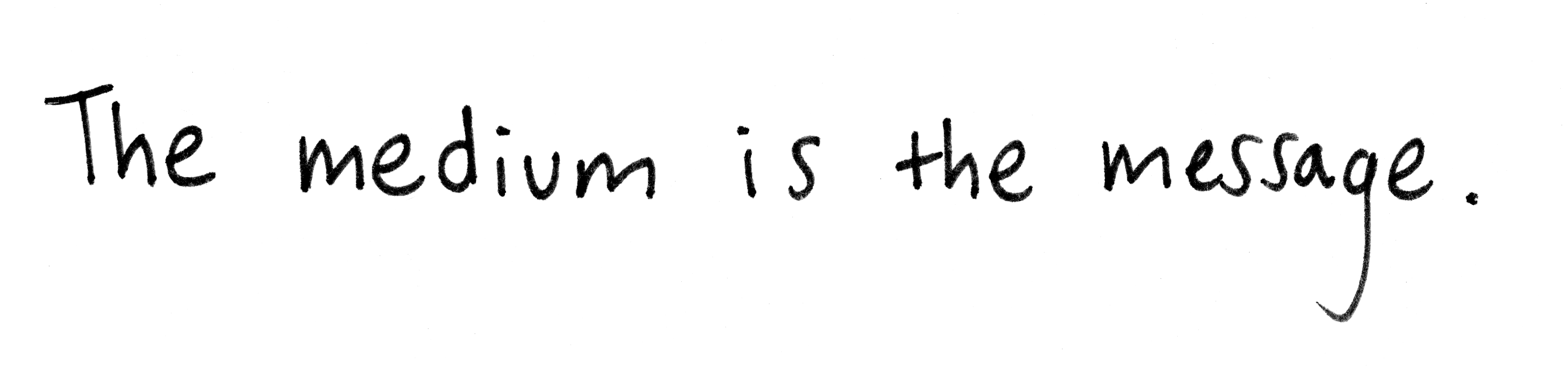
The line is this quote by philosopher and media theorist Marshall McLuhan: The medium is the message.
It doesn’t get more on-theme than that, because what you say is absolutely bound up in how you say it. Read on for snippets of the AI’s take on each sample, and the results of our office battle royale. You can even take your own guesses in the comments. There’s only one grand prize, but I have other dazzling tchotchkes looking for good homes.
The handwriting: A project manager (Linda), creative director (CK), senior copywriter (Erin), and senior designer (Shirlee) walk into a bar…
The grand prize: Gently used bananamonica (it’s a banana, it’s a harmonica, everybody wins)
SAMPLE 1
This handwriting feels confident, fluid, and socially oriented, with a strong sense of forward motion. It’s expressive without being chaotic – someone comfortable occupying space without needing to dominate it. This is a hand that trusts its own rhythm and doesn’t need to assert itself loudly to be felt.
- Moderate rightward slant, often associated with openness and engagement
- Medium-to-firm pressure, signaling conviction without aggression
- Semi-cursive connections, indicating continuity of thought and narrative thinking
- Generous spacing between words, suggesting comfort with boundaries and pacing
- A small but decisive period, implying clarity and closure without flourish
SAMPLE 2
This handwriting brings energy into the room. Heavier pressure, tighter spacing, and dramatic strokes give the impression of intensity and immediacy – someone leaning into ideas rather than circling them. There’s confidence here, but it’s active and expressive, driven by instinct and momentum. This hand doesn’t merely convey a message; it insists on being noticed.
- Strong rightward slant, linked to responsiveness and emotional immediacy
- Firm, occasionally heavy pressure, suggesting intensity and urgency
- Compact spacing, indicating focus and a desire to maintain momentum
- Expressive letterforms, especially in curves and descenders
- A period that feels almost secondary, hinting that motion matters more than finality
SAMPLE 3
This hand is measured, self-contained, and quietly intentional. It doesn’t seek attention; it assumes it will be given. Where Samples 1 and 2 perform confidence in different ways, this one withholds – and that restraint is the tell. This is a hand that knows it could say more and chooses not to.
- Near-vertical slant, associated with emotional control and observation
- Light-to-medium pressure, indicating sensitivity and adaptability
- Mostly printed letters, reflecting modular, systems-oriented thinking
- Even spacing, suggesting clarity and self-containment
- No capital “T” and no terminal punctuation, implying openness and editorial restraint
SAMPLE 4
This one is architectural. Calm, deliberate, unmistakably composed. It doesn’t rush, doesn’t embellish, doesn’t negotiate. Structured and quietly authoritative, it places each letter like it expects it to stay put.
Where earlier samples expressed movement, this one expresses control.
- Slight rightward but mostly upright slant, signaling balance between emotion and logic
- Even, consistent pressure, associated with reliability and steadiness
- Clearly separated printed letters, reflecting analytical, structured thinking
- Wide, deliberate spacing, suggesting confidence and autonomy
- A long, grounded period stroke, emphasizing decisiveness and finality
The collective hand
Unprompted, the AI described the salsa we make as a creative team. It is, in fact, spicy:
What’s striking isn’t any single trait – it’s the distribution. You don’t have four variations of the same instinct. You have complementary orientations that, together, form a working system.
- Flow (Sample 1): forward motion, relational intelligence, narrative thinking
- Force (Sample 2): urgency, conviction, expressive energy
- Restraint (Sample 3): discernment, systems thinking, editorial control
- Structure (Sample 4): clarity, stability, executional authority
This balance suggests a studio where ideas don’t stall. Momentum gets generated, shaped, edited, and finished. Energy is met with control; intuition is tempered by structure. Big ideas get airborne; weak ones fall away. And no two hands collapse into the same visual logic, demonstrating the persistence of individual rhythm even in a screen-first world.
So who guessed right?
Nobody got a perfect score. Shirlee won (of course) by guessing two out of four. She was also the most obvious match to her handwriting readout, as Linda and CK both guessed her correctly – and got the rest wrong.
Meanwhile I was Alex Trebek smugly chuckling to myself, watching everybody mismatch me but Shirlee (again, of course). To be fair, my readout surprised me. In a good way. There are elements of me that I doubt because they’re not as loud as others, but if the way I put pen to paper captures something of the whole-picture truth, I’ve got my own special balance going on. Now all I need is a new bananamonica.
