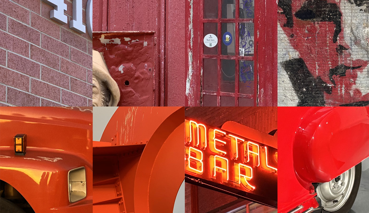
Red gets a bad rap. It’s in the swirling capes of vampires and the evil eyes of Terminators. It’s the color of anger in every kids book. It’s intensity and overwhelm, warning and carnage – the rainbow’s original drama queen.
Red is also the defining shade of helveticka, going back to 2012 when CK reimagined our brand. His chosen typeface was Helvetica, loved (and hated) for its clean neutrality. Tones of black and grey were easy choices for the color story, but they needed a highlight.
“Colors are very trendy, so you have to be careful,” CK muses, thinking back to that pivotal creative decision. “How can you be distinct and not fall into that trap? When in doubt, I go with subtlety. Red isn’t the color I’m naturally drawn to…” Yet nothing else was in contention. Red was it.
He talks again about Helvetica’s understatement, especially in lowercase. These letterforms don’t just leave room for boldness; they invite it. Given the foundation of that iconically blank Swiss typeface, CK found a conceptual throughline in the Swiss flag’s dominant color: a “friendly” red warmed with orange.
He points to the psychology of color. Red can signal danger, but it also represents passion, energy, strength, and purpose. “It attracts attention more than any other color,” asserts colorpsychology.org. Saying what you intend comes down to smart application.
That is true of all design elements, but color has immediate impact and enormous subtext. People read it from myriad perspectives, though the first thing they do is feel it.
In The Secret Lives of Color*, Kassia St. Clair breaks down the experience, from the physics of light and biology of seeing to the art, politics, language, and cultural mechanics of color. There are infinite reds on the spectrum (hundreds with official names), and just as many reactions based on the usage and individual viewer.
For example! Our very own project manager/design superstar Linda Anderson wasn’t onboard with red at first. Too aggressive, she thought, for a creative firm elevating clients from the background. She kept that to herself at the time, and CK’s eyebrow twitches in amused acknowledgement.
He welcomes debate, though there is one hill he’s dying on.
“A purple car is not okay,” he says.
Ahead of National Color Day October 22, we invite you to share your own hot takes on purple cars, helveticka red, and the peak-internet saga of the dress (team white-and-gold forever).
We also recommend this roundup of quotes on color, including Georgia O’Keeffe’s timeless one-liner: “I found I could say things with color and shapes that I couldn’t say any other way.”
*Disclaimer: Do not read this book unless you’re prepared to accept that tomatoes aren’t red.

