blog
tyblography

categories

architecture (31)
on location (23)
random thoughts (1,267)
staff (27)
the design life (294)
the writing life (418)
blog archive


Great Shirts Think Alike

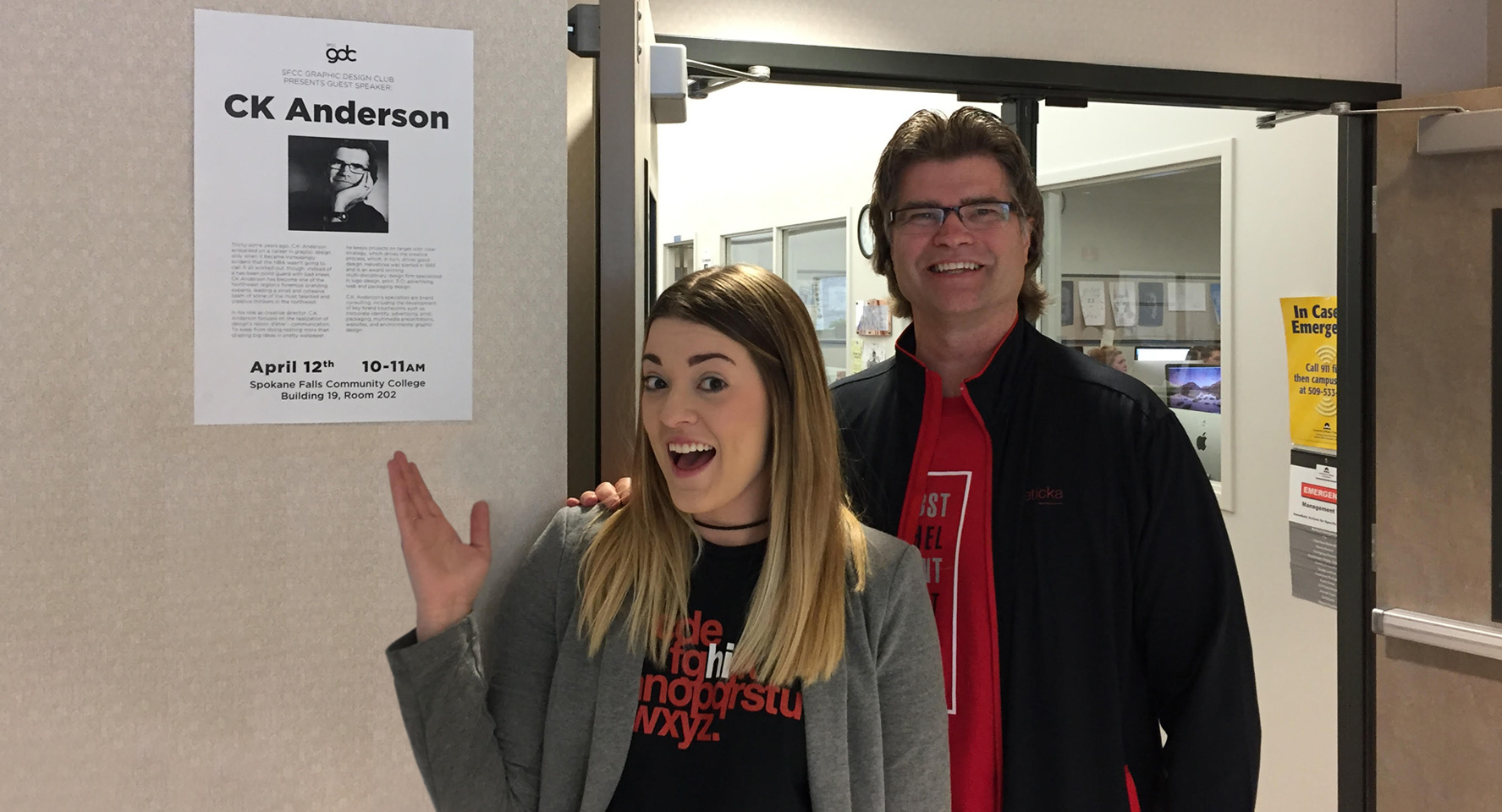
Thanks to Isabel Heisler for the invitation to speak yesterday at my alma mater, Spokane Falls Community College.

Originally from Brazil, Isabel was the very first recipient of a $1,000 design scholarship gifted by our sister company, Helveticahaus—a philanthropic enterprise dedicated to providing an annual design scholarship through the sale of Helvetica-based, Swiss-inspired apparel, note cards, coffee, posters, and more.

Isabel’s about to wrap up her second year in the visual communications program, and will be taking her talents to Kentucky (her husband’s home state) soon after graduating. Congrats to you, Isabel. We wish you the very best.

The B.S. Goes to 11

Jeff Koons is unveiling his latest project, and, from the sounds of it, well…let’s just let him describe it:

“They touch on the metaphysical: the right here right now and its connection to the past and the future.”

Hmmm. Since metaphysics includes ontology (the nature of existence), cosmology (the origin of the universe), and epistemology (the theory of knowledge), Koons must really be on to something this time.

“They’re about shine, the basics of philosophy, passion, what it means to be a human, what it means to be an animal, the idea of transcendence.”

My copy of the OED helpfully describes transcendent as “surpassing or excelling others of its kind, supreme; beyond the range or grasp of human experience, belief, etc.” Which helps explain the next line:

“Working on this, I felt a sense of my own potential, and the sharing of that with a large community.”

Hard to believe that the record holder for “price at auction for a work by a living artist” could be so humble, right?

“I hope people understand my ideas. I hope they embrace them as a continuation of my effort to erase the hierarchy attached to fine art and old masters.”

So. What’s Koons up to? Glad you asked. It’s…handbags.

Today in History

Lord Byron to Thomas Moore, from Venice, April 11, 1817:

My late physician, Dr Polidori, is here on his way to England, with the present Lord Guilford and the widow of the late earl. Dr Polidori has, just now, no more patients, because his patients are no more. He had lately three, who are now all dead – one embalmed. Horner and a child of Thomas Hope’s are interred at Pisa and Rome. Lord Guilford died of an inflammation of the bowels: so they took them out, and sent them (on account of their discrepancies), separately from the carcass, to England. Conceive a man going one way, and his intestines another, and his immortal soul a third! – was there ever such a distribution? One certainly has a soul; but how it came to allow itself to be enclosed in a body is more than I can imagine. I only know if once mine gets outs, I’ll have a bit of a tussle before I let it get in again to that or any other.

from The Folio Book of Days (2002)

Insanity

Today I was going to write about the recent decision by the editors of the AP Stylebook—perhaps my least favorite guide, but one that wields enormous influence—to allow they/them/their as singular pronouns. I see, however, that the great Andrew Ferguson not only beat me to it, but did so in a way that should leave no question on the subject. So I’ll just point you to his takedown over at the Weekly Standard. If you care at all about language clarity, please give it a read.

Wait. What?

Last week, Vincent Connare, the typographer who unleashed Comic Sans on an unsuspecting world, confessed his sins in an interview over at the Guardian‘s website.

After reading his account—and that of Microsoft program manager Tom Stephens, whose job it was “to match products to fonts, sort of like a marriage broker”—I was fully prepared to grant mercy, if not outright absolution.

Until, that is, Stephens said that “[w]hen you use Comic Sans, you’re making a statement: ‘I’m more relaxed, more creative. I may be working in this area, but this job does not define me.'”

Now, I may not be a designer, but something about that didn’t seem quite right. So I asked the crack design team at helveticka world headquarters to more accurately complete his quote.

“When you use Comic Sans, you’re making a statement…”

Skooch “…I’m probably a kindergarten teacher.”

Shirlee “…I’m still in kindergarten.”

Courtney “…I failed kindergarten.”

Stop! Grammar Time!

Unwieldy? Or unwieldly?

This is a tough one—because neither the correct word nor its root are all that common these days. We generally have an inkling of the meaning when we use it, believing (correctly) that it refers to clumsiness or awkwardness. But which is the correct word?

Let’s start with the root: wield.

According to my OED, the pertinent definition here is “Direct the movement or action of, control, (a bodily member, a faculty, etc.).” Another is “use or handle with skill and effectiveness; ply (a weapon or tool, now always one held in the hand).” Both come from the Old English wealden. Then there’s this etymology entry, which mentions “moving gracefully” as a meaning dating back to the 1520s.

Now that we know what the root means, let’s apply some basic rules of English word construction. If wield means “with skill and effectiveness,” adding the suffix -ly would create an adverb:

Swinging the battle axe in a downward arc, Steven wieldly cleft Aaron’s skull.

Not very pretty, though, is it? Partly because it’s somewhat redundant. If wield already means “with skill and effectiveness,” we don’t really need an adverb form. But if we did, it would probably be wieldily, wouldn’t it? It stands to reason, then, that unwieldly isn’t an option.

Wieldy, on the other hand, starts to make more sense—especially when the prefix -un is added. As an adjective, unwieldy would therefore mean “not (un) under control (wield),” or “without effectiveness,” or “ungraceful.”

English doesn’t always make sense. But when it does, it’s a beautiful thing.

Mr. AZ / 5 of 5

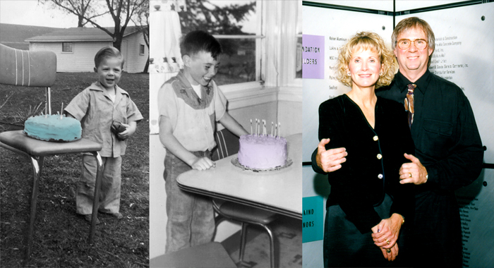
Today, helveticka co-founder and part-time contributor John Richard Mraz turns 70! In celebration of this special occasion, we’ve been paying tribute to him all week: here, here, here, and here. That’s John in all the photos above: circa 1949 and 1956, and with his lovely wife Marilyn in 1998. (We thought about including a picture with this year’s cake, but we would’ve needed a fire engine on standby.)

Happy birthday, John Richard Mraz!

Wishing you and your family all the best.

Mr. AZ / 4 of 5

Keeping with this week’s theme about John Richard Mraz (who celebrates his seventieth birthday tomorrow), I would be remiss if I didn’t mention a couple of important honors.

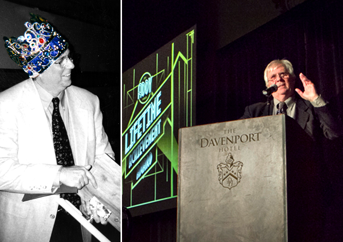
John was awarded the distinguished 2000 Advertising Professional of the Year Award by the Spokane Advertising Federation (below, left). And if that wasn’t enough, ten years later he became one of only six recipients of the prestigious Lifetime Achievement Award from the same body (below, right).

I met John around 1979 while attending Spokane Falls Community College. He came to speak to a small group of students who were part of the FAD Club (Future Art Directors). I remember he passed around his brown portfolios and shared stories about projects and clients. It seemed that most of his work was logos: black and white representations along with printed stationery samples. I was in awe; enamored with how clean, crisp, and polished his design solutions were—not to mention how nicely they were presented within those plastic sleeves. He told us that his work represented a lot of “blood, sweat, and tears.”

The meaning of those three words have never been lost on me. As true then as they are today, they represent a kind of old-school ethic. Practical. Sensible. Accountable. The kind of thing you learn growing up near a small town, on a farm, in the middle of the Palouse. The kind of thing that helps explain the success John has enjoyed, both in his personal life and throughout his career.

Mr. AZ / 3 of 5

We first met at Spokane Falls Community College when John Richard Mraz was a part-time faculty member in the design department. (He taught full-time from 1980 to 1983.) Although I had just one class with John, we struck up a friendship that, on January 1, 1988, turned into Anderson Mraz Design. For the next twenty years, before he stepped down as partner and into his current state of semi-retirement, John continued to forge a reputation as one of the region’s finest designers.

Known for his prowess designing logos, packaging, and printed materials, John’s most impressive—yet largely unknown skill—is designing and engineering custom-fabricated components for displays, exhibits, and 3D installations. Today, he continues to lend these skills to helveticka. His mastery of materials and knowledge of the fabrication process—as well as of fastening systems and hardware—is extraordinary. Combine this talent with an innate love for details, and you have one seriously anal designer.

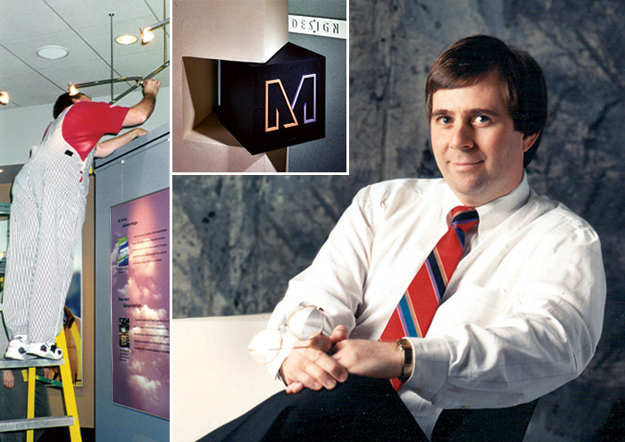
John calls this the Mraz Curse, because it apparently runs in the family. He actually lies awake at night thinking through all the ways something can be easily fabricated while not only looking great, but also being simple to install. It makes him one of the world’s best installation planners, which may help explain why he always seems to be the most comfortable working in a hands-on mode: overalls, tennis shoes, tool belt, and a pencil behind the ear as he puts everything together. It turns out that his experiences growing up on a farm profoundly shaped his design career.

Mr. AZ / 2 of 5

Upon receiving valedictorian honors from Colton High, John Richard Mraz—the second oldest of Norm and Virginia’s five children—enrolled in Washington State University.

He did…OK. Probably spent less time attending classes than he did working on his 1956 Chevy Bel Air. (Had to make sure he could cruise up the old Lewiston grade in record time.)

John eventually graduated in 1970 with a Bachelor of Fine Arts. My dictionary defines “fine” as “exquisite, outstanding, superlative.” Whatever. I’ve seen some of his student work, and it wasn’t that good.

John spent some time in Portland before settling in Spokane, where he started a firm called whynotgraphics. It must’ve been hip at the time to ignore word spacing—not that it mattered, since he kept changing his company’s name anyway. Clearly, he couldn’t make up his mind.

One thing he had a penchant for, though, was working in nice studios, one of which was located on Spokane’s lower South Hill in the Historic Corbin Mansion (photo above, circa 1987). One of his earliest business phone numbers was 624.4029. He retained it throughout his career, and, more than forty years later, it remains helveticka’s number.

From the very beginning of his career, John was quickly becoming known as one of the area’s premier graphic designers. Not bad for a lefty.

Mr. AZ / 1 of 5

This week on the blog, we’re paying tribute to helveticka co-founder John Richard Mraz, who celebrates a special birthday this Friday. But before we officially kick things off, I want our readers to know that, along the way, I’ll be sharing a few insights about John that I believe—to the best of my memory, anyway—are mostly true. Whatever details I may miss, well…let’s just say that helveticka isn’t a news organization. And that fact-checking is overrated among friends.

Here’s John in 1965. Legend has it that the Colton High School Wildcat got most of his morning farm chores done before school, and that he was a below-average basketball player and a way-above-average student. (Of course, he graduated with only 18 classmates, so how hard could that have been?) In fact, Colton High’s valedictorian standards were sufficiently low as to enable John to achieve this distinction.

Interestingly, the Rolling Stones released The Rolling Stones No. 2The Rolling Stones, Now!Out of Our HeadsDecember’s Children (And Everybody’s); and Got Live if You Want It!—all in that same year. John, an aspiring drummer, remains a lifelong fan.

“Hello darkness, my old friend…”

“The sounds of the office are essentially sounds of paper and machines. Here are some of them, in a rough chronological sequence, from the start of a day to its end, or at least the end of the morning.”

That’s from the liner notes to Folkways Records FX 6142The Sounds of the Office. Released in 1964, the album includes classics like “Plastic Laminator,” “Addressograph,” and “Postage Meter and Envelope Sealer.”

Wondering what The Sounds of helveticka would be? I put together a track list of the first hour:

Aaron unlocks the doors and turns on the lights
40 minutes of loud obnoxious music
door opens
feet shuffling on concrete floor
Skooch says “Good morning, Aaron”
Aaron grunts
door opens
“clomp clomp clomp clomp”
Courtney says “Good morning!”
Aaron nods
door opens
Shirlee complains about Spokane drivers
doorbell rings
CK greets his minions
minions respond in kind
Shirlee drops an F-bomb
Shirlee drops another F-bomb
Aaron closes his office door
Courtney and Skooch trade witticisms

And…that’s about it. It’ll go on like that for the next eight or nine hours or so. I mean, sure, Skooch occasionally ends up sobbing in the corner, but not as often as you might think.

Fake News

Pretty much everything about this article, written two years ago and shared over a hundred thousand times since, is wrong. “While faster tempos can get you up and going,” writes Dan Scotti, “slower ones—such as the standard tempo of jazz music—will soothe both the mind and body.”

So…slower tempos are standard in jazz? That’ll come as quite the surprise to every jazz musician I know.

Then there’s this howler: “If you guys have a test coming up, or just want to be more creative—and more inspired—I recommend all of you download Coltrane’s entire discography, and start there. I have a feeling you’ll enjoy studying a lot more.” Mr. Scotti has clearly never listened to anything released after A Love Supreme.

That said, however, the article’s headline is at least two-thirds correct. Not only are we jazz listeners smarter and more creative, we’re also devastatingly handsome.

Word of the Day

tartle (verb; Scottish) To hesitate in recognizing a person or thing.

“Good morning, Courtney,” said Aaron cheerfully as he arrived at the office.

“I’m sorry,” Courtney replied. “And you are…?”

An uncomfortable silence ensued. Wiping a tear from his cheek, Aaron retreated to his desk, head down and spirit crushed. Am I really so forgettable? he wondered. Clearly, my life is meaningless. He drew a pistol from his desk drawer, chambered a round, and slowly brought the muzzle up to his temple.

“Don’t worry, buddy,” said Skooch, patting him reassuringly on the shoulder. “I’m sure she just tartled.”

The Whole World’s Gone Nuts

The truly jaw-dropping line in this story about pet plastic surgery isn’t the one about botox for Dobermans’ ears. Nor is it that “New Yorkers have spent up to $8,000 a month on pet ‘maintenance’ such as nail painting, shrinks, chiropractors and massages.”

No, it’s the casual mention of “testicular implants such as Neuticles to help neutered pets regain their masculinity.”

Neuticles, folks. That’s a thing. So of course I checked out their website.

“It’s like nothing ever changed,” reads the service-marked tagline for a product that “allows pets to retain their natural look, self esteem [sic].” Unsurprisingly, there’s a photo of one of the Kardashians on the home page.

So what’ll these set you back? NeuticalOriginals start at $109 a pair; NeuticalNaturals $254. But hey, your pet’s worth it: spring for the UltraPLUS models—with ScarRetard!—at only $399. Of course, that’s for the XX Small. If you’re truly worried about your pet’s self-esteem, you’re gonna want to get the XXL. It’s just another $70, after all, which seems like a small price to pay for all that swagger.

back to top    |     1 50 51 52 53 54 132     |    archive >