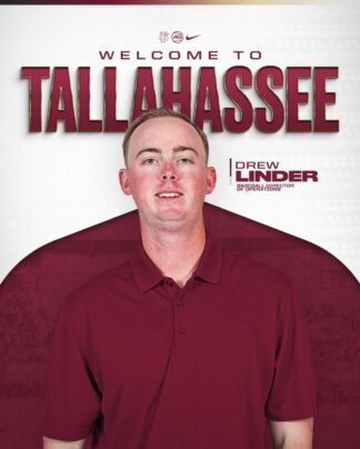
They say the camera adds 10 pounds, but in this case, it’s more. A lot more.
In September, the Florida State Seminoles introduced their new baseball director of operations, and this post popped up in my Instagram feed.
I did a double take, and I wasn’t the only one.

In this image, Drew Linder looks more like a linebacker than a baseball coach. His shoulders appear disproportionately larger than his head, making him seem hundreds of pounds heavier than he really is.
But the camera didn’t add the weight. The design did.
The problem here is the contrast – or lack thereof. The garnet polo shirt and background have the same visual weight, making them nearly indistinguishable at first glance. And, when it comes to social media, a glance is likely all you’ll get.
Visual contrast, through color, size, shape, etc., helps us quickly recognize distinct elements in an image and make sense of them. Good, purposeful design relies on contrast to:
• create visual separation between elements,
• establish a visual hierarchy,
• emphasize which element is most important,
• add depth and dimension, and
• create a sense of balance.
Without it, we risk confusing the audience or communicating something we didn’t intend to – and embarrassing ourselves or someone else in the process.
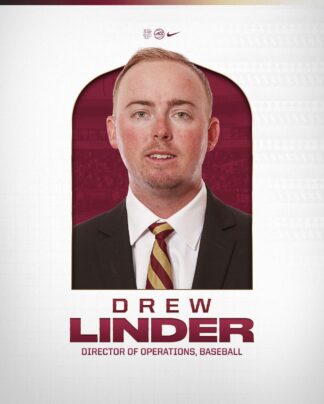
Kudos to the social media team at Florida State (incidentally, where the Big Dumper played college ball) for recognizing the mistake and posting a new image.
Thankfully, this one shed the excess weight.


