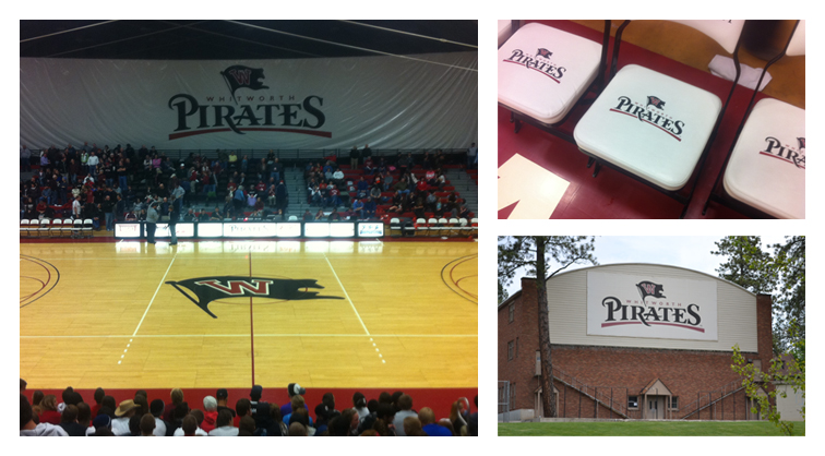
A few years ago we created the Whitworth University athletic logo. I recently attended a men’s basketball game and was reminded how it’s always fun to see where your work ends up. The logo now appears on all kinds of applications such as banners, football helmets, web pages, apparel, mugs, gymnasium floors, etc. It’s even more exciting when it’s really, really, BIG!

And if you’re wondering about the value of a good athletic logo, it should be noted that since it was implemented in 2005, the Pirates men’s basketball team has a record of 148 wins and only 29 losses—a winning percentage of .840. Go Pirates!

