I recently wrote about visiting the Herb Lubalin Study Center of Design and Typography at NYC’s Cooper Union. But what I didn’t discuss in that post was the show in Cooper’s main gallery—Swiss Style Now—which, as it turns out, included not only contemporary Swiss designers, but also a few retrospective pieces related to our favorite typestyle, Helvetica.
We got to see the first pamphlet, designed in 1958, promoting Neue Haas Grotesk (as Helvetica was called prior to 1960), as well as an oversized business card for Alfred Hoffman, son of Helvetica father Eduard Hoffman. The younger Hoffman began working for the Haas Type Foundry in 1951, retiring in 1989.
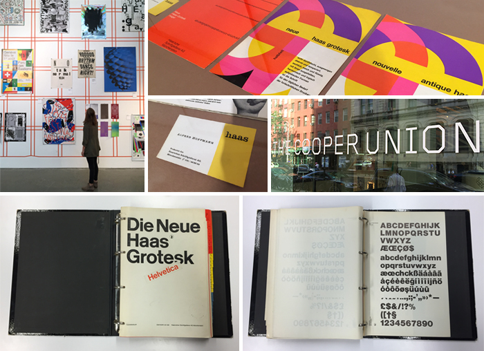
Before we left, the curator pulled off the shelf a very rare piece: a Neue Haas Grotesk specimen book designed in 1960 by famed Swiss designer Josef Müller-Brockmann. Back in the day, when designers actually used math when working on page layouts, specimen books consisted of pages of dummy text organized according to different point sizes and leadings.

by Haley