Okay, kids: Time for another lesson in old-school design techniques.
Transfer type used to be a big deal. You would run over to the art supply store, pore over the available Letraset typestyles, then purchase a sheet of instant lettering. Using a burnisher, you would rub down each character, one at a time, to transfer it to your art board (hence the name “transfer type”—pretty clever, huh?). All you had to do was align the horizontal tic marks under each letter to your blue line guide and start burnishing.
Transfer type was great in a pinch, either as a way to put together a quick layout or when you needed to use it as a basis for a special type treatment or logo design. Over the years, we collected dozens of partially used Letraset pages, each one a different font size.
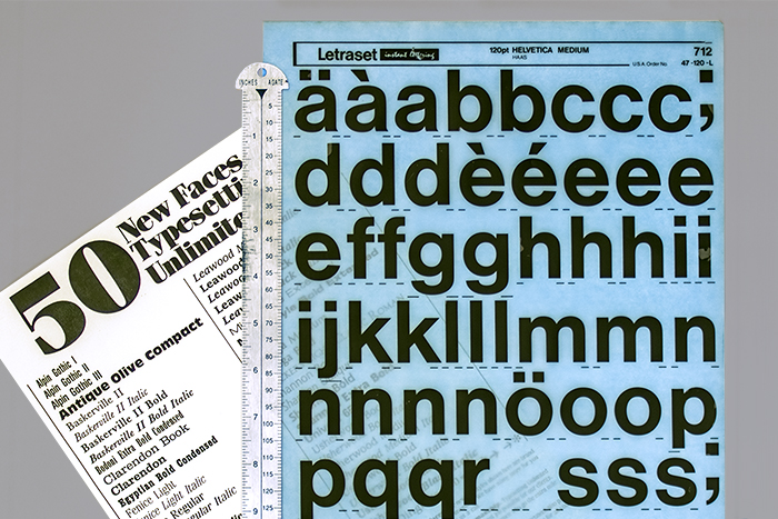
That’s a handy pica pole (a lesson for another time) above, along with typestyles we picked up at one of our favorite typesetting vendors back in the 1980s and early 90s: Type Unlimited. Thanks to Steve Jobs, they, along with countless others, went out of business when designers fell in love with Apple’s then-new desktop publishing tools.
