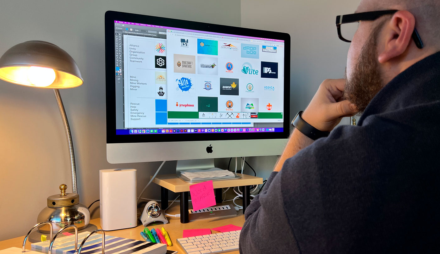
Psst. Here’s something I’m embarrassed to tell the rest of the team.
I used to think logo design was simple.
Admitting that to my talented coworkers is – as my kids like to say – super cringey. But hey, I’m a copywriter and not a graphic designer.
Granted, I only believed that before I’d ever actually made a logo. In truth, all it took was a single design disaster to learn that I was dead wrong. It happened several years ago, when I was fresh out of college. A friend asked me to design a logo for his new side business. And I, of course, replied with those famous last words.
“How hard can it be?”
Well, I found out. It’s exceptionally hard.
I’ll spare you the gory details of ugly font choices, bad kerning, and cheap clip art, and I’ll skip right to the carnage at the end of the story. The logo was terrible, and my friend’s business closed within six months.
Which just proves the power of a bad logo.
Recently, I asked one of our senior designers, Aaron Robertson, what goes into logo design. His answer was, I kid you not, a full 45-minute discourse on brand research, strategy, analysis, design, and refinement. That’s a heckuva lot of work. And it shows – in his logo design and his clients’ branding success.
Which just proves the power of a good logo too.

