This xkcd comic—from 2010, mind you—remains true today:
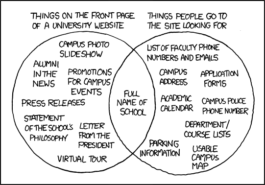
I mean, see for yourself: exhibit A, exhibit B, exhibit C, exhibit D.
It’s not just university websites, either. It’s pretty much every website for any government entity and any organization larger than a dozen people.
Case in point: I recently had to update my credit card information for some bills I pay automatically (utilities, electricity, Internet, et al.), and MY GOD is it unnecessarily hard to do. You can’t find what you’re looking for, the naming conventions aren’t even close to intuitive, and once you get there, the Byzantine twists and turns you have to navigate in order to simply update your information and delete the old card are painful.
I’ve got a question for all you website designers and developers out there. Are you sadists? No, really. That’s the only explanation I can come up with.
Here’s some free advice: It doesn’t cost more to make information clear and easily accessible. It does cost more, however, every time someone has to call your customer service line because of bad design and abstruse language.
