blog
tyblography

categories

architecture (29)
on location (21)
random thoughts (1,262)
staff (27)
the design life (289)
the writing life (414)
blog archive


Braces and Virtual Reality

I had braces in high school. And I loved them.

Every day I could see my teeth moving from huge and bad to straight and normal – which meant that the occasional associated pain (outside of that first throbbing week) was practically enjoyable. Even today, I love putting on my retainers after a few weeks (or, more often, months) of neglect. Maybe I’m weird, but there’s just something wonderful about biting down and feeling your teeth move.

Because I loved my braces so much – and, let’s be honest, there’s good money in it – I figured a career as an orthodontist was exactly what I should study for. So I started at EWU with a packed schedule of chemistry, anatomy, and physiology.

And cadavers.

Now, I wouldn’t necessarily say that I’m a squeamish person (unless we’re talking needles), but dead bodies? That’s a whole different ball game. Every lab period, when we had to enter that smelly white lab and see those people just…lying there, was a struggle. Hence my career in graphic design.

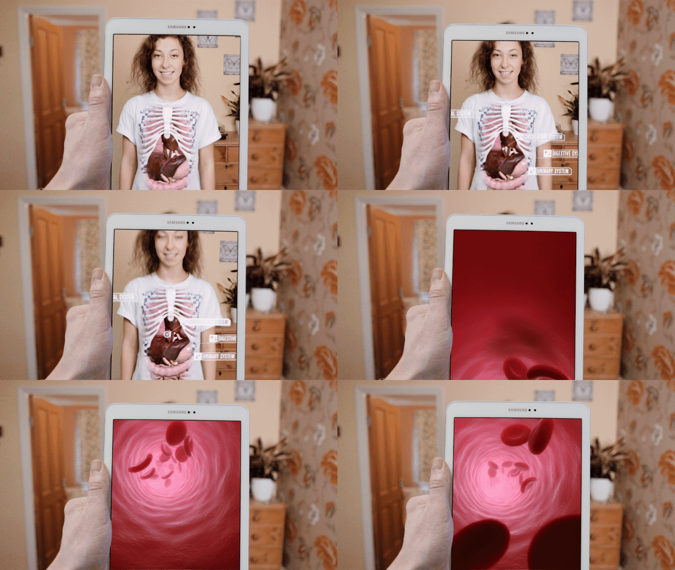
However, I recently stumbled upon a Kickstarter campaign that quite possibly could have changed my course in life. The Virtuali-Tee is a T-shirt that uses virtual reality to enable people to view and explore human anatomy on a live person. No more smelly lab, no more bodies. Behold, learning tools of the future… today! Talk about the perfect mashup of technology, design, and learning.

6ca3f448e03cb219304383ddf2770d7b_original

I wouldn’t change my career for anything, of course, but that T-shirt definitely would have helped me pass all those science classes!

Could You Smile Just a Bit More?

hannah_birthday_blog

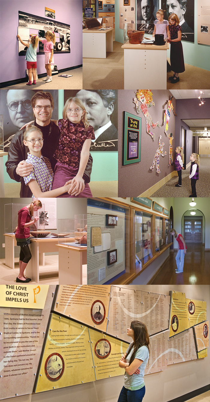
When we complete one of our environmental graphic design projects, we often arrange for them to be photographed. And over the years, one or both of my two daughters would play the role of visitor—pretending they were interested in the subject matter while providing much-needed photographic scale. It helped that they were available, worked cheap, and would listen to most of my instructions. They even learned to always wear the proper camera-friendly clothing. I’d still be using them for scale if they lived nearby.

Having worked with lots of talent over the years, I definitely have my two favorites. So in honor of one of those two, I’m sending birthday wishes to my youngest, who turns 22 years old today. Happy birthday, Hannah! Now, if you could just move to your left slightly…no, no, your other left…

Poetry Break

reflection

CEREMONY
Richard Wilbur

A striped blouse in a clearing by Bazille
Is, you may say, a patroness of boughs
Too queenly kind toward nature to be kin.
But ceremony never did conceal,
Save to the silly eye, which all allows,
How much we are the woods we wander in.

Let her be some Sabrina fresh from stream,
Lucent as shallows slowed by wading sun,
Bedded on fern, the flowers’ cynosure:
Then nymph and wood must nod and strive to dream
That she is airy earth, the trees, undone,
Must ape her languor natural and pure.

Ho-hum. I am for wit and wakefulness,
And love this feigning lady by Bazille.
What’s lightly hid is deepest understood,
And when with social smile and formal dress
She teaches leaves to curtsey and quadrille,
I think there are most tigers in the wood.

(1948)

Contest!

Last week I got everyone to take an interactive version of the Narcissistic Personality Inventory—a test developed in 1979 “for the measurement of narcissism as a personality trait in social psychological research.”

For this particular version of the test, a maximum of 40 points are possible; the higher the score, the more narcissistic the individual. The average U.S. college undergraduate scores 15.6; U.S. adult, 15.3; U.S. celebrity, 17.8.

Going in, I had a pretty good idea how my esteemed coworkers would do. But there were some surprises. Let’s see how you do. Match the following people…

CK
Linda
Shirlee
Aaron
Courtney

…with the following scores:

1
7
12
13
16

Submit your guesses, along with your own scores (if you dare), in the comments field below. The first to answer correctly will win…something, I’m sure.

Prove it!

Soon, Microsoft is going to be making things easier for all of us.

“By designing with the disabled in mind, we can create products that are better for everyone else.”

Forget the making forms more user friendly, these people are creating “a font and system of text wrapping that makes reading easier for dyslexics – but also faster for those without dyslexia.” Check out the article from Fast Company introducing the genius and thinking behind these great ideas. I’m more then excited for you to get through the article and discover what they’re doing for GPS apps and women (hint: It’s GENIUS).

Quote of the Day

“After playing Chopin, I feel as if I had been weeping over sins that I had never committed, and mourning over tragedies that were not my own. Music always seems to me to produce that effect. It creates for one a past of which one has been ignorant, and fills one with a sense of sorrows that had been hidden from one’s tears. I can fancy a man who had led a perfectly commonplace life, hearing by chance some curious piece of music, and suddenly discovering that his soul, without his being conscious of it, had passed through terrible experiences, and known fearful joys, or wild romantic loves, or great renunciations.” – Oscar Wilde

(Now listen to Prélude in D Flat Major (“Raindrop”), from last year’s The Chopin Project, then read the above quote again.)

The Cookbook

In my family, when you get married, you get a cookbook. Not just any cookbook. The cookbook. It’s filled with recipes from my mother’s side of the family, dating back about three generations. Like the amazing ham sauce that’s changed Easter for me forever. Or my great grandmother’s sticky buns. (They. Are. So. Good.)

This is clearly a gift to be coveted. But if you’re like me (unmarried), then you’re out of luck. The closest I get to The Cookbook is over the phone with my mom, asking her to read me the ingredient list from her copy. I know I could always just snap pictures of the pages when I’m at a married relative’s house, but it’s just not the same.

A little about me. I’ve been dating this guy Joel for seven-plus years now. In no rush to get married, I’m in limbo regarding The Cookbook – which is obviously annoying – but I respect tradition…sort of. After a crazy 30-person Christmas dinner this year (my family’s huge), I proposed a gift idea to my Granny. (Every year she puts a lot of time and effort into a special gift that everyone gets – one year it was a bound book of her and my grandfather’s story, another, it was a CD of my great-uncle’s collected piano recordings.) So I suggested that, since her talented granddaughter (that’s me) is a graphic designer, why not give her The Cookbook (see where I’m going here?) so that I could redesign it for 2016! I could give it an index, fix the typos, format the recipes, and make it a better visual piece overall. I could also have it printed it to give it the professional and cherished binding that it deserves.

But she, being my smart Granny, said No. Not because she caught on to my plan, but because she thought that the typo-filled pages gave it personality and authenticity; that the Microsoft Publisher borders give it a “Granny” feel. Bless her heart.

Though I didn’t receive the go-ahead, I still love the idea. And then, earlier today, I stumbled upon this: Choosing and Pairing Typefaces for Cookbooks. Whether this is the universe telling me to go over Granny’s head, I’ll never know. But for now, I will keep in my Pocket for when she changes her mind.

It’s Like They’re Not Even Trying

irsspam

This email came over the helveticka transom on Monday. Apparently, we’re to believe that the IRS now has an earthlink.net email address, that its representatives have difficulty with spelling, that a PTIN is a thing, that the tax-filing “season” now comprises two years, and that the irs.gov domain is apparently so crowded that they have to rent space at asiadesignworks.com to accommodate all their “instruction.” C’mon, guys. You need to elevate your game a bit if you’re going to fool someone as sharp as Linda. Besides, she already gave her account information to that Nigerian prince.

Untranslatable Puppy Names

After becoming frustrated by the lack of help received by the internet in naming my new puppy (oh yeah, did I mention that? I have a new puppy. She is adorable.) I went to our resident wordsmith, Aaron, for some advice. She is a Japanese breed, a Shiba Inu, yet I couldn’t seem to narrow down any Japanese names that fit her personality. Aaron quickly jumped to his shelf and pulled out a book of untranslatable words.

Though none of those names became that of our new pup (we landed on Remi, a French name, a few days later) it did get me thinking about the awesomeness of this concept. This morning my internet scour (check out my post yesterday for a more in-depth explanation) led me, as usual, to swiss-miss.com where I found this gem of a link rounding up just that: untranslatable words! My favorite of the bunch is number 14:

words_blog

Check out more here, or when Aaron gets back from Greeley, Colorado I will post the title of the book he pulled out in the comments section!


My Daily Dose

I thrive on routine. Lack of structure does not look good on this lady, which is why I do little things throughout my day to keep on track and focused. One thing I find crucial – not to mention soothing – is design research. Every morning I brew a cup of coffee, sit down at my desk, crack my knuckles (CK hates it but Aaron does it too so at least I’m not alone in this terrible habit), launch Chrome, and start opening tabs. I scour the same basic websites for design news, trends, tutorials, articles, and awesomeness. Time permitting, I dive into new sites, and naturally with time this list evolves. This does three things for me: It wakes me up and gets my mind right for designing, it allows me to stay up to date and current on news and trends, and it keeps me excited about the field of design.

websites_blog

This is my list of my ever-growing, go-to morning websites:

The Skimm – “We read. You Skimm.” This is my daily dose of current news and events, boiled down to quick and direct paragraphs that are fun and informative. These ladies know how to do it.

Muzli – This is my creative dashboard. Muzli has a Chrome extension that makes every new tab I open a link-chalked checkerboard of design. You can also choose which sites that Muzli will source from, tailoring your experience.

Swiss-Miss – Swiss-Miss is a blog I have been following for years. Based out of NYC, this designer gives her daily post of interesting whether it be art, quotes, podcasts, products, or websites. She also runs Tattly, CreativeMornings, and TeuxDeux. Yep. She’s a badass.

Designer News – Designer news is not as fun as the previous three, but allows me to stay on the up-and-up with the industry. You can filter between top stories, most recent, and also dive into discussions.

Medium – At some point in time, Medium became one of my favorite websites, yet I have NO idea when that happened. It crept into my daily routine and now I would be devastated if something happened to it. They pride themselves on being “a community of readers and writers offering unique perspectives on ideas large and small.” Trust me, they deliver.

Pocket – When I have a pressing deadline and my morning routine of internetting is cut short, this baby comes in handy. Pocket is an app that allows you to save articles for safekeeping, effectively bypassing the clunky/dated bookmark. Just add the small icon to your browser window (much like you would do with Pinterest), and any time you find something you would love to read but don’t have a moment, click the icon and pocket it for later.

Throughout the day there are distractions, whether good or bad. These are a few sites that get me back on track feeling design-centered and productive:

From Up North – This website has a killer and endless supply of inspiration to explore. Expand your design mind with galleries of illustrations, motion graphics, typography, packaging design, logos, and web design. This website make me want to create cool and inspired work while helping to banish any lackadaisical mood that could be lurking behind 3 p.m.

Pinterest – Pinterest gets a bad wrap for being a “chick website” (a term that I loathe) when really it is littered with fantastic examples of design and inspiration. In the last year, I have revamped my boards and created a design-centric page that showcases my design affinities. Our sister company HelveticaHaus also has a Pinterest dedicated to all things helvetica and design.

Word of the Day

shih (noun; Chinese) An insightful, elegant kind of knowledge.

Though she considered him ill-bred and loutish (if not a downright cad), Courtney had to admit that there was a certain shih about Aaron—the kind, she noted to herself, that might come in handy the next time she attempted a crossword puzzle.

Editing More is Less

HMC_video_blog

One of my favorite things to do is sit in an editing suite. It must have something to do with knowing that much of the heavy lifting—budgeting, planning, scripting, scouting, shooting, pre-editing—is already in the can. Editing, then, is all about squeezing everything you can out of both the footage and the audio in order to tell the best possible story.

The thrill of experiencing the creative really coming together is another reason I enjoy the final leg of the process. It’s rewarding to collaborate with uniquely talented people, whether it’s writers, producers, cinematographers, drone operators, composers, motion designers, and, of course, the editor. In the case of Metals Fab’s recent video, that would be Adam Harum (shown) from ILF Media. And since editing often involves removing the extraneous, I’ll simply leave it at…thanks, Adam. 

The Only Time Verbing Is a Good Thing

Back when I was a callow youth and working in one of those fast-paced, too-hip-for-words advertising agencies that looks more like an adult daycare than an actual place of business, one of our accounts was Netflix. And one thing Netflix wanted—really, really wanted—was to be verbed. See, this was around the time that “Googling” became a thing, and the way the Netflix suits figured it, if people started to say that they “Netflixed” a movie, well…that would pretty much be the final nail in Blockbuster’s coffin. (Remember Blockbuster? No? Never mind.)

Anyway, I was thinking about this as I read the Trademarks page over at Adobe’s website. Here’s a taste:

Trademarks are not verbs.
Correct: The image was enhanced using Adobe® Photoshop® software.
Incorrect: The image was photoshopped.

Always capitalize and use trademarks in their correct form.
Correct:The image was enhanced with Adobe® Photoshop® Elements software.
Incorrect: The image was photoshopped.
Incorrect: The image was Photoshopped.
Incorrect: The image was Adobe® Photoshopped.

Now, setting aside the fact that I’ve never—ever—heard anyone say that “the image was enhanced using Adobe® Photoshop® software,” this seems pretty short-sighted, doesn’t it? I mean, wouldn’t you want your product or service to be verbed? The New York Times thought so back in 2009.

Turns out it’s not that simple. Mike Hoban has some thoughts about it over at Fast Company; meanwhile, The National Law Review weighs in the supposed legal ramifications here.

As for me, well…Photoshop will always be a noun and a verb.

Rebrand Alert!

Depending on how often you Internet (new verb coined by yours truly; it means to scour the Internet with no real direction or time restraint) and what your Internetting (Aaron will love that) brings you to, you will have either heard about the Alaska Airlines re-brand or not. If you have, tell me your thoughts. If not, then please, continue reading, make your own assessment, and then let me know your thoughts. Enjoy…

ALASKA AIRLINES! I love Alaska Airlines. Being from Alaska, I naturally have an affinity toward things that make me nostalgic and the state I hold so near and dear. Growing up in Alaska you vacation…a lot. Every winter you fly somewhere, and by you I mean everyone. My girlfriend from Alaska moved to Spokane and the first time she came to visit me she asked, “So where are you guys going this winter?” My boyfriend was shocked that this was not an Alaskan tall tale ploy to trick him to go to Hawaii with me.

So anyway, you take your yearly oil dividend and you fly far, far away from the frigid darkness of February – and because there is no other airline crazy enough to operate out of Fairbanks, you fly Alaska Airlines. I think most people who fly Alaska can agree (after seeing the redesign) that the brand was due for a refresh. The navy blue looked very dated and stale compared to Southwest’s pallet and their adorable heart (I mean, who doesn’t want a heart-shaped swizzle stick in their drink?). So the talented people at Hornall Anderson set forth to create a new brand that could freshen up the image without stripping it of everything people have come to love about it over the last 80 years.

akaair_rebrand

A new, bright palette is going to help it stand out from competing airlines while also adding some much-needed energy to the stuffy airport check-in stations. I am extremely happy that they chose not to scratch the famous Eskimo on the tail of the planes, in part because the editing and softening of his face makes him more approachable and friendly—though, to be honest, I’m going to miss the proud look he used to carry, as it felt very Alaskan. (Maybe they could have pumped the brakes just a touch, because now he feels a little less noble and a bit more jolly.) The new letterforms are clean and legible. I honestly hadn’t noticed the oddities in the old logotype, such as the K overlapping the A or the harshness of the S, and now that they’re gone, I find myself missing them. There was a streamlined and individual feel about the old logo, and though it was dated, I think it held up very well. I would have liked to see a bit more stylization carried over from the old letter forms, but I understand why they made the choices they did.

Maybe I’m just being sentimental, but I’m torn. My education and experience and personality and expertise tell me I should love it (as does CK). But I’m just not there yet.

Be sure to check out Alaska’s brand-launching website to see more.

The Texture of Design

When talking about design, so often I lean on buzzwords like grid, structure, layout, typography, rhythm, and scale. All of these are quintessential to great design, but lately I find that I am craving something with more substance: design focused around texture. Though painstakingly detail-oriented and time-consuming, graphic design done with just a pencil, paper, X-Acto knife, and varying depth is clearly a work of art. A true labor of love that begs the viewer to get closer and explore—to find the treasure in the details.

With the inspiration below, more Pinterest searches of “paper, graphic design,” and a trip to the art supply store, this is going to be my February project. Wish me luck (and patience)!


paper_design_blog


back to top    |     1 61 62 63 64 65 131     |    archive >