Depending on how often you Internet (new verb coined by yours truly; it means to scour the Internet with no real direction or time restraint) and what your Internetting (Aaron will love that) brings you to, you will have either heard about the Alaska Airlines re-brand or not. If you have, tell me your thoughts. If not, then please, continue reading, make your own assessment, and then let me know your thoughts. Enjoy…
ALASKA AIRLINES! I love Alaska Airlines. Being from Alaska, I naturally have an affinity toward things that make me nostalgic and the state I hold so near and dear. Growing up in Alaska you vacation…a lot. Every winter you fly somewhere, and by you I mean everyone. My girlfriend from Alaska moved to Spokane and the first time she came to visit me she asked, “So where are you guys going this winter?” My boyfriend was shocked that this was not an Alaskan tall tale ploy to trick him to go to Hawaii with me.
So anyway, you take your yearly oil dividend and you fly far, far away from the frigid darkness of February – and because there is no other airline crazy enough to operate out of Fairbanks, you fly Alaska Airlines. I think most people who fly Alaska can agree (after seeing the redesign) that the brand was due for a refresh. The navy blue looked very dated and stale compared to Southwest’s pallet and their adorable heart (I mean, who doesn’t want a heart-shaped swizzle stick in their drink?). So the talented people at Hornall Anderson set forth to create a new brand that could freshen up the image without stripping it of everything people have come to love about it over the last 80 years.
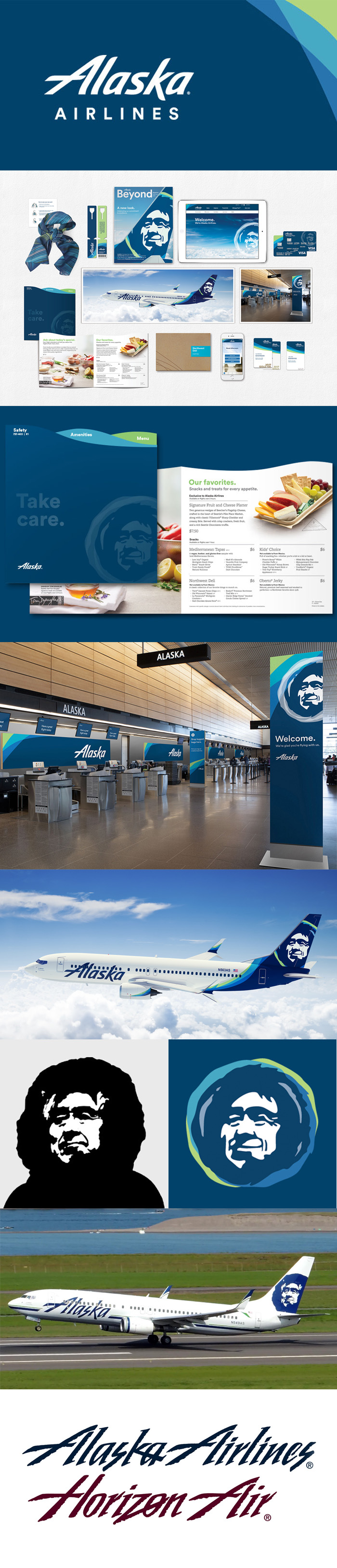
A new, bright palette is going to help it stand out from competing airlines while also adding some much-needed energy to the stuffy airport check-in stations. I am extremely happy that they chose not to scratch the famous Eskimo on the tail of the planes, in part because the editing and softening of his face makes him more approachable and friendly—though, to be honest, I’m going to miss the proud look he used to carry, as it felt very Alaskan. (Maybe they could have pumped the brakes just a touch, because now he feels a little less noble and a bit more jolly.) The new letterforms are clean and legible. I honestly hadn’t noticed the oddities in the old logotype, such as the K overlapping the A or the harshness of the S, and now that they’re gone, I find myself missing them. There was a streamlined and individual feel about the old logo, and though it was dated, I think it held up very well. I would have liked to see a bit more stylization carried over from the old letter forms, but I understand why they made the choices they did.
Maybe I’m just being sentimental, but I’m torn. My education and experience and personality and expertise tell me I should love it (as does CK). But I’m just not there yet.
Be sure to check out Alaska’s brand-launching website to see more.
