I thrive on routine. Lack of structure does not look good on this lady, which is why I do little things throughout my day to keep on track and focused. One thing I find crucial – not to mention soothing – is design research. Every morning I brew a cup of coffee, sit down at my desk, crack my knuckles (CK hates it but Aaron does it too so at least I’m not alone in this terrible habit), launch Chrome, and start opening tabs. I scour the same basic websites for design news, trends, tutorials, articles, and awesomeness. Time permitting, I dive into new sites, and naturally with time this list evolves. This does three things for me: It wakes me up and gets my mind right for designing, it allows me to stay up to date and current on news and trends, and it keeps me excited about the field of design.
![websites_blog]()
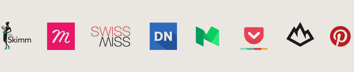
This is my list of my ever-growing, go-to morning websites:
The Skimm – “We read. You Skimm.” This is my daily dose of current news and events, boiled down to quick and direct paragraphs that are fun and informative. These ladies know how to do it.
Muzli – This is my creative dashboard. Muzli has a Chrome extension that makes every new tab I open a link-chalked checkerboard of design. You can also choose which sites that Muzli will source from, tailoring your experience.
Swiss-Miss – Swiss-Miss is a blog I have been following for years. Based out of NYC, this designer gives her daily post of interesting whether it be art, quotes, podcasts, products, or websites. She also runs Tattly, CreativeMornings, and TeuxDeux. Yep. She’s a badass.
Designer News – Designer news is not as fun as the previous three, but allows me to stay on the up-and-up with the industry. You can filter between top stories, most recent, and also dive into discussions.
Medium – At some point in time, Medium became one of my favorite websites, yet I have NO idea when that happened. It crept into my daily routine and now I would be devastated if something happened to it. They pride themselves on being “a community of readers and writers offering unique perspectives on ideas large and small.” Trust me, they deliver.
Pocket – When I have a pressing deadline and my morning routine of internetting is cut short, this baby comes in handy. Pocket is an app that allows you to save articles for safekeeping, effectively bypassing the clunky/dated bookmark. Just add the small icon to your browser window (much like you would do with Pinterest), and any time you find something you would love to read but don’t have a moment, click the icon and pocket it for later.
Throughout the day there are distractions, whether good or bad. These are a few sites that get me back on track feeling design-centered and productive:
From Up North – This website has a killer and endless supply of inspiration to explore. Expand your design mind with galleries of illustrations, motion graphics, typography, packaging design, logos, and web design. This website make me want to create cool and inspired work while helping to banish any lackadaisical mood that could be lurking behind 3 p.m.
Pinterest – Pinterest gets a bad wrap for being a “chick website” (a term that I loathe) when really it is littered with fantastic examples of design and inspiration. In the last year, I have revamped my boards and created a design-centric page that showcases my design affinities. Our sister company HelveticaHaus also has a Pinterest dedicated to all things helvetica and design.
posted by: Courtney Sowards | category: the design life | make a comment

