We’ve all seen them.
Design mistakes so embarrassing that they make us laugh.
They’re everywhere – from the logo that resembles a body part to the typeface that makes it look like the local bakery sells “farts” instead of “tarts.”
Then, there’s the copy that’s oddly uncomfortable. Like the old Yellow Pages tagline to “let your fingers do the walking.” Oof. This one practically begs an awkward innuendo.
It’s the stuff memes are made of.
Let’s face it. When it comes to design, pitfalls abound. Especially if you don’t know what you’re doing.
Take the basic restroom sign, for example. Of any design project, this one seems the most straightforward. Heck, we’ve already got universal symbols for restrooms. So, all you need to do is stick them on a door, right?
Au contraire.
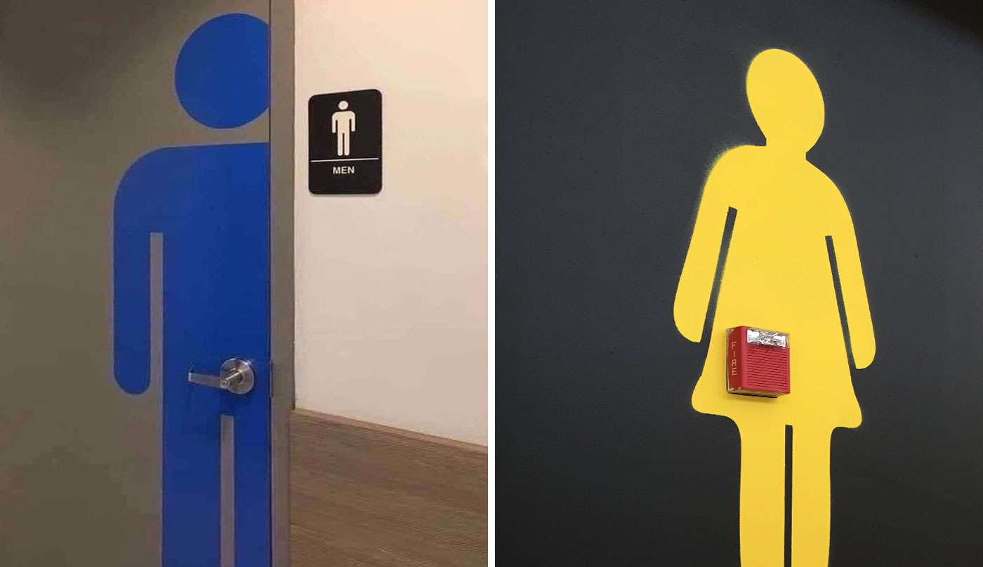
Even the humble restroom sign requires a surprising amount of thinking, planning, and intention – not to mention a keen eye for visual details.
Now, take our design solution for the restrooms at the downtown Spokane Public Library, shown below. These vinyl graphics are clean, modern, and simple. They even allow the natural beauty of the wood to show through.
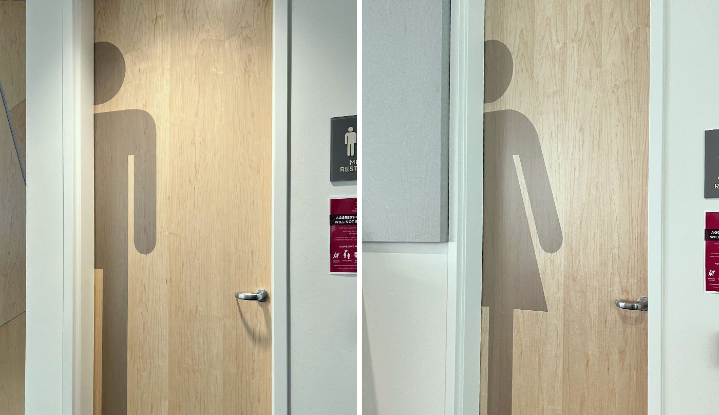
And, best of all, their placement won’t make you feel like a middle schooler whose voice just cracked in front of the entire class.
Hey, I’ve said it before, and I’ll say it again:
Some things are just better left to the professionals.
