blog
tyblography

categories

architecture (32)
on location (23)
random thoughts (1,271)
staff (28)
the design life (298)
the writing life (420)
blog archive


Reading between the typefaces

You know you work for a design firm when Instagram starts serving you typeface ads.

I liked Flapjack immediately. To me, it felt current and fun, easygoing but distinct. The letterforms were clever, with a hint of a wave like batter carefully poured into a shape. What would CK, a person who knows way too much about typefaces, think? Would he confirm my good taste, or politely tell me he’s not into Nickelback.

Without context, I flipped the printed ad over on his desk.

“It’s fine.” Not Nickelback, but not great.

“It has personality and character. The K is unusual, and that’s fun.” Getting warmer…

“It has a retro quality, like it’s been reproduced a bunch of times – dated in a good way. The two As are different. That’s a cool feature giving it a hand-drawn, organic look.” Hooray, my taste doesn’t suck!

“In the right context, it’d be great.” Taylor Penton’s taste doesn’t suck either!

Penton, a Maui-based designer, specializes in hand-drawn type. From these examples, you can see he has a knack for names that personify the energy.

Things read so differently, depending on font. And designers have hundreds of thousands of options, with new ones constantly coming into being. There are many subreddits full of professional designers debating bests and worsts, though even civilians know the universal pariahs:

In discussing Flapjack, and the idea that every typeface has a purpose in the right application, CK added that these two are the exceptions. “There is no purpose for them.”

He compared typeface vibes to that of colors or clothing. They have foundational qualities that transform in different venues and in different ensembles on different subjects. The challenge for graphic designers is to pinpoint which vessel most reflects the message.

To keep my influence out of it, I asked AI to give me a sentence to test typefaces against. Apparently, it knows me too well.

Here you have a mix of stalwarts and gimmicks (and whatever Raanana! is). Many of them work for me, but my pick is American Typewriter. Because it’s the funniest – imagining myself typing this to a cat and silently slipping the missive under its paws.

When typed writing was confined to typewriters, there weren’t half a million options for giving the text personality. There were essentially two, Pica and Elite, respectively spaced at 10 and 12 characters per inch. Elite was preferred for personal correspondence because it felt cozier.

I think about this stuff when I write letters. Sometimes in my unpredictable handwriting. Sometimes typed in Calibri, a small and spare typeface that was served to me by Microsoft and stuck. Mostly I type, because I like to edit myself; because it hurts my hand to scratch out more than a page or two; and because it gives readers more room to interpret. To that end, one writer friend shares poetry exclusively typed in lowercase with no punctuation. The clean Apple packaging of forms inviting all users to find their own rhythm and meaning.

But neutrality is an illusion. The absence of character is character too. Our brains are never not dancing with aesthetic choices, and their associations shape how we receive the messenger as much as the message.

The cat will judge me no matter how I present my confession. So, in this case, I’m pleasing myself.

And our 2025 Helveticahaus scholar is…

In one conversation, Caya Berndt defended geese, contextualized monster romance novels, and considered flat minimalism’s takeover of visual culture. This is what happens when two intellectual doodlers meet for coffee.

Caya had won the 2025 Helveticahaus scholarship, and we were talking about their approach to design. And everything else.

Our exchange was so rich that I had to share some excerpts, coinciding with Caya being announced as the 20th recipient of the Hh scholarship. Since 2016, the fund has supported students in the Spokane Falls Community College (SFCC) graphic design program. Congratulations again to Caya, whose perspective was a joy to absorb.

This interview has been edited for length and clarity.

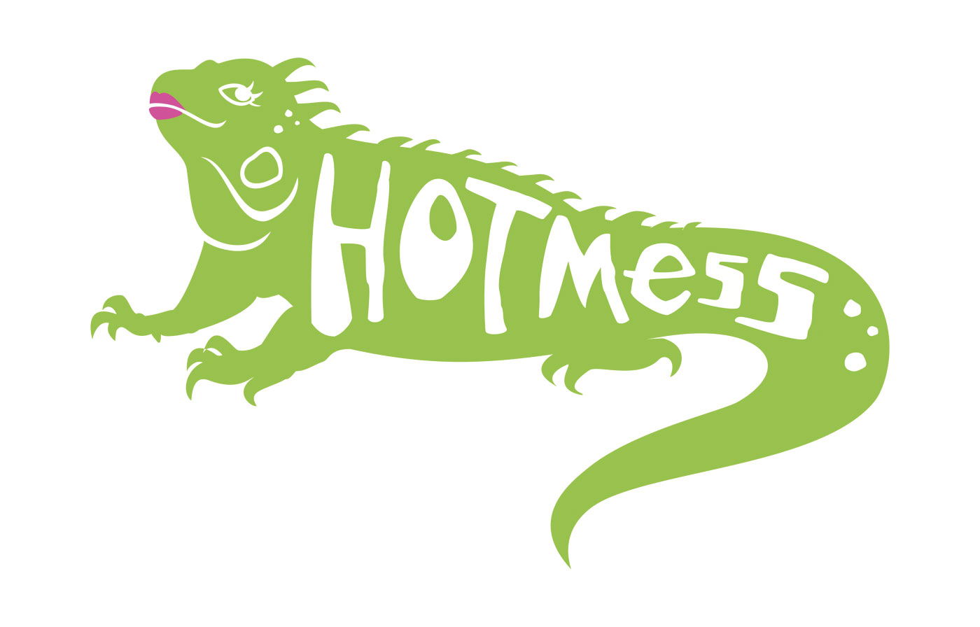
Erin Ryan: Your iguana logo delighted our panel. CK said, “This is pretty much perfect.” Why did it work for your restaurant branding challenge?

Caya Berndt: Wow, thank you. I made a vegan breakfast place, because I have a hard time finding good breakfast places with more nonmeat options. And iguanas eat insects, but for the most part they can be herbivorous – a fitting mascot.

ER: There’s so much in design that the average person isn’t going to pick up on, glancing at a logo or a graphic treatment. Why is it worth putting all that time and thought and effort into adding significance? As an artist, I know the answer – it just is. But what’s your take on that?

CB: One of my favorite parts of the idea development process is coming up with things and realizing there are unintended meanings or connections. Something that we talk about in class is that younger designers will throw things in because it looks cool. And I think you can do things because they’re cool. Like, wizards are cool (references Thomas Hammer’s wizard-bedecked Hammer Van). I get it; you want to evoke energy and magic. But there needs to be a purpose. I really do try to have an intention behind everything that I put out, because I think that if something is well-designed, you don’t need to add stuff to make it look cool. It already is.

ER: The way I see it, things have a specific identity, a feel, a soul. And design has to bring that out. Not just show you nice lines and colors, but show you that thing, in a way where every mark on the page or menu or wall is necessary. And you feel that when you look at it. It’s the same with a really good line of writing that nails the essence of something.

CB: I wouldn’t call myself a writer, but I read a lot and I listen to a lot of music, and I’m a very lyrics-forward person. I have my own running list of perfect songs.

ER: It’s amazing where I find those songs. Whenever I’m in line at the grocery store, I ask the clerks what they’re listening to, and so often they have incredible taste. Every kind of music you can imagine.

CB: I’ve seen these videos on TikTok – and the ethics of gonzo, on-the-street, asking people questions in their face; the ethics of that are an ongoing thing – but they’ll stop people and be like, “Hey, what are you listening to right now?” Then they’ll play that song while the person is walking away. It’s fascinating, just seeing what people are into. I’ll think, that could’ve been me! I hope if I get stopped by one of these guys, I’m listening to something good. (laughs)

ER: For some reason, I have worked my entire career with hardcore music nerds – people who knew so much more about the entire universe of music that I always felt embarrassed to admit liking certain stuff. Thankfully, most of them were like, this is not a cool contest. It’s not about your bona fides. If you enjoy something, that’s great. For example, I love just very basic pop music.

CB: Because it’s good.

ER: I like a little bit of everything. Almost everything. The only place where I get lost is really experimental noise-rock where it’s just so dissonant. And I appreciate that as a form of art, but I cannot connect to it.

CB: It’s a mood. I admire people for whom that’s their ambient. We need people like that in the world—everyone’s brains are wired differently.

ER: Let’s talk about designer brain. Milton Glaser is one of the greats, and you mentioned the documentary about him, To Inform and Delight, in your scholarship application. He felt such a pull between being an artist and creating design for everyday life, and I loved how you articulated the value and beauty of that everyday design side.

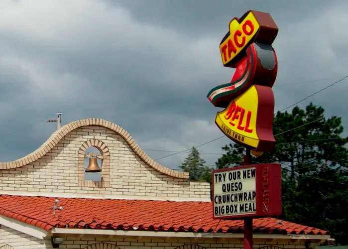
Not to mention your appreciation for the original Taco Bell sign. Do you know who designed it?

CB: I have a lot of inner conflict about my relationship with design that has been designed for profit. Most of the things around us are. It’s branding, it’s advertising, and I have conflicting feelings about that in regard to my personal politics. But at the same time, you know, if you’re going to brand and advertise and create these things, you gotta at least make them look good. Make them interesting.

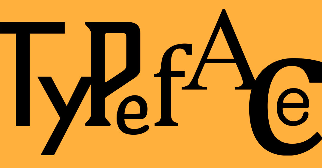
I should know who designed that Taco Bell sign. I do not. But I have always had strong opinions about what I consider to be the erosion of individual character in branding. I’ve noticed this trend. I saw a side-by-side comparison online, all these famous brands you’d recognize in their original iterations and then after rebrands. In the 2000s and 2010s, a lot of brands started switching over to something sleek, more minimalist, what I would call flat design.

ER: I recognize that term from your application, too, where you got into what it means to take away so much of the vocabulary of design for this idea of understated cool. Whereas you’re a huge fan of Aries Moross, whose design is awesomely maximalist.

CB: I saw their work and immediately was like, this is it. This is my style, the type of energy that I want to bring to the world. Also, I think a lot of design and creative arts in general have been overrepresented by straight white men, and it was really nice seeing another queer person in a position like that. It was like, there’s a place for me!

But going back to the Taco Bell sign, just because I want to close that thread, I have a real soft spot for landmarks – old road signs, decaying motel signs, these remnants of Americana. And to my knowledge there’s only that one remaining original Taco Bell sign in Savannah, Georgia. The new Taco Bell logo is good, but this one is so full of motion. Look at that thing (shows a photo of the sign on their phone).

ER: Wowsa. It’s a beauty.

CB: And it’s totally different energy.

ER: You need to do a pilgrimage, I think.

CB: I lived there for a year and a half and didn’t realize I was living with a monument.

ER: (laughs) Let’s talk about flat minimalism, the aesthetic du jour.

CB: My thoughts on this are connected to something that I see in design in general, and that includes environmental design. I listened to a podcast about a book where the author went in search of “the last coffeeshop.” Because he noticed that wherever he traveled, he happened to find a coffeeshop and they all had a similar aesthetic. He was like, what’s going on here? Why do I always find this same style? The hanging plants, the geometric lights – you know the place I’m talking about; you see it everywhere. What he observed was that one coffeeshop like this would advertise online, and then other coffeeshops would mimic it. Next thing you know, you have all these different coffeeshops trying to be like each other, and that creates this same aesthetic because they’re all trying to appeal to the broadest audience, which means fewer elements they see as offensive or evocative. Those tastes are then curated by social media. It becomes this recursive effect, and the result of that is a complete lack of character.

And I just think that’s really sad, because I don’t like the idea that people aren’t taking risks because they’re afraid of financial loss or feel like they have to design to maximize profit. Sacrificing creativity for the sake of profit.

So, I think there is a little bit of frustration in me, where I’m like, try something different. Just get weird! Get silly with it. Try something new. That could be riskier. You do see brands willing to try something different and break outside the box, and you see a lot of success there, because I think people like seeing things that are different. They like seeing new things that expose them to new ideas and aesthetics. It shakes the mind out of its routine.

ER: That makes me think of a panel I went to the other day, featuring four women in different areas of creativity. Marit Fischer, head of advertising and media relations for the Northwest Museum of Arts and Culture, was talking about her early experience at this backcountry magazine. Her boss always said, “The risky way is the safe way.” I think it’s true. Like you say, I think humans actually do want to be rattled. They want to be stopped. You’re just coasting, and then something gets your attention.

That’s definitely the case with the Aries Moross-designed illustration you referenced in your application. The one you said reads like a poem and looks like one. Scrolling Aries’ portfolio, the range is amazing, yet there’s this core brilliant signature in the hand-drawn lettering.

CB: I did it for my Hot Mess logo and did the entire alphabet for the menu typeface.

ER: What would you call your typeface?

CB: Scrabble Rabble? I don’t know.

ER: I love this (points to a menu detail that reads “The eggs are not what they seem”).

CB: We were almost to the end of the project and somebody finally asked, “What does that even mean?” I’m like, “It’s a Twin Peaks reference.” Kids! (laughs)

ER: Apparently you’re old enough to like Dungeons & Dragons, too.

CB: It’s like having an awesome TV show, only it’s your friends doing improv.

ER: What’s your character’s name?

CB: Asphodel. My character’s a warlock, but his patron is my partner’s old character. This is like friend D&D lore, but rest assured it’s very spicy as a concept. (laughs)

ER: Do you still doodle? You must.

CB: Not as much anymore. During the school year, classwork takes up all my time. But when I was a kid, I was always drawing in the margins. I was always drawing on the back of my assignments. I would get in trouble all the time. And I’ve since learned that I really do need something to occupy my hands just because of the way my brain works.

ER: On that panel of creative women I mentioned, there was an illustrator named Madison Merica who talked about being that same kind of kid and constantly getting in trouble for drawing. She ended up in graphic design. I think because of the place she was working, but also because of the work, her creative spirit died. And she found that she couldn’t just draw anymore. Ideas weren’t coming to her. Whatever she had was broken, and she wasn’t sure if she could ever get it back. So she quit and healed herself, and now she has a successful career as an independent artist.

I thought that was so sad and probably very common, that you could have creativity that’s just bursting from you while everybody is telling you to keep it in.

CB: I can relate really hard, because that happened to me. So it’s been really, really enriching to be in this [SFCC] program and have an outlet again. And I’m very fortunate to be learning from Katrina Brisbin. She incorporates a lot of physical practice into her curriculum. When we learned about Art Nouveau, she wanted us to create an Art Nouveau book cover. It’s challenging! I actually didn’t finish the assignment because I was getting really, really detailed with it. Those types of challenges give me an outlet for the non-design artwork stuff.

ER: Speaking of non-design, I love that you volunteer for animals at a rescue.

CB: I think you can learn a lot about a culture by how it treats its animals. I would love to work on creative campaigns for an organization like that.

ER: Do you have any concrete notions of what that might look like?

CB: I think I’m still too early in my education to know what the shape of that would be. And I’m trying to be realistic about my career.

I’m also still learning about how design can make an impact. And again, I’m really grateful for Katrina’s mentorship, because that’s a lot of what she focuses on – design for social impact. For a recent history assignment, she wanted us to look at an event and see how design was critical in shaping it. One of the options was Pride and LBGTQ rights in the ’90s. There was a group called ACT UP and Gran Fury. ACT UP was formed to raise awareness around AIDS, because the epidemic was horrible and absolutely the result of political neglect due to homophobia. The community had to step up and keep each other safe.

Gran Fury was the art and design arm of ACT UP. They created a lot of these awareness campaigns, usually distributed through flyers – things that were really easy to spread around. Some of them were overt, like a bloody handprint suggesting blood on the hands of those in power. There was one that, after the fact, they didn’t consider to be their best work, but it was really simple black-and-white with a baby doll in the corner and the stat “1 in 61.” It called attention to the fact that a lot of babies were being born with HIV, because the stigma around it was that it was something only gay men got. Or reclaiming the pink triangle (a Nazi symbol marking gay men) and pairing it with “SILENCE = DEATH.”

These are examples of how knowledge can be spread in an impactful way that moves people and gets them thinking and starting to unlearn preconceptions and prejudices. I think contributing to information campaigns that are able to shake those things loose for people would be really meaningful.

What that would look like, I don’t know yet. I’m still learning and figuring that out. I’m hoping that I’ll get adopted by an agency that will teach me how. (laughs)

ER: I believe that when you have something driving you and you want to share it, you’ll find your place. You’ve said you’re not as young as some of your classmates. You’re not in your 20s chain-smoking and drawing with ash on the street anymore. You have the perspective and the awareness of what will suck your soul, and you’re not just going to take something that will crush who you are.

We really appreciate your work, and that of the other students who submitted. It was so much fun to look at every application. Personally, I was moved by your words. You are a writer, just so you know.

CB: Thanks!

ER: Last question: How did you decide on an animal for your own personal logo?

CB: It’s called a ligature, putting first and last initials together in a single mark. I always thought if I were to brand myself, I’d probably want to do something where I’m a goose. I love geese.

ER: I’ve never met anyone who loved geese. They’re so angry.

CB: I think y’all are acting really weird about an animal that’s just asserting its boundaries in a way that you don’t understand.

ER: I was once driven into a car by a goose. My grandmother and my sister and me. We all had to run for our lives and jump into the car. The goose was not having us.

CB: If you thought that your family was threatened, would you not do the same? (laughs)

ER: I totally would! This goose was not playing.

CB: They’re warriors. I love them. So I was just doodling stuff, and I was like – wait a minute! I’m still so proud of this.

ER: The little feet at the end. Such a sweet little touch. I look at something like this, and not having that design experience, I’m wondering how you choose how the tail looks in terms of bringing balance to the overall image, and where the wing is placed in relation to the tail, and all of those dimensional aspects.

CB: I think this is where my illustration experience comes into play, because animals are one of my favorite things to draw. I wish I could say I put some lines here to make sure that these were perfectly proportional, but I just eyeballed what looked balanced. When you have the little tail going up, that’s a very friendly shape. The one thing I will say is that I made sure the leg was aligned with the curve of the body, made sure the beak was aligned and then rounded these edges. The little things.

ER: The risky way is the safe way, and the little things are the big things.

An ode to hand-drawn animation

There’s no comparison to a hand-drawn robot chicken. I say that with the authority of a mom who has watched Sonic the Hedgehog cartoons with my young sons and when I was young myself. And the difference between computer-generated stuff and traditional animation is disheartening.

I guess I’m officially one of the olds, yelling at the slick new thing to get off my lawn. But seriously, if you look at these artistic creations side by side, you can’t deny how lifeless the digital product feels. Every edge is smoothed, every shape and expression uniform. Somehow even the hi-def colors read flat.

Then you have The Adventures of Sonic the Hedgehog. It doesn’t come anywhere close to representing the golden age of animation, between the 1920s and 1960s, but it pops with charm. Even more than the characters, what I notice are the backdrops – otherworldly fever dreams I would frame. The quality of the landscapes is such that these fantastical places seem real. Drawn from memory. And quality doesn’t just mean the artist’s imagination and ability; it’s about specificity. That’s what I find most lacking in today’s cartoons. So many of them are interchangeable in terms of visual style, and the perfectness grates.

That doesn’t make sense. My brain should love not having to work so hard in processing images. But think about how you feel listening to elevator music. We want variation and depth and emotion, which fully illustrated animation can bring in the simplest lines of ink.

This International Animation Day, revisit a favorite cartoon or animated film that showcases human skill. Maybe it’s a Disney classic (The Sword in the Stone is a masterpiece), or a Miyazaki wonder, or the “Let’s all go to the lobby” jingle that lives forever in the American consciousness.

Whatever it is, get your kids to watch.

Seeing red on National Color Day

Red gets a bad rap. It’s in the swirling capes of vampires and the evil eyes of Terminators. It’s the color of anger in every kids book. It’s intensity and overwhelm, warning and carnage – the rainbow’s original drama queen.

Red is also the defining shade of helveticka, going back to 2012 when CK reimagined our brand. His chosen typeface was Helvetica, loved (and hated) for its clean neutrality. Tones of black and grey were easy choices for the color story, but they needed a highlight.

“Colors are very trendy, so you have to be careful,” CK muses, thinking back to that pivotal creative decision. “How can you be distinct and not fall into that trap? When in doubt, I go with subtlety. Red isn’t the color I’m naturally drawn to…” Yet nothing else was in contention. Red was it.

He talks again about Helvetica’s understatement, especially in lowercase. These letterforms don’t just leave room for boldness; they invite it. Given the foundation of that iconically blank Swiss typeface, CK found a conceptual throughline in the Swiss flag’s dominant color: a “friendly” red warmed with orange.

He points to the psychology of color. Red can signal danger, but it also represents passion, energy, strength, and purpose. “It attracts attention more than any other color,” asserts colorpsychology.org. Saying what you intend comes down to smart application.

That is true of all design elements, but color has immediate impact and enormous subtext. People read it from myriad perspectives, though the first thing they do is feel it.

In The Secret Lives of Color*, Kassia St. Clair breaks down the experience, from the physics of light and biology of seeing to the art, politics, language, and cultural mechanics of color. There are infinite reds on the spectrum (hundreds with official names), and just as many reactions based on the usage and individual viewer.

For example! Our very own project manager/design superstar Linda Anderson wasn’t onboard with red at first. Too aggressive, she thought, for a creative firm elevating clients from the background. She kept that to herself at the time, and CK’s eyebrow twitches in amused acknowledgement.

He welcomes debate, though there is one hill he’s dying on.

“A purple car is not okay,” he says.

Ahead of National Color Day October 22, we invite you to share your own hot takes on purple cars, helveticka red, and the peak-internet saga of the dress (team white-and-gold forever).

We also recommend this roundup of quotes on color, including Georgia O’Keeffe’s timeless one-liner: “I found I could say things with color and shapes that I couldn’t say any other way.”

*Disclaimer: Do not read this book unless you’re prepared to accept that tomatoes aren’t red.

When creativity goes super-niche

You’ve heard of the Olympics. Of similar prestige is the Allett Creative Lawn Stripes Competition, wherein lawn enthusiasts make grass into “mesmerizing works of art.”

On September 25, British mower-maker Allett declared Joe Davis the ultimate lawn enthusiast, with over 1,500 public votes backing his work on Westfield Football Club’s massive pitch. As funny as I find Allett’s hype around the contest, Davis’ art is legitimately mesmerizing. Someone in Hereford buy this man a pint.

The highbrow design world may not recognize lawn stripes as a medium, but it’s fun to consider how many outlets for creative work are ingeniously, sometimes comically, specific. In that spirit, we offer you this roundup of off-the-wall honors. Most involve design, though we had to throw a word one in there.

We hope you laugh – and realize that it’s never too late to find and achieve a psychotically niche dream.

Turnip Prize
What it recognizes: Deliberately terrible art, parodying the renowned Turner Prize (“too much effort” gets you disqualified).
Prize: An actual turnip nailed to a board.
Most recent winner: Wonga Woman’s “Tax in Creases,” basically a bunched-up white shirt with tacks sprinkled in its creases. “I couldn’t be bothered to finish the ironing!” the artist told the BBC.

Stuck at Prom
What it recognizes: Formal dance attire made entirely from Duck-brand duct tape.
Prizes: $15,000 scholarships for dress and tuxedo champions, with $1,000 cash awards for runners-up and Most Runway Worthy, Most Inspiring, and Trust E’s Choice.
Most recent winners: Emmalyn H. – the hot-pink Disney-princess ballgown of your dreams – and Nicholas M. – if Willy Wonka were a drum major on Pluto.

Nob Yoshigahara Puzzle Design Competition
What it recognizes: Exquisitely micro-engineered mechanical puzzles in metal and wood (names aren’t a factor, but there are some beauties among the 2025 contenders: Marshmallow Test Burr, Tortoise Protocol, Watermelon²).
Prizes: Bespoke puzzle trophies and pins.
Most recent winners: Junichi Yananose’s Hugo the Hippo, which won the public Puzzlers’ Award and shared the Jury Grand Prize with Jukebox by Daniel Czuriga and Tibor Folytán.

Loo of the Year Awards
What it recognizes: Public restrooms that undergo a 101-point inspection in 63(!) categories, ranging from those at zoos and bingo halls to portables and whatever qualifies as “Quirky.”
Prizes: The Golden Loo Seat Trophy goes to the overall winner, and it is literally a golden toilet seat mounted on a square plinth (other honorees get trophies that are disappointingly classy).
Most recent winner: The Centre Livingston in West Lothian, Scotland (Google’s overview of its facilities includes this distinction: “toilets described as immaculate”).

Peeps Diorama Contest(s)
What it recognizes: Mixed-media world-building with adorable (and always polarizing) marshmallow treats.
Prizes: Many organizations put on Peeps diorama contests, and schwag for top entrants ranges from exposure and gift cards to…more Peeps.
Most recent winners: For a sense of the playing field, peep (hahaha) the Peeps-spiration Gallery through the Library Arts Center in Newport, New Hampshire.

Diagram Prize
What it recognizes: The oddest book title of the year.
Prize: None, though the nominator of the winning title traditionally gets “a passable bottle of claret.”
Most recent winner: The Philosopher Fish (our money was on How to Dungeon Master Parenting).

Mind the Gap: On semicolons

comm

I’m a fan of semicolons, and I’m a fan of Kurt Vonnegut, who half-joked, “All they do is show you’ve been to college.”

I guess very few of us have been to college. Since the 1800s (and especially in the past two decades), use of the punctuation mark has fallen off a cliff. To the point where a June opinion piece in The Washington Post declared, “the semicolon is dead. Or semi-dead.”

WaPo columnist Mark Lasswell referenced a recent Babbel study that found:

1. Most people don’t use semicolons.
2. Most people don’t know how to use semicolons.

While their utility in separating chunks of long, comma-studded lists is straightforward, their other main function throws people. One commenter on Lasswell’s essay, Kaibab, put it this way: “The problem with the semicolon is that you have to understand what an independent clause is and also deal with the nuance of relatedness. This is way too much for most people. Apparently.”

If you’ve read this far and are questioning your own understanding, no shame (though we can’t speak for Kaibab). Misunderstanding is so common it’s in the subtitle of an acclaimed book about the semicolon. I like the way playwright Ben Jonson, a contemporary of Shakespeare, broke it down as “a distinction of an imperfect sentence, wherein with somewhat a longer breath, the sentence following is included.”

Two independent yet connected thoughts combined not with a conjunction (i.e., “and”), but with a mark denoting the character of the pause and degree of connection between them (nuance of relatedness, amirite). The truth is, there aren’t many instances where a semicolon is the only choice. Hence the bend toward extinction. It’s mostly a style thing, but a valuable one.

Semicolon
I wanted to be productive today; instead, I obsessed over semicolons.

This shows what a smoothie the semicolon is. A relaxed visual handoff acknowledging that each clause stands on its own while allowing them to share the moment.

Em dash (drama)
I wanted to be productive today — instead, I obsessed over semicolons.

Period (hard stop)
I wanted to be productive today. Instead, I obsessed over semicolons.

Ellipsis (emo)
I wanted to be productive today… Instead, I obsessed over semicolons.   

Comma (NO)
I wanted to be productive today, instead, I obsessed over semicolons.

Only one of these is technically wrong. Still, I would argue that the semicolon is just right. The mood. It feels like the sentence does in my head, and it prompts you to read it that way.

It doesn’t feel like a pretentious display. Maybe because I’m pretentious! But I think it’s because I’ve seen the mark work so well in great literature. Austen. Dickens. Melville. Woolf. All chronic users.

Of course there are high-profile haters, too, whether they found the semicolon unnecessary (Poe, Orwell) or dismissed it as “idiocy” (that was way harsh, Cormac McCarthy).

As with so many things humanity opines on, this is trivial. But to those of us whose job it is to say things intentionally, it matters enough to weigh in and hopefully spark conversation.

In fact, this blog kicks off our series Mind the Gap, which dives deep (at least to the 4-foot mark) into punctuation — these tiny, vital elements of wordsmithing. Wednesday is National Punctuation Day, and we encourage you to think about what marks you love (or find idiotic) and share your thoughts with us. We might just put them on a T-shirt.

Rogue postcards from Ireland

If you look up Dublin on Google Images, you get Temple Bar and Trinity College, the river and the castle. Postcard stuff that screams, THIS IS IRELAND. But so is the sick carved relief of a Great Horned Owl on O’Regan’s pub, and William Street’s soggy poster wall with its boombox-rocking banana. I’m not anti-landmark, I’m just pro-minutiae. Most of the pictures I take in foreign lands are of random details, lovely or cutting or funny, winking at me and demanding to be kept. Somehow they feel more like the place than the monuments.

Scrolling through my capture of eight September days on the Emerald Isle, I noticed some patterns in what caught my eye.

From the Dublin sidewalk, I saw the king of beasts through the window of a Georgian residence. Nothing else in the room was visible, no other clues to who was behind such a singular delight. Back in the city a week later, I turned from the chaos in the LEGO Store to look down on Grafton Street. Even knowing the scene, the flower hawkers and buskers calling to passersby under umbrellas, the fullness of it was obscured. Looking in or out of windows, we can only see so much.

Doorways are something I photograph anywhere I travel. Both invitation and boundary, they are eye-grabbing portals. A gritty street in Cork and a centuries-old garden near Kilkenny offered doors of beautiful intrigue. One with hard lines and harsh colors under cloudy grey, and the other all soft whimsy in the autumn glow. This land belongs to my ancestors, and I loved seeing all its faces.

Urban architecture is so much fun in Europe because it’s schizophrenic. The ancient mixes with the contemporary, the stately with the tacky. With over 1,400 candles on its birthday cake, Cork embodies that multiplicity. So many buildings made me look up, and these two were as different as they were oddly echoic. My sister Jeanne and I could not peg the sculptural elements above the Turkish barbershop (ultrasound views of a Fomorian from Irish legend for $300, Alex). The Art Deco figureheads on the cocktail bar were obvious, but the scale and positioning of the burnished ornamentation stirred similar attraction.

A fluthered father and the father of Western philosophy, framed by dark wood in the belly of The Celt and the Long Room at Trinity College. The Celt is a gloriously ramshackle Dublin pub known for live music, and the Long Room is the most stunning library I’ve ever seen. The latter is a holy place, home to some of the oldest and most precious books known to man. In both settings, you can feel the history soaked into every surface (sometimes including whiskey).

Brick, sharp lines, faces. An accidental graffiti clown and Samuel Beckett, the Irish writer who championed the Theater of the Absurd, blending dark humor and profound sadness over the futility of human existence. These environments were opposite – a grimy alley and the smart lobby of historic hotel Number 31 – but of course I see a sameness. They say the best clowns are the saddest.

My stepfather David is a photographer, and we’ve talked about the power of catching someone in a moment, never knowing they’re in your lens. This candid snap of Jeanne happened inside a museum exhibit. She was looking down at her phone, trying to check us in for our flight home, because she is always taking care of us. Of me. The light illuminates and seems to come from her, everything some keen shade of blue. In stark contrast is my unadulterated cheese on the rainy street that evening, ice cream in hand and Helveticahaus shirt blazing. The scrawled heart was one of many I spotted along the way, and posing with it felt exactly right. I am prone to following my feelings. Is fearr rith maith ná droch-sheas (a good run is better than a bad stand).

Et tu, Ampersand?


It’s World Ampersand Day! Because there’s a special day for pretty much everything, and because the pretzeled punctuation is lovable enough to grace brand names, paperweights, and calf tattoos alike.

With roots in Roman shorthand, the ligature of “e” and “t” represents the Latin “et,” meaning “and.” After being coopted into English, it became so popular that it made the alphabet. There was just one problem, explains Grammarly:

“When people recited the alphabet, it sounded strange to say, ‘x, y, z, and and.’ Instead, they said, ‘x, y, z, and per se and,’ because per se meant ‘by itself.’”

Say “and per se and” fast and the name makes sense. The words slurred together so often in everyday speech that they became a mondegreen – a new word that springs from prevalent misuse. This one was welcomed into the dictionary in the 1830s.

Since then, it has become common in informal writing, though you’ll also see it in academic citations, artistic titles, computer code, and oh so many brand names.

Here at helveticka, we’re ampersand fans. In fact, the logogram features on merch from our charitable arm, Helveticahaus. In triplicate. As the product description says: “Everyone treated the ampersand as treble clef’s ugly stepsister – until Crate&Barrel embraced it in its corporate logo. And if one symbol for “and” is good enough for Crate&Barrel, then three must be better.”

If you celebrate ampersands every day but especially today, feel free to follow the advice of National Day Calendar (which is responsible for this holiday) and “send friends whose names contain ‘and’ a special note – &y, &rea, Alex&er, Gr&ma.”

If, however, ampersands are among your petty grievances, we get it. It’s the pumpkin spice of punctuation. For you, we have other great T-shirts! Plus this list of reasons to hate the ampersand by Stephen Dedalus Jr., who skewers it with angry panache. Some excerpts:

The ampersand is cute. Dave and Buster’s: not cute. Dave & Buster’s: incredibly cute!

Have you ever tried to write an ampersand? Like, with a pen in your hand? I mean, faithfully capture it, not cheat with some squiggly line. That’s right, it cannot be done.

Did Jane Austen use an ampersand in the titles of any of her novels? No, she did not! Why is that, do you suppose? It’s because she hated the goddamn ampersand!

Right Place. Right Time.

Discovering a graphic design-focused exhibition in a far-away place is rare. Even more unusual is seeing one that makes your heart beat faster.

Joao Machado : Visual Poetics – 50 Years of Graphic Work did just that. Beautifully curated and designed by the MUDE Museum of Design in Lisbon, Portugal, Machado’s creations offered a wide variety of elegant work, but his illustrative poster designs stole the show. Conceptually strong, bold, colorful, and finely crafted, they easily capture your attention and imagination.

Upon seeing his work, I’m not surprised that he’s a member of the Alliance Graphique Internationale, a distinct group made up of the planet’s finest graphic designers (membership by invitation only). It made stumbling upon Machado’s work all the more special, given the fact that I had never heard of him.


Unconventional space. Unconventional signage.

Imagine a signage system that needs no fabrication. No long lead times. No material specifications. No mounting system. And it’s easy for just one person to install.

Turns out all you need is some paint and a really good graffiti artist.

This revelation came in Hamburg, Germany, while I was visiting a repurposed World War II “flak tower.” One of the largest ever built, the St. Pauli Bunker was constructed in 1942 by forced laborers under the Nazi regime. Essentially a 25-story building with walls over 11 feet thick, the fortress served as an anti-aircraft defense post and public shelter during air raids by Allied Forces.

After the war, the colossal structure remained. Partly because a grand repurposing was part of its original design (hence the counterintuitive windows, which were sealed in wartime), and partly because demolishing it would’ve flattened surrounding neighborhoods, too. So the bunker was given new life. New lives, to be exact.

Over the decades it housed residential and event spaces, restaurants, and media organizations. Gyms for rock climbing and UFC training were added more recently, along with a nightclub that is a staple of the local scene. And in 2024, the bunker’s most transformative project opened on top – a 5-story hotel with a green facade and sprawling rooftop garden framed by unreal city views (REVERB’s first guest was Karl-Heinz Pischke, who took shelter in the bunker as a 12-year-old while bombs dropped on Hamburg in 1945).

It’s a lot to take in, but I was equally drawn to the beauty underneath. The ingenious graffiti signage in the bunker’s original portions, where visitors can learn about its history.

Do you know where your apostrophe is?

There are two certainties in life, and it ain’t death and taxes.

1. Horrifically stubbing your toe
2. Apostrophe abuse

Of all the linguistic criminals I see in the wild, none is more prolific than the apostrophe – in the wrong spot in words, there when it shouldn’t be, or missing when it should.

Most people don’t notice, which explains why these mistakes wind up on gargantuan billboards and in $7-million Super Bowl ads. They are made by leaders of countries and companies, by professional writers and designers, even by educators who are supposed to teach us what not to do.

Does it matter? No! Is it fun to care anyway? Oh yes. So fun that there is an organized group devoted to righting apostrophe-related wrongs.

The Apostrophe Protection Society (APS) was born in 2001, the work of retired newspaper editor John Richards. The Englishman took it upon himself to raise the alarm about misuse of the punctuation mark (following in the footsteps of Keith Waterhouse, another British journalist who founded the Association for the Annihilation of the Aberrant Apostrophe in the ’80s). Richards hoped he might rally half a dozen kindred souls.

He roused many more than that, as a global force of apostrophe champions came together to shake their heads and fists at improper usage. Over the years it grew to a following of thousands. But in 2019, then 96-year-old Richards formally disbanded the APS. His farewell post didn’t mince words: “We, and our many supporters worldwide, have done our best, but the ignorance and laziness present in modern times have won!”

He noted that fewer organizations and individuals cared about being correct, and the pithy goldmine that was the APS website went dark. Fortunately for those of us who get an abnormal amount of amusement from dunking on apostrophe flubs, it was revived in 2022 by retired tech executive Bob McCalden.

The site is a treasure. You’ll find a comprehensive guide to apostrophe use; a gallery of blunders with commentary that is somehow both charming and ruthless; a cache of newsletters/blogs and media coverage; helpful links; and merch. Becoming an APS member is free, and it guarantees you a quarterly newsletter from McCalden.

In the April edition, he wrote: “The world’s media seems to have been a little quiet over the past few months on apostrophe-related topics. I guess there have been other bigger news stories to cover, rather than reporting the efforts to protect our humble apostrophe.”

I admire his commitment to the bit, given what pops when you ask Google to list major news stories from the first quarter of 2025.

Is he… serious? I think the answer is no and yes. I think McCalden and Richards and we 5,000 APS members and other language nerds with too much free time do care whether punctuation rules are observed. This is our medium, and we want it pure. Because errors are jarring and confusing, and because they feed on themselves to the point where guidelines change to fit Richards’ ignorant, lazy majority.

Even the meanings of words can change if enough people go rogue. My favorite example is “literally.” It used to exclusively denote the actual. Like if you said, “I am literally sickened by your ham-banana casserole,” it would be accompanied by some chunks. But the kids like using it as a blanket intensifier, and that usage overwhelmed.

The Guardian’s Martha Gill summed up public reaction to dictionary definitions including the new nonliteral meaning:

Did we, as genuinely hundreds of people are tweeting, just break the English language? Or did we, as totally tens of bloggers are writing, prove that the English language is a beautiful, organic creature that is forever slipping out of our control? Well, no: to be precise, we have done something mildly annoying.

“Literally”, you see, in its development from knock-kneed, single-purpose utterance, to swan-like dual-purpose term, has reached that awkward stage. It is neither one nor the other, and it can’t do anything right.     

I hear people use the mutant “literally” on a daily basis. I’ve never heard a song lyric that didn’t say “lay” when it should be “lie” (I forgive you, Bob Dylan). And apostrophe errors are so rampant that I snap pics and send them to a friend, a fellow writer and former journalist who is my main enabler in cackling smugly about humanity.

I gave this same friend a pebble I found in the exact shape of an apostrophe. On this holiest of days, International Apostrophe Day, I hope he gives it a squeeze and remembers with great fondness the time he sent me a text message with “your” instead of “you’re.” He will never live it down.

This is silly stuff, but as helveticka is literally in the business of clarity, it is our duty to care. Apostrophe errors can obscure meaning, invite judgment, and fuel transcontinental outrage. And as I publish this blog, I am silently praying to the spirit of John Richards that I didn’t miss one. 

Tangling with old tech

There’s a graveyard in my closet. A Rubbermaid plot where almost every laptop, digital camera, and cellphone I’ve ever had rests in chaos. There are so many charging cords I could probably make a rope to rappel down the side of my house.

But my collection paled next to helveticka’s – desktop and laptop computers, cables and connectors, keyboards and mice, external drives, network hubs, routers, speakers, scanners, printers, and wiring accumulated over 25 of the firm’s 37 years. A quarter-century is an eon in modern tech. Tools emerge and become obsolete whiplash-fast, and some of us hang on longer than we should.

The thing was valuable.

The thing might still be valuable.

The thing stores something valuable.

The thing sparks memories that are valuable. (Okay this one is 100 percent me.)

All that value goes on existing if the thing camps in a closet, waiting for us to find time to deal with it.

CK found time recently. Having cofounded the firm a year after Adobe Illustrator launched in 1987, he has seen endless evolution in creative technology. However compelling, fads were forgone in favor of enduring quality. That cut down on device retirements and system conversions over the years, but dinosaurs still ended up roaming the work room.

So CK made a pile, and Shirlee helped him decide what could go to the recycling center. Inland Retech accepts “pretty much anything with a battery or a cord” (and sells VCRs for $10 and up!). I didn’t bother asking CK who’d been attached to the computers or what the speakers had played. He doesn’t suffer from terminal sentimentality like me. Even if he did, this was work equipment. Circuits and plastic just taking up space next to project archives that will one day be recycled too.

That’s where I’d have the biggest problem – shredding the only evidence certain work was ever done (there’s a famous story in my family about me confronting my mother for trashing my math homework). My garage contains print copies of every magazine and newspaper article I’ve ever written, a library of my 23-year working life that absolutely no one needs. Not even me. I will say that I got a good chuckle out of the review I did on “diet” chocolate breath spray in 2003, as I visited my clips during a move.

Every now and then my husband looks longingly at the shelf space under my boxes, but after a decade together he knows not to ask. I’m not a hoarder, but if something was ever meaningful it stays that way. In the case of my Nokia brick, it’s the text messages that only exist there. The cameras remind me of the travels and everyday beauty they captured. The cords stay because I don’t know what goes with what anymore. And the 3.5-inch floppy disks labeled “ERIN’S TOP SECRET FILES” await a sympathetic geek with an ancient computer.

The internet is full of questions from people wondering what to do with their old tech. Most want to sell, donate, or recycle it, though some are looking for ways to restore or repurpose things. Maybe for retro cool points, or maybe because “old pieces of technology get linked inextricably to the simpler times they belonged to.”

That’s part of why I’m sitting on my relics. If I can’t pull the data, there’s always the floppy disk kokiriko, an inspired rip-off of the traditional Japanese instrument that one commenter says “sounds like someone farting.”

Everybody wins.

Remembering another prominent designer


Dorothy and Bill Trogdon. Photos courtesy of the Trogdons.
______

During the development of one of my firm’s most compelling projects – a 2013 exhibition featuring Spokane’s mid-century modern architects – one story in particular stood out to me.

We learned of a 1952 graduate from Harvard’s Master of Architecture program who faced a common challenge during that era. Even being married that same year to a graduating student from the Harvard Graduate School of Design (a parallel architecture program directed by Walter Gropius) couldn’t overcome the odds. Dorothy Trogdon couldn’t find a job as an architect.

The following text appeared in our SPOMa: Spokane Modern Architecture, 1948-73 exhibition:

Armed with an undergraduate degree in art history from Wheaton College and a Master of Architecture from Harvard University, Dorothy Trogdon had a bright future and a promising career ahead of her – until she started looking for work. Seattle architecture firms were unimpressed with her Ivy League pedigree, going so far as to suggest that their draftsmen would be distracted by her very presence. Ironic, then, that two of Spokane’s greatest Modern achievements – the Ferris residence and the Washington Water Power Central Service Facility – owe something to her remarkable talent.

She and her husband Bill first settled in Seattle before coming to Spokane, where they would spend the next 30 years and raise three children. Dorothy would go on to have a long and distinguished career as an interior designer.

The exhibition filled 3,500 square feet with architectural achievements, photos, art, furniture, and music from that era. But perhaps the most poignant story of all was found on that simple 12” x 18” narrative panel. Dorothy Trogdon passed away at age 99 on June 25, 2025. Read her obituary here.

How to use a long dash like a human


Blade Runner is adapted from Philip K. Dick’s novel Do Androids Dream of Electric Sheep? We can’t answer that, but we can ruminate on dash length and whether using a long one means your intelligence is synthetic.
______

Am I real?

Not the first time I’ve asked that question, but maybe the trendiest. Because I’m a chronic user of the em dash (the longest one), and it’s the surest tell of AI-generated copy.

At least that’s what people have been screaming online. The punctuation mark is beloved by Large Language Models (LLMs) like ChatGPT, and the masses are worried that using it will flag their stuff as fake. Deep dives by major outlets like Rolling Stone and The Washington Post to gloriously shallow dives by Reddit scholars like @hairyback88 and @SluttyCosmonaut, everyone is musing on why this is a thing and whether we should care.

The short answer is, we shouldn’t. But the uproar got our firm thinking about the long dash, which is often the best way to break a thought in one sentence. So say the works of Dickinson and Nabokov, Vonnegut and Roth, Salinger and King. And don’t forget Nietzsche, who loved it so much he turned it into a six-pronged weapon of visual semantics. That’s a fancy way of saying he weirded it up with the usage, forcing deeper interaction with and interpretation of his thoughts.

OGS Media founder Brent Csutoras creatively attacked the AI debate by attempting to train LLMs to ditch the em dash. They couldn’t, no matter how he prompted, warned, or outright threatened them to stop. It’s that baked in. Blame those famous names I mentioned earlier, though really it’s the entire canon of human expression.

“In books, articles, essays, humans used them so often that AIs learned them as a default natural flow,” Csutoras wrote on Medium. “It’s like asking a bird not to chirp.”

Why do we chirp when we have perfectly good commas, semicolons, colons, ellipses, and parentheses to force a pause, connect thoughts, or set off details? I’m just one bird who hasn’t studied punctuation theory, but I dig the long dash because it’s insistent. Dramatic but somehow casual. It makes you stop harder and allows the cleanest cheating of girthy statements into one. It’s a visual breath between words, and around here we deepen that effect with spaces on either side of the mark.

Beyond that rebel spacing, there’s something you should know. I said “long dash” instead of “em dash” above because the longest dash is forbidden at helveticka (along with pets and hats and pets in hats). We quietly champion its little brother, the en dash.

Shorter than an em dash and longer than a hyphen, the en dash is meant for offsetting numbers (think date ranges, page runs, and sports scores) or indicating a connection between opposing concepts (like a student–teacher relationship). However…

Take a look at this sentence — a hard look.

Take a look at this sentence – a hard look.

We think the second one is just right. Cooly effective, not overly emphatic. There are font-related exceptions, because sometimes you get a stubby en dash and have to bump up for that visual balance. But most of the time, it looks the best and feels closest to how we hear text break inside our heads. Plus, it won’t get us mistaken for AI or a programmed replicant à la Blade Runner.

We asked ChatGPT to weigh in from the perspective of a graphic designer. It still favored the em dash (of course), but it also proved our point:

If you disapprove, take it up with Nietzsche.

The 2025 ADDYs Were Kinda Punk (Both Times)

A good time is worth having twice. Obvious wisdom demonstrated by this year’s ADDY Awards.

Having never been to one, it was a treat to be christened with an unexpected double-whammy exactly one month apart. With and without my pink wig and thrifted flannel that smelled like casino carpet, I was welcomed into a community as rich in skill as it is a sense of humor. Which came in handy, because the event’s theme bled into its execution(s).

Part 1 – April 12, 2025

“I wonder how he got that in the car…” Shirlee said, awed.

The man’s hair was awesome. Not like a free T-shirt is awesome; like Henry David Thoreau losing his entire mind on Mount Katahdin at the sight of pure wildness. These liberty spikes were savage and beautiful. Impossible. An unholy halo as long as my arm and deserving of its own award for interactive design (passersby not having much choice in the interacting). And the human attached was in very good company.

Punk was the theme of Spokane’s 2025 American Advertising Awards, and the memo was gotten. Not with the cheap moves you might expect from an industry group. No prop skateboards or “The Sex Pistols Were a Boy Band” shirts. The room looked right, but it was more of a feeling – an electric unbuttoning of a bunch of professional creative people and the semi-bewildered college students laughing along.

It helped that delays, technical difficulties, and cash bars were in abundance; that tables were cluttered with Sharpies and stickers of fever-dream graphics and verses about love’s destruction. It’s not punk to designate a wall for tagging, but some of the scribbles were. My favorite was a block of baby-blue paper marked with grease from the noodle buffet and a single word in black scrawl: STUFF.

I may or may not have contributed a Gothic poem. (Strange things happen when I wear eyeliner.)

It was my first time at the ADDYs, representing helveticka as the new senior copywriter. It was Shirlee’s 27th, almost all with this crew for what amounts to an actual pile of awards. Seriously, you should see the conference room.

The hardware goes back to 1988, when helveticka was born as Anderson Mraz Design. The formal announcement of that fated partnership between CK Anderson and John Mraz won a 1989 ADDY, setting the tone for a winning legacy that defies pigeonholing. We’re talking wine labels and websites to museum exhibits and documentary films.

Many wins happened with two particular clients who’ve been with the firm since the start: Avista and Hecla Mining Company, respective giants in energy and precious metals. When you’ve worked with a company for that long, grown together, the shared recognition is that much sweeter.

A 2025 Silver ADDY went to Avista’s 5-minute film “Stronger Than Ever,” which tells the company’s remarkable story over the past 135 years.

A 2025 Cobalt ADDY went to Hecla’s latest annual report, which underlines the importance of silver to the momentum of the global green economy.

For our fearless (albeit costume-averse) leader CK, the best part of any ADDYs is giving awards to clients. Because it’s validating for them, and because it helps make the bigger case for good design. That’s something that drives CK beyond his own success. He wants everybody to see the value, to know the difference made by extra thought, sweat, and finesse put into the work.

Having attended even more ADDYs than Shirlee, he can vouch for the talent in Spokane’s Ad Club, which has been active for well over a century. After a little spelunking in the MAC’s archive of Charles Libby photos, CK shared a 1917 portrait of the club. Not at a table. Around a locomotive. Engine 2184 looks spit-shined as the white shoes on all the men. There are dapper canes and dandy hats, lapel pins and sleeve garters (and a banner that speaks to the bald cultural insensitivities of the times, because of course).

Only four women are pictured, contrasting the membership and leadership of today’s AAF (American Advertising Federation) Spokane. Executive Director Angela Schutz and President Skyler Noble got the 2025 ADDYs crowd through the hitches and glitches of the night with good humor.

It’s hard not to have good humor when you’re presenting to a bunch of normies trying to be punk. But the thing is, great creative work is punk in the way it makes you look, and keep looking. It disrupts and demands. Not always with fireworks, as the sparest treatments can scream in standing out.

Milton Glaser, designer of one of the most iconic concert posters ever (Bob Dylan’s profile), put it this way: “There are three responses to a piece of design – yes, no, and wow! Wow is the one to aim for.”

That wow is something you feel without knowing anything about design, or writing or filmmaking or any other kind of art. It’s a rightness. An exactly-rightness, on rare occasions.

The guy with the levitating hair had it. He was a student from the alma mater of both CK and Shirlee, Spokane Falls Community College, and he accepted his honors with maximum style and zero eyeballs jabbed on his way to the podium. Kinda punk, and perfect.

Part 2 – May 12, 2025

Speaking of perfection… AAF Spokane’s leadership wasn’t happy with the way the night went down. So much time and care went into the 36-minute presentation of winning work, and they wanted to make up for the sound cutting out and overall “messy” production flow. An ADDYs redux was organized at Brick West Brewing, with promises of free beer and a chance to enjoy the full experience of the awards video.

I wasn’t on the list because I didn’t RSVP (so punk), and they graciously let me in anyway. I used my drink ticket for a hazy IPA and waited for the show to kick on. I was late, but luckily the video was too (again). The Violent Femmes blasted across the bar, and we were off.

This time I absorbed every single piece being honored. I clocked the names of contributors and their agencies, and raised my eyebrows more than once at the impressive creativity and polish. Even in a spot about the Squatty Potty.

Somewhere in the middle, we lost the feed and ended up with the Knicks game on the big screen. A poetic moment of imperfection. It took nothing away from the goodness of sitting there sharing free fries with new friends while a sudden hailstorm raged outside. When the video ended, Angela and Skyler thanked us for showing and said they’d let it loop again.

“Is the noise over?” a man at the next table said dramatically to his friends.

“Nope,” I said. I even winked.

back to top    |     1 2 3 132     |    archive >